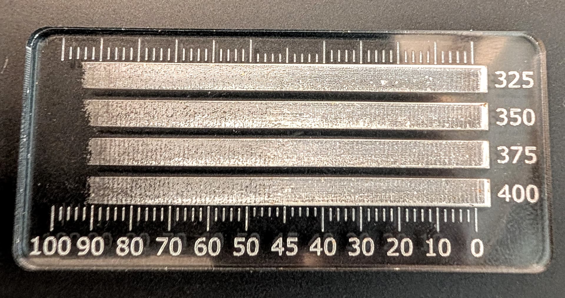
Lately, I’ve been using the 3D Engrave feature to create accurately contoured recesses in acrylic. After several failed attempts to get the desired results, I discovered that the relationship between grayscale value and engrave depth is surprisingly non-linear. So I had to bite the bullet, make some test pieces, measure the results, and try to map grayscale values to engrave depth.
Grayscale values typically range from 0 (black) to 100 (white). Keep in mind that the relationship between grayscale value and laser power is inverted, so a value of 0 (black) is full power and 100 (white) is no power.
Here’s what I found: starting at a value of 100 (white), with Min Power set to 0, the laser doesn’t even make it through the backing above a value of 92. Engrave depth increases gradually from 92 to 50. From 50 to 40, engrave depth increases dramatically. This 10% of the value range accounts for 30% of the engrave depth range. After that, engrave depth increases fairly linearly from 40 down to 0 (full depth).
Keep in mind, these are just my results on an OG GlowForge, cutting PG acrylic–you’re mileage may vary. I haven’t tried doing this on any other materials yet, perhaps this non-linearity is unique to acrylic. I’m wondering also wondering if this non-linearity also applies to things like cut depth.
If you’re using something like Blender, GIMP, Photoshop, etc., it should be fairly easy to create a grayscale correction curve to match your material/laser.
Thanks for sharing. It is information like this that makes the forum such a useful resource. Do you have pictures of any of the acrylic work you are doing?
Technically speaking there are 255 different greys, not 100 (256 if we count pure white but Glowforge ignores that). You may have meant 0-100%, which is valid way of looking at it but has some caveats depending on the software you used to make your gradient.
Some software’s gradients are linear, meaning the underlying grey value is actually stepped up by a constant amount across the gradient, and some are designed to make the gradient look linear to our eyes. It’s hard to know which you have by quick inspection, but it’s something to keep in mind — to do a truly accurate depth gauge like this it’s good to know which you’re dealing with.
Yeah, you could use RGB and get all 8 bits (or more) of color depth. A typical HSL palette gives you 360 hues, but limits the range of saturation and lightness/value to 0-100 (101 values ). Granted, HSL only covers about 20% of possible RGB values, but it works great for this:
It’s easier to work with base-10 numbers when measuring and converting (unless you’re a computer).
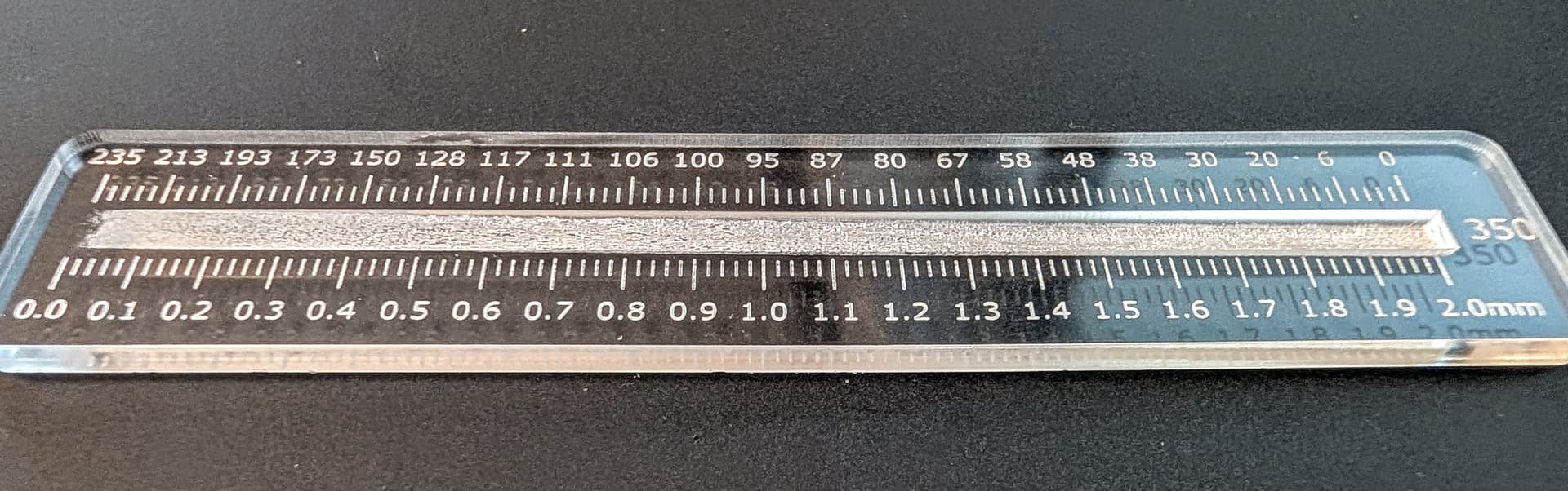
I’m converting about 20 depth measurements into stop points on a gradient. Everything between the stops gets linearly interpolated in Inkscape. (Measurement precision is limited by surface roughness to about 0.1mm.)
There’s clearly some stair-stepping going on, but I don’t think it’s due to discrete power levels, so much as the rate at which GF can vary power level. Not sure, though; more testing needed.
You’re dealing with hex codes and that boils down to 255 grades of grey.
The Glowforge interface desaturates your image behind the scenes via some algorithm. It’s pretty good, but they’ve never said which way they do it. So, it’s good practice to desaturate your images and then modify the contrast to your taste with an external editor if you’ve got a specific vision.
I think I’ve got it dialed in now. Running at 350/full, I’m within about +/- 0.05mm, some areas being better that others. @evansd2, I tried tweaking the final gradient stops in RGB mode (0-255), not sure if it made much of a difference though. I feel like I’ve been chasing my tail for the last few iterations, trying to eek out some precision/consistency that’s just not there.
There’s definitely something funny going on in the 50-60% power range. You can see that it gets a bit lumpy around 0.5-1.0mm. As the laser scans across the gradient, you’d expect it to smoothly dim and brighten, but it doesn’t! The laser visibly flickers as it passes over that trouble area. Weird. Perhaps there’s some proprietary magic going on, like transitioning from one modulation regime to another.
This should be good enough for my needs. I just wish I’d figured this out sooner.
There definitely is some weirdness going on, it was discussed a lot in the early days and I seem to recall changes were made over time which messed up some peoples past prints.
I played around with it a little, to give acrylic beveled edges. They never really looked great, because of the banding that was evident in certain parts of the print, depending on the settings.