WOW !!! This is beautiful work but it’s on a whole Nother level!!!
I love the spacer support discs. I don’t know how many of those I have gathering dust because I figured I’d find a use for them. Now I know!
1 Like
I wonder if you engraved the edge so there was not the extreme drop off at the edge of the sheet and more 3d in each sheet if that would not set it off more.
I’ve done it with a thin ply backer to attach to a plastered and painted surface. Warnings signs long before the days of “every sticker you want” on Amazon. 
If I had to do it today, I would use chipboard if it was going to be indoors.
1 Like
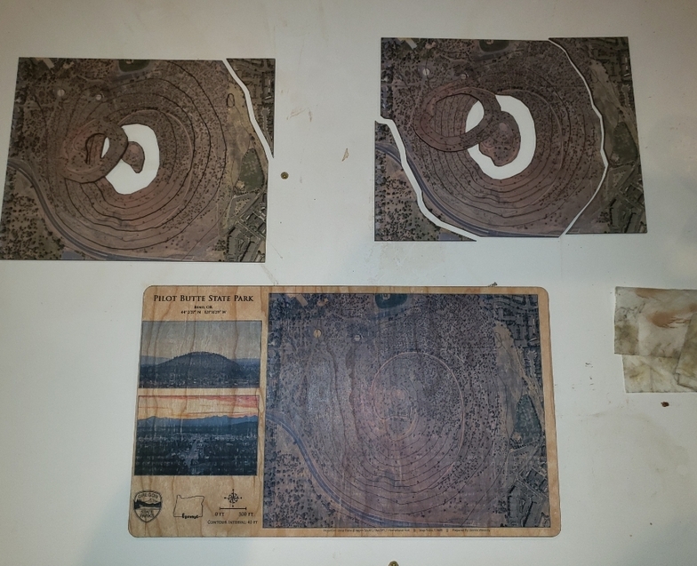
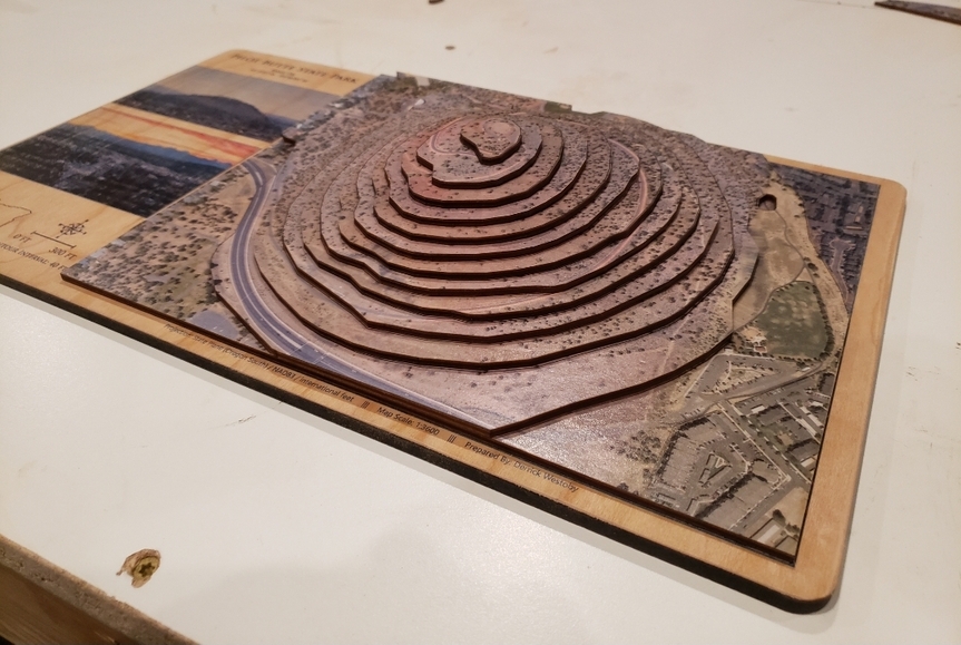
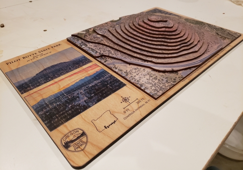
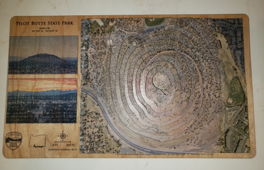
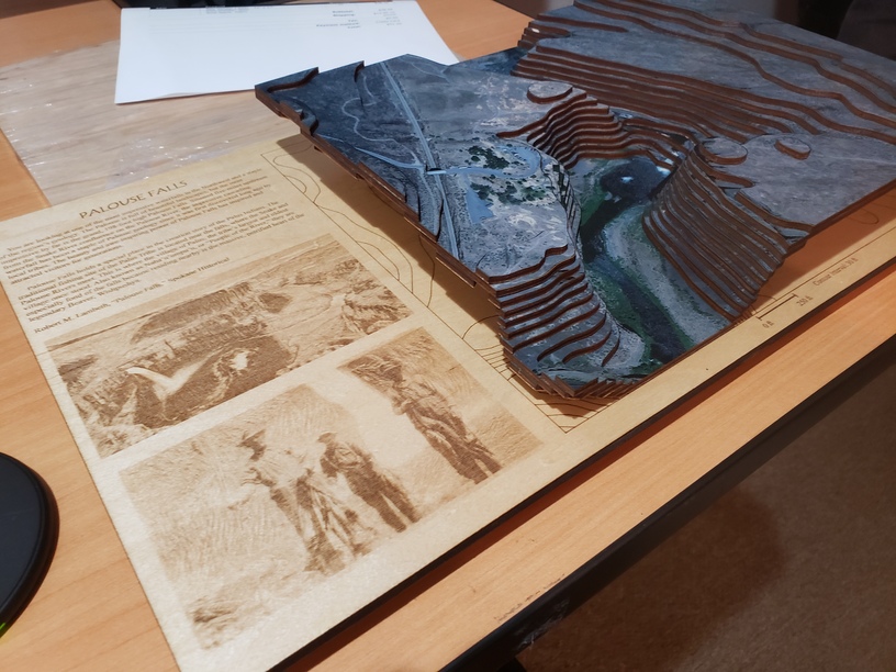
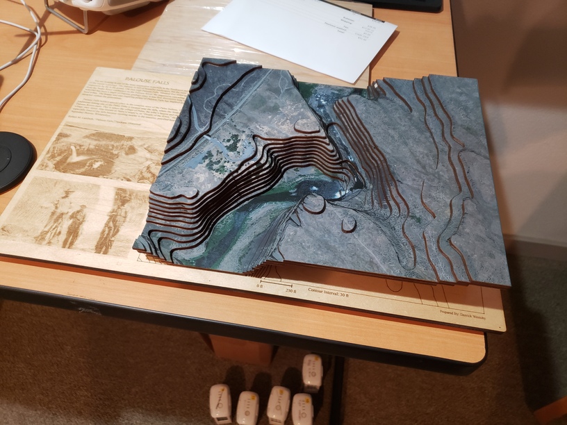
I finished this one up a couple of weeks ago but never posted the pictures. I’m treating all of these as just practice and am happy with any of them that I learn something on. Thoughts after this one:
- I’m with @eflyguy - Printed photos look better than engraved
- The text says that the waterfall is 198ft tall. Counting up the contour layers, someone would notice that the waterfall appears to be 150ft tall. This waterfall is kind of a weird one anyways, but I’m not exactly sure how waterfalls are measured. If it includes the depth of the terrain below the water’s surface, that would explain why my terrain layers don’t accurately reflect the waterfall height. I’m using photogrammetry-derived layers and I didn’t even think to look and see if bathymetry is available for this area. Long story short - ensure that narrative & legend text aligns with map findings and vice versa.
- Glossy = ugly. Matte mod podge & matte clear coat looks much better.
*building layers progressively off of the base board makes it much easier to align layers and ensure they aren’t warping. (I was gluing together in pairs before, then gluing pairs together)
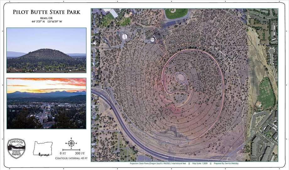
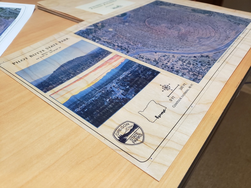
Anyways, I’m setting up for the next one now. My little sister used to run up Pilot Butte every day, twice a day when she was getting ready to leave for the Naval Academy. She just finished up her training and is stationed on the other side of the country, so I thought I would send her a little piece of home.
(don’t mind the wonky border. Path offset in Inkscape was acting weird when I made this screenshot, fixed it for the other prints/cuts)
I used @shop 's recommendation and ordered some printable veneer from Cards of Wood. Looking good so far…
5 Likes
it’s a lot less work to print straight on the wood. the negative is your “white” is wood colored. but if the look is ok for you, less time and money. and one less thing that can mess up (adhering print to wood).
That’s not a negative at all! That’s the whole reason I wanted to print directly on the wood and was trying the mod podge photo transfer method on the TRANCHE map. I don’t like the aesthetics of the white background.
1 Like
which is great here. but not everyone wants that, so i was just pointing it out. it’s something that trips people up sometimes when printing on anything not white, so i thought it was worth mentioning it here. printers will give a non-white substrate a “hit of white” first when people want white in the background. it’s a little more expensive to do that, since not every printer can do white and many printers that can need to be set up specially to do that hit of white ink/toner.