I made a few notable word clock designs recently. Though I would share the highlights.
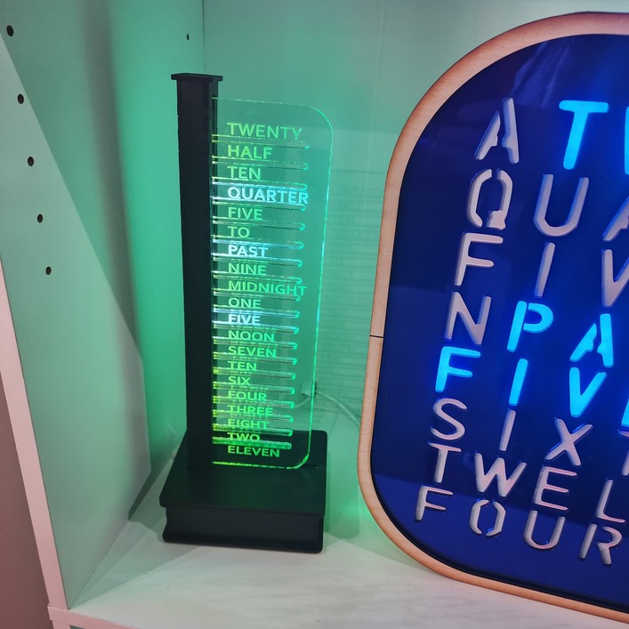
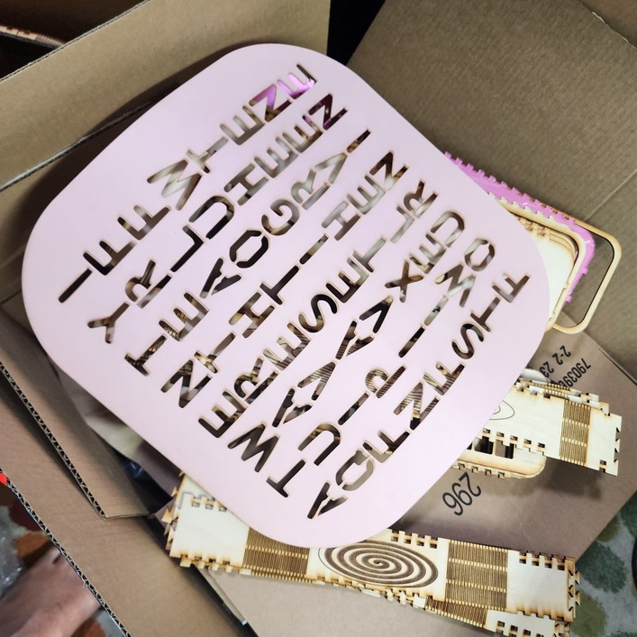
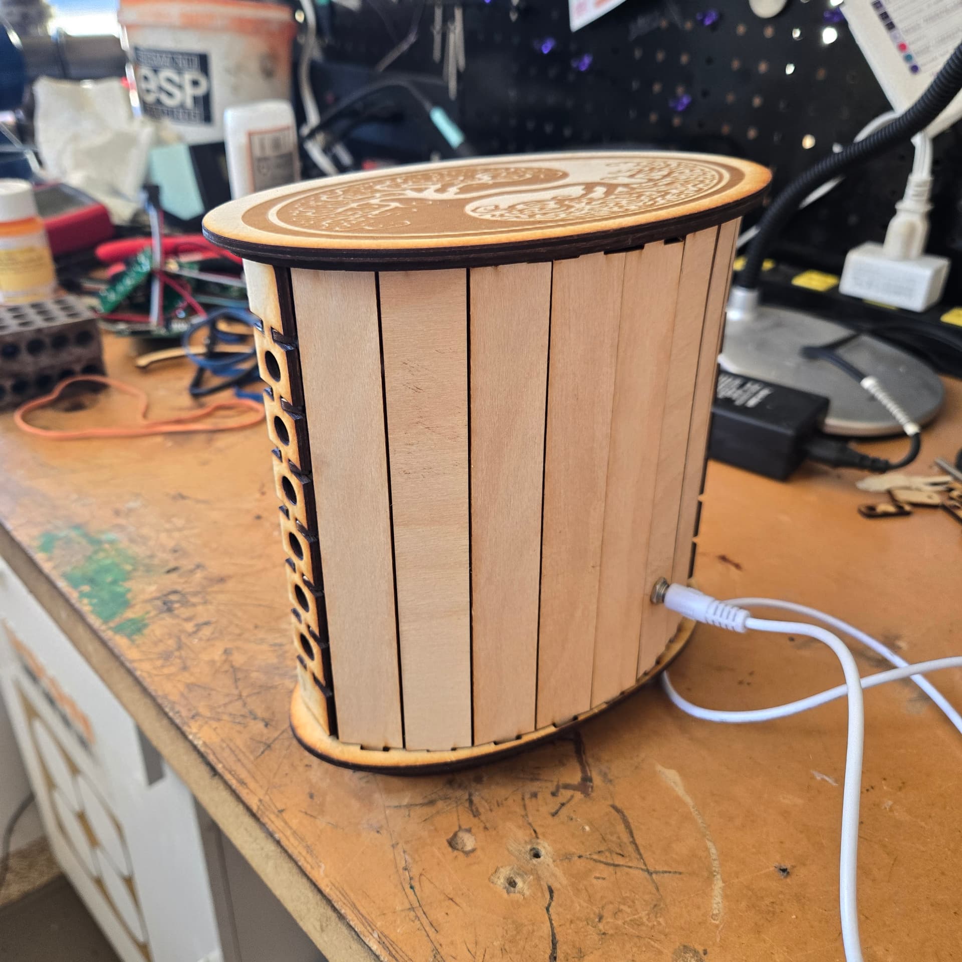
This is a shorter version of the vertical word clock. I made it primarily to fit in the display cases (book cases) that I use in 2 local galleries. The original design used 2 leds per word, skipping a 3rd LED between words. A strip of 60 LEDs to cover 20 words. This skipping, in concert with the gaps in the acrylic and an internal grate helped contain the illumination to the targeted words.
The new version does not skip the 3rd LED. So it is just down to the grate and the gaps in the acrylic. Ends up, that works almost as well but is 2/3 the height and thus fits in the bookcase.
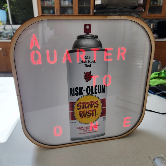
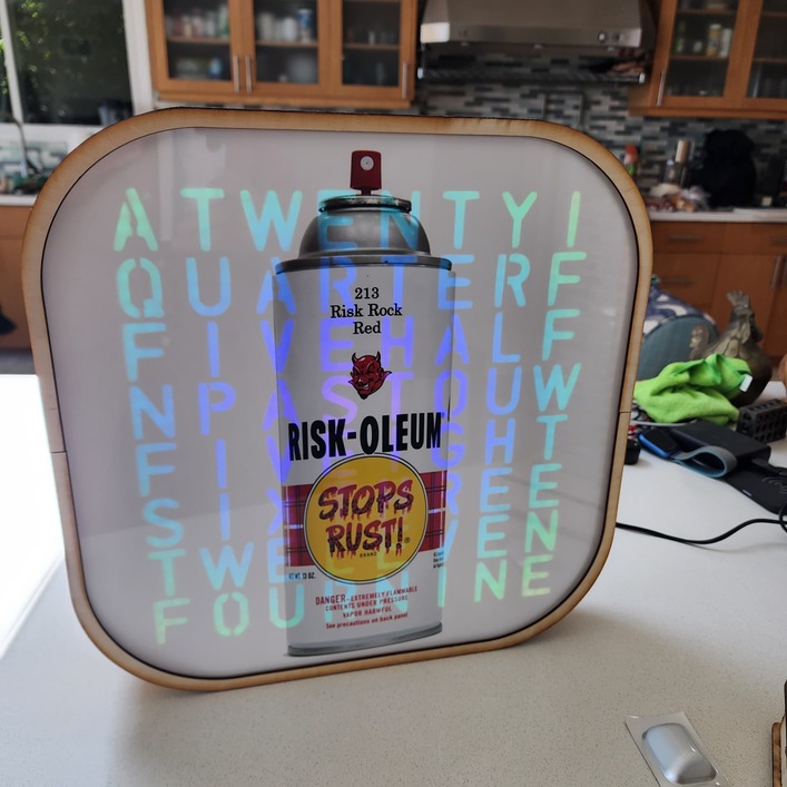
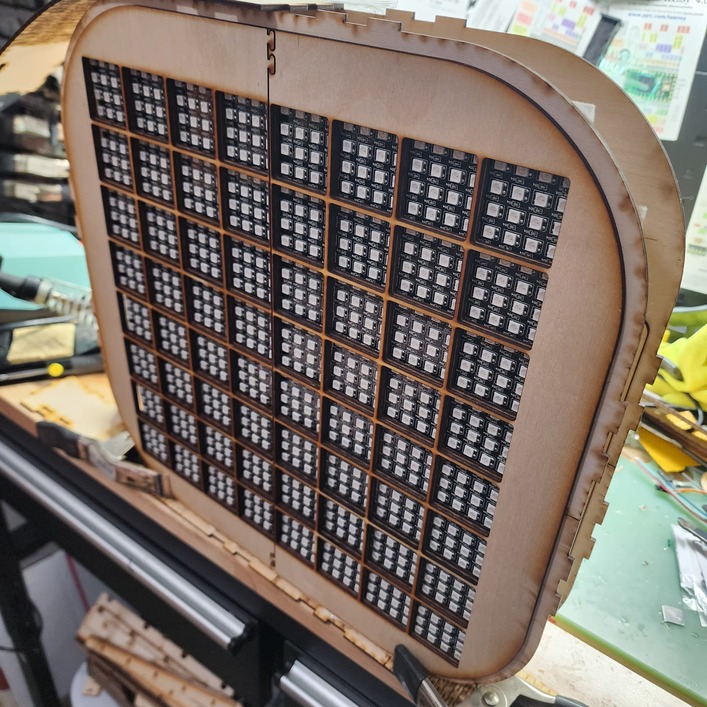
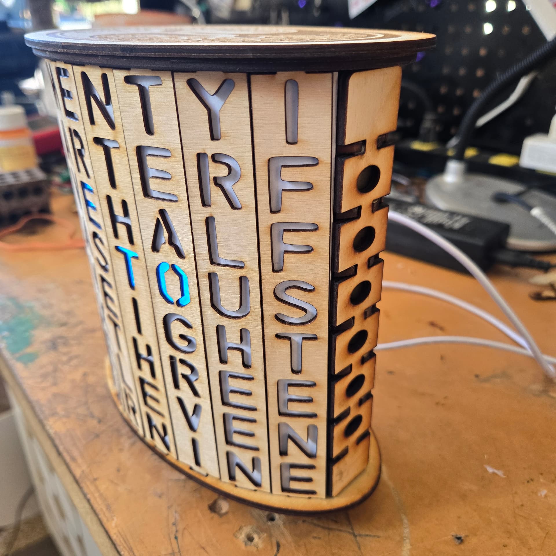
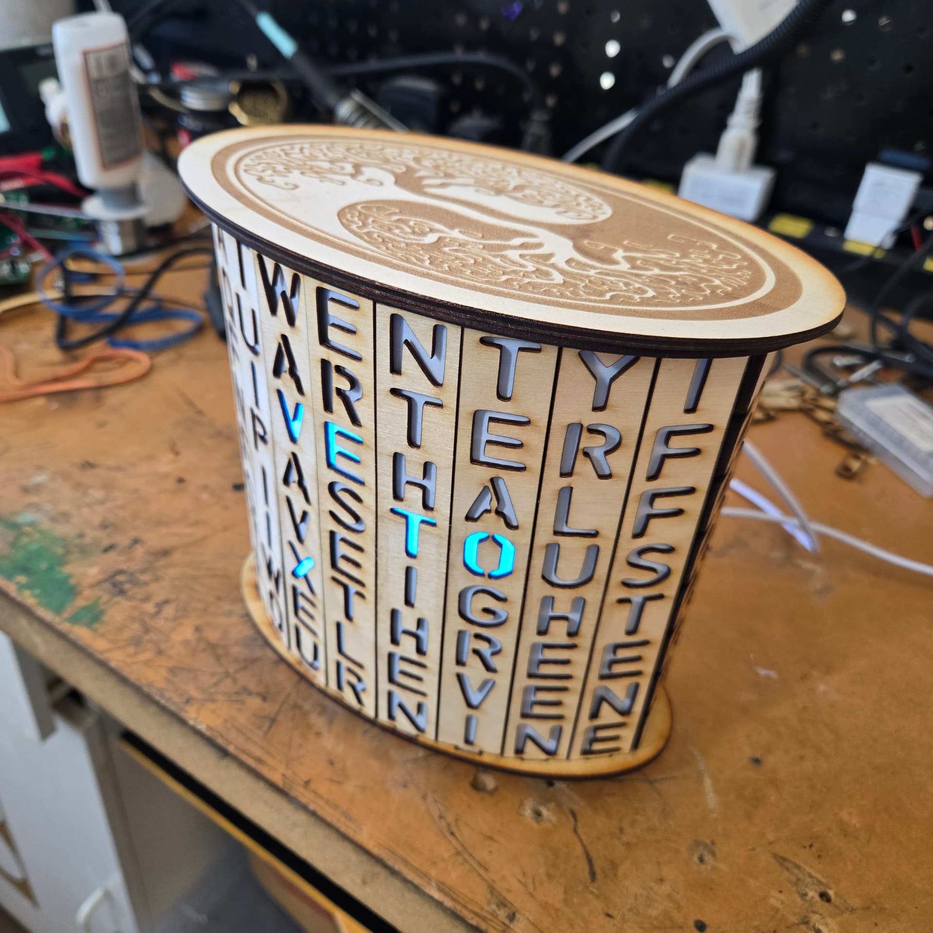
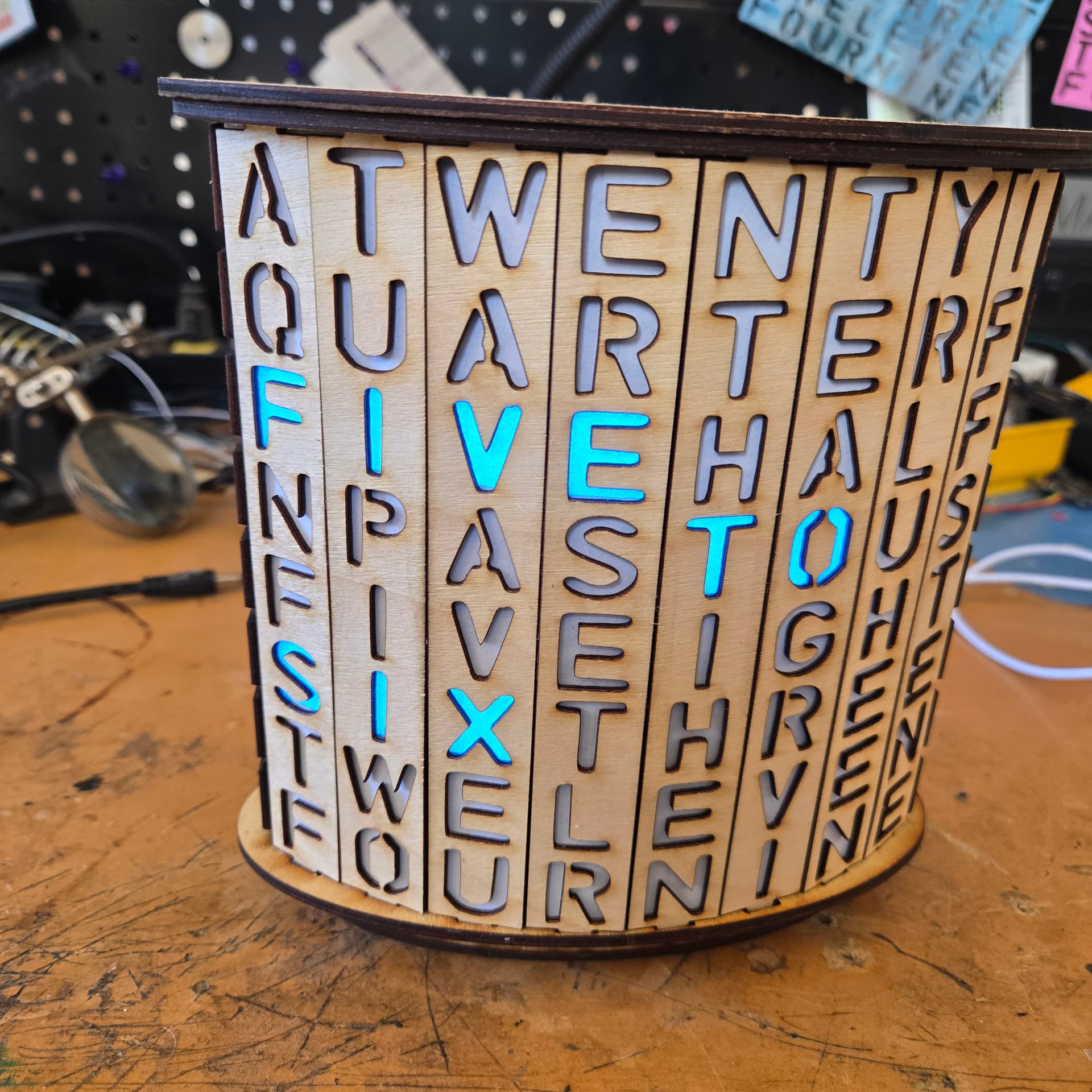
The other new word clock is a new variant on my larger square word clock. The new twist here is that the collaborating artist (RISK) printed his iconic RISK-OLEUM spray can on relatively thin stock which allows the light to shine through without cutting out the upper layer. There is a masking layer underneath that forms the letters. The keen eye will note that while the back and front and masking are large enough to need the passthrough, I have split the other internal layers into parts that fit a standard sheet size to not need to rely on the passthrough working perfectly.
I like that vertical one as something different. I have a kit of the electronics bits to assemble, been too unwell to start on it so this post is timely.
That’s cool. Did it turn out the way you wanted? It seems like it’s a little harder to read than the traditional flat-faced types, does it work out that way in person or is that camera distortion?
Good question. It is a tad harder to read from side angles but on par with early flat faced clocks that used 1/8 thick material for the faces. I used 1/16th ply for the letters which helps make up for the issues caused by the angled portions.
Unlikely to build a lot of these vs flat face but it was a fun adventure.
Thank you. I’ve seen this one go by on the YouTube feed but I had it pegged as clickbait (I have a bunch of dumb rules of thumb like refusing to watch videos with an arrow in the thumbnail). It’s always good to have someone vouch for a video.
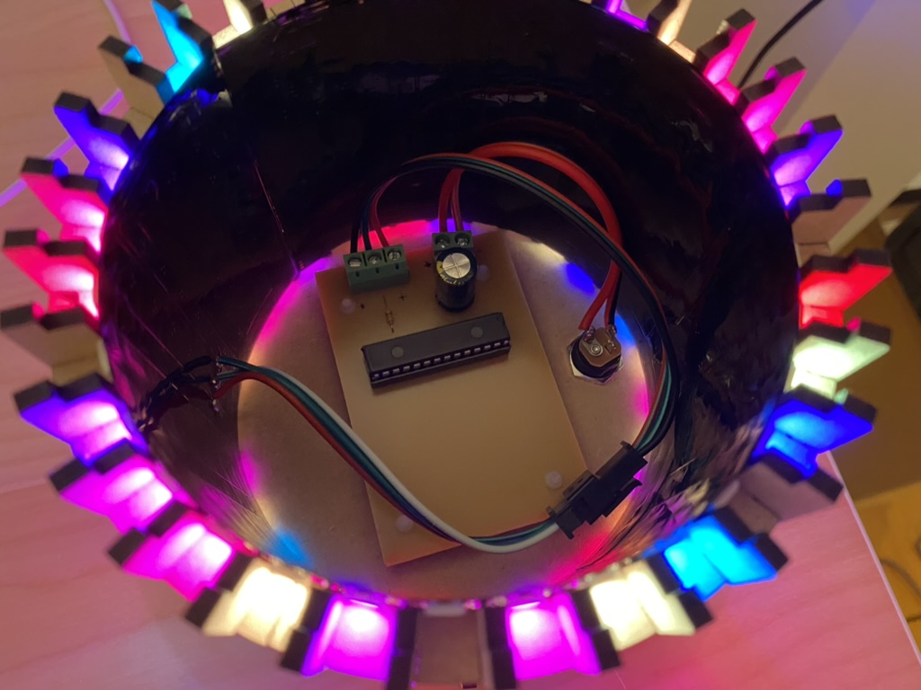
It’s worth knowing about the option to drop down to direct port manipulation (if you don’t need the safety checks that digitalWrite does). My own version of the matrix lamp uses a bare Arduino chip with no clock crystal, which means it has to run at half speed with a less stable internal oscillator. Yet it has no problem driving the display, because I didn’t try to clock out the bits myself. I’d rather use the great FastLED library and take advantage of the collective knowledge and optimization skills of the open-source community.
I know they’re useful to drive new traffic to a channel but once I’ve subscribed, I check out the new stuff regularly and the clickbait images irritate me enough that I’m less likely to look at them than just a screen cap and a rational title that doesn’t “Change Everything!”.