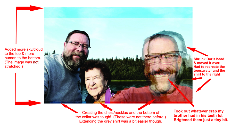
So my dear brother Dorian, his husband Ron and 85 yr old mom Sue are out gallivanting about Alaska for a few weeks and posted the unaltered pic on the left. It’s a really important photo for me so I’ve decided to design a frame for it using a cool raven logo from their favorite Alaskan bar. (They do love their martinis, even out in the boonies lol.) The dimension of the pic is problematic so a “few” tweaks and manipulations later and voila, a “new” pic! I’m pretty proud of it actually.
I’d say there a seven changes that needed special treatment so you can play a game of “spot the difference” and see if you can find them. Let me know if you think it’ll pass muster when printed (5"x7") or if you spot any areas that need more touch up. (Spoiler pic a few comments down.)
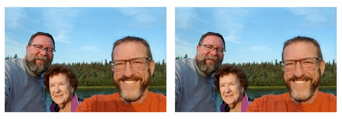
Grandkids are on the way … so, what I quickly see is that you have moved the right gentleman a bit closer, and then used the landscape between them to fill in to the right. I think you did a great job!
We used to add a family member to a group shot. With eight of us, it was sometimes hard to get the whole group in the same state.
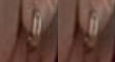
What a wonderful job! I could tell the photo was different but it just wasn’t obvious! The only thing that really jumped out at me was the blemish in the orange shirt gentleman’s teeth. I think that is the sign of what a truly good job of photoshopping you did is that it just looked nicer. **
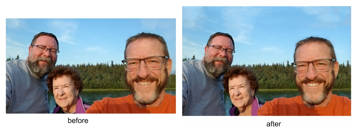
Everyone got most everything and some folks saw things that had not been altered. I take folks seeing different things as a really good sign that it’ll be good to go! Thanks for playing along! I did an overlay to show the changes.
It was all done with a clone brush and by making copies of certain areas, moving them and then using the translucent eraser the blend them in. The hardest part was adding to the 1/2" inch at the bottom of the photo. I made a copy of the last 1" of the pic, flipped it upside down and overlapped it with the bottom just a bit and then had to do a lot of cloning and erasing. The collar stitching at the bottom of Dorian’s (orange) shirt was a composite of four different pieces of the original collar. All and all there were probably 18 separate layers before the image was merged into one.
Yeah, clouds are a pain and don’t always look natural, even when they are lol. I didn’t stretch them though, but did have to add to them when I extended the sky. Making it all blue sky wold have been more awkward. :-/
Thanks, I’m glad it’s a more pleasing composition. I had to make it more square anyway and the perspective of Dor’s head did make it awkward looking. (It was kinda satisfying to be able to shrink your brothers head a bit lol.) The shadow is my biggest peeve with it as well and it draws too much attention away from the faces. I don’t have a lot of unadulterated orange pixels to work with, but I’m going to give it a shot and try and work on it a bit more. I added the tree and bear to the bottom right of the frame and I was hoping a dark element in that corner would mitigate the shadow a bit. Still don’t know if that’s how I’ll keep it though, kinda liked just the Raven alone.
Funny thing is, I didn’t sharpen anything. It’s possible I have it set to automatically sharpen when I export it and I’ll have to check that, but not sure why the two earrings would look different if it was applied at the same time.

 **
**