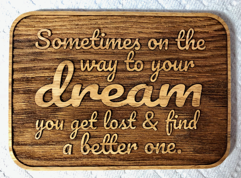
But then I found out she was envisioning more of a horizontal format and wanted a “whimsical” font, so I reworked it with her selection from Google Fonts:
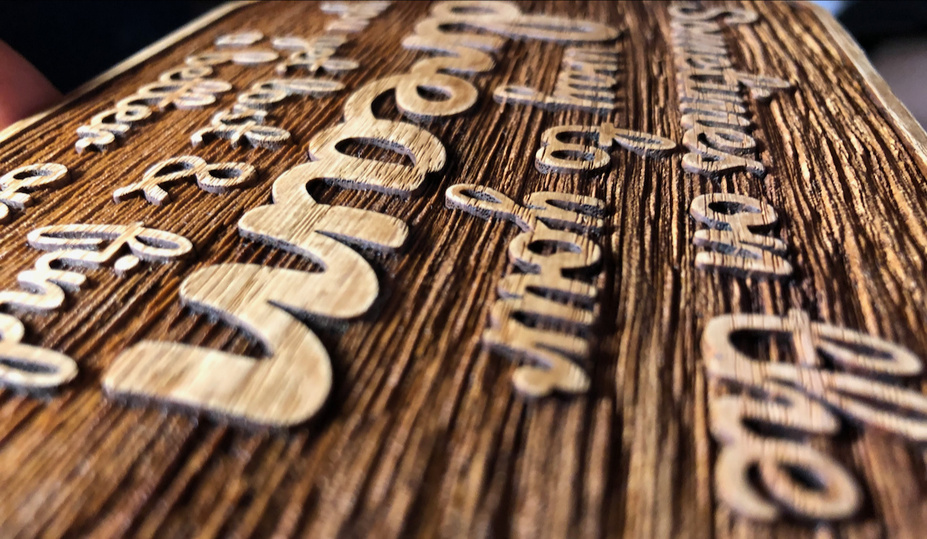
i had a similar piece of mystery wood that i engraved the same way (negative space around the lettering) and i really liked the effect as well. it gives it such a nice rustic look.
@geek2nurse: Sounds like I “re-invented” what you (and not doubt others) are doing after an engrave. After a good scrubbing (typically using ethanol in my case), I clamp the work piece between two boards and wait for it to dry thoroughly. No warping if you are patient enough.
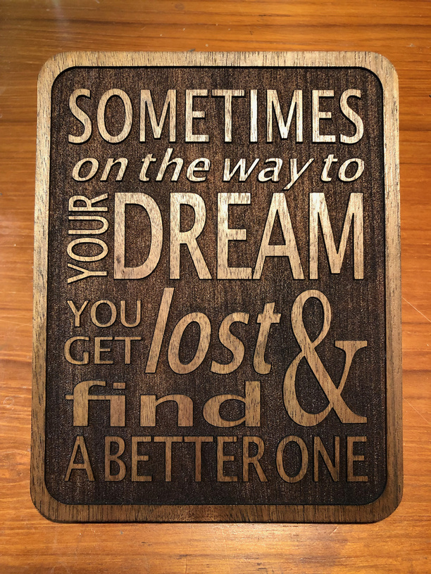
I like it better, too. Usually I use different fonts, but I got all cross-eyed trying to choose and decided to try it with variants of one font instead. I wasn’t sure I was happy with it at first, but it’s been growing on me.
I really like the raised grain on the second one, but I prefer the arraignment of the first. It better reflects the Helter -skelter nature of the dream search…