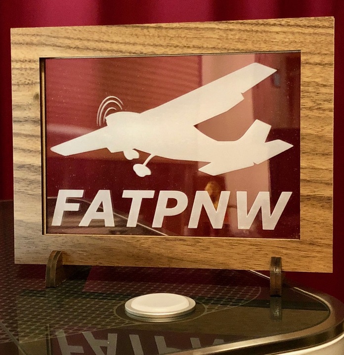
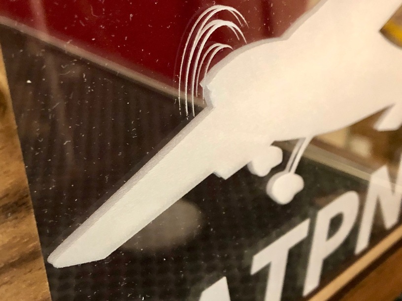
The structure is three layers of draftboard, the face is maple ply. It’s tough to tell from pics, but there are actually two back-engraved pieces of acrylic sandwiched in there to give it more depth when you look at it the right way.
If I’m to do it again, I’d either go single-layer to avoid alignment hassles, or add another 1/8" layer between the acrylics to expand the depth effect.
Really nice, I especially like the simple, strong graphic look of the design. I like the effect you got with the layering as well. Another way to get depth would be to sandwich the clear acrylic between two cut out planes. I did something similar and it came out pretty cool.
It wasn’t so much physical alignment (everything snapped together like Lego), but rather design decisions. Do I double up the whole image, or just the plane? If the latter, how do I crop the plane and still keep everything aligned? Do I separate the two sheets or smush them together? Should I back-engrave one sheet and not the other? Which should be which?
As most projects usually go, I decided pretty early to downgrade it from Grand to Realistic. My spec began as:
Wall/window mountable or free-standing
Side-lit
Has remote
Has internal battery
Solar charged
And changed to:
Stays standing when someone walks through the room
Club is ‘Flights Above The Pacific Northwest,’ putting me squarely in the PNW. Not sure where FAT is.