Fast forward almost 3 years and clockmaking has become a reasonable business for me. Enough so that I have designed my own circuit board for the electronics and hired an assistant to run these parts on the forge. The pandemic slowed things down for a year but business is picking up lately as we return to “normal” life.
My designs have evolved along the way.
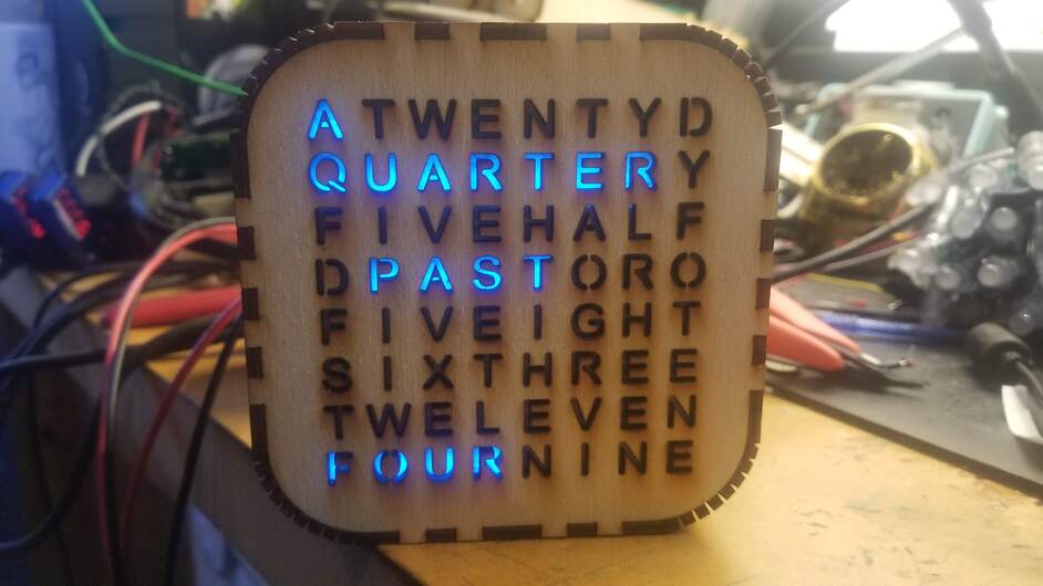
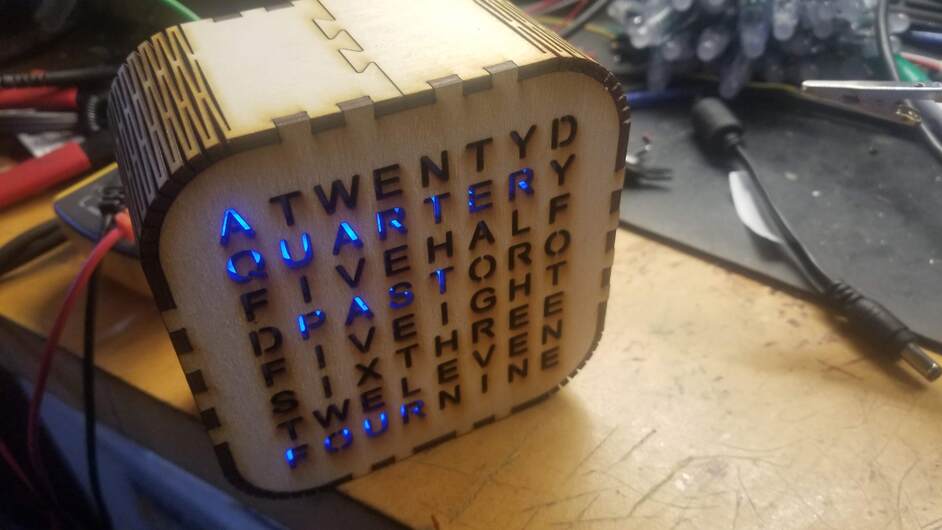
At first, I did not like how the viewing angle was narrow on this original so changed to a design with multi payer front face. This change opened up the viewing angle and allowed colored faces. I made a bunch of these but have stopped making them lately in favor of larger versions.
I wanted to make a larger clock so I updated the design to use a 16 x 16 matrix. This matrix is a larger version of the one used in the original design. This larger matrix has 4 times as many leds. This results in 4 LEDS per letter. So, some software tweaks were needed to map the leds to the letters. The matrix is 6 x 6 inches and the resulting clock is about 8.5 x 8.5 inches. This size is my best seller. That design saw a few improvements as well, with the addition of an additional spacer layer, the initial spacer/grid being attached to the walls of the box, and a trim ring that tidies up the front being the most obvious. I also played with a few different shapes for the clock body, with hearts and more rounded boxes. I ended back with a rounded square box that is not far from my original shape.
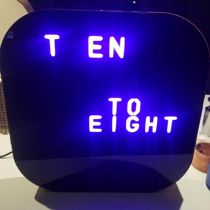
The black led acrylic has been a recent option for the square clocks. It makes a great front that only shows the letters that are illuminated. Results in a look that some say approaches neon. My son in law calls it “retro”. I like it a lot. The initial prototype sold right away. The next batch (4 of them) will be hitting the gallery today.
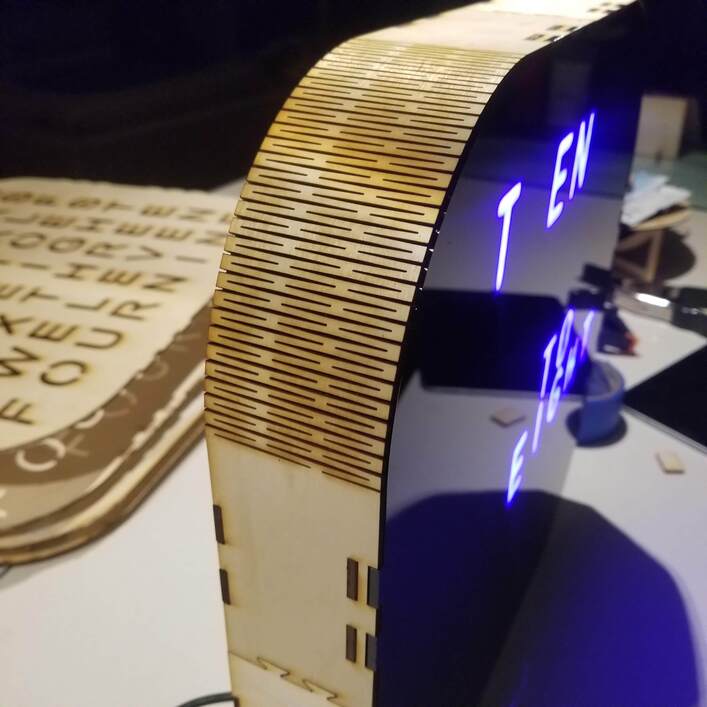
I added a few vertical and horizontal word clocks that are based on edge lit acrylic. The latest version of these use RGBW leds for added brightness. The first of these will be hitting the gallery today as well.
Along the way, I have also tried to make even larger sizes of clocks. The passthrough helped with those. The challenge there was getting enough light from the LED source and finding an alternative to the prefab led grids used in the smaller square clocks. I tried variants of strings of wired LEDs but never really got enough light out of them. They were also hard to assemble and made the clock thicker than I wanted. I then tried strips of leds. The strips worked to provide enough light and allowed a thin clock design but were also hard to assemble reliably (too many ways for all of those wire connections to fail). Despite those challenges, I managed a few big clocks that were presentable enough for sale (and a bunch that were not). More recently I have developed a design using 4 of the 16 x 16 matrixes. This is an expensive choice and overkill on brightness as 16 leds/per letter provides way more light than needed. On the positive side, it looks great and was fairly easy to assemble despite being a prototype. The first of these is hitting the gallery today. I am very happy with the result. Probably more to follow with this design.
I am having fun. None of this would be possible without my Glowforge.
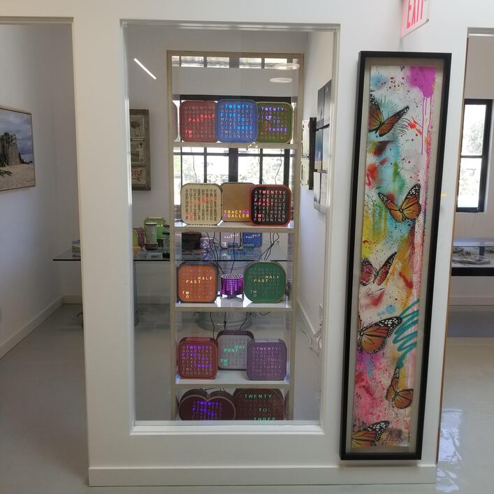
View of the gallery from a few weeks ago (Tracy Park Gallery, Malibu CA) with many clocks:
Note the heart shape in the bottom row , an example of a difficult larger design also on the bottom row, and a more rounded version in green on the middle row.
Vertical word clock version 3, brighter and more colorful
The latest big (15-inch) word clock. With Black LED acrylic face and way too many LEDs inside. (before adding front trim ring).