Greetings all,
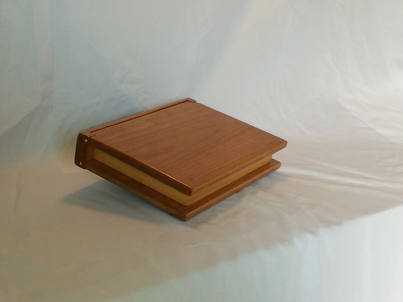
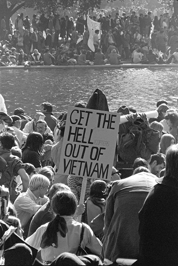
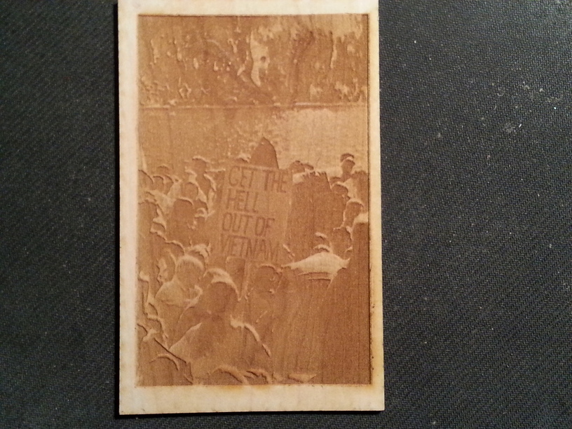
I made the attached gift box to look like a book and I would like to engrave a book cover on it. This is a retirement gift for our editor and the cover is the last book she worked on for us. I have searched the forum and tried different settings, but I am not happy with the results (see attached). I know the photo is not necessarily a good candidate, but would appreciate any advice anyone might have. I am also considering making the box in maple to help with the contrast.
Thanks.
I’ve found when engraving from a jpg or bmp file that you need to make sure that you have a super high contrast for it to come out nicely engraved.
I think the attempt you have posted looks pretty nice, but if you lighted the sign up and then increased the power while slowing it down slightly could give the darker parts a bit more depth.
Also, and I’m just saying from what I’ve done, using the PG settings for SD photo works good and not using the pattern or dot engrave settings.
Did you by any chance use the 3D Engrave settings for your photo? (I’m not wild about the results of engraving for depth on photos.)
I prefer the Photo Engrave settings for photos, you’ll get a much better result. That should show a lot more contrast than it does, although you could bump the contrast a bit more.
I meant more along the actual size of the image. The one uploaded here is like 350x524 pixels. I don’t know the size of your finished engrave product, but if this is the size of the image you’re uploading, it’s very, very small for trying to do any engrave.
That’s not necessarily going to fix the background detail issue but larger resolution will help the entire overall engrave.
Mostly it is what you are able to do. Tthe original was 1200x800 before cropping and fooling with you can always decrease the resolution, but there is no value in increasing it does little good but the picture is 20 years old and it is hard to go back and take another.
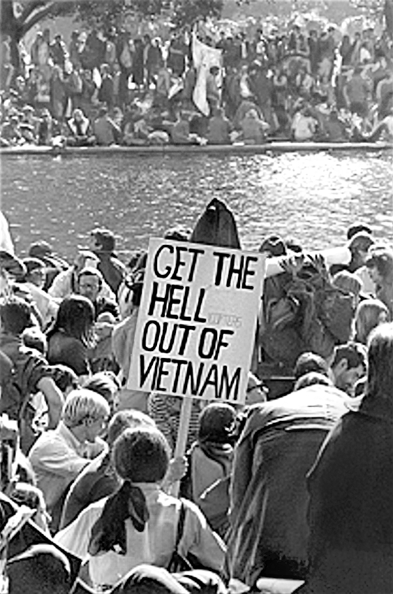
It’s tough to get stellar editing results with the low res. image, but this is an idea how I would edit it. I used a brush to doge/burn , highlight and sharpen specific areas. The below video I a good overview of what I do for an image like this.
For Photo settings or Graphic? I just spot checked a bunch of different materials… I guess I was wrong on SD Photo (since I don’t see any SD Photo settings), I only see Draft and HD Photo; every photo setting uses Convert to Dots/Dithering though.
On the Graphic Proofgrade settings, pretty sure the Draft and SD modes use vary power, and the HD settings use dithering/convert to dots (which doesn’t make a ton of sense to me).
Yep, you’re right. I knew there was only one SD setting and I wrongly assumed it was the photo setting you were referring to. I used the HD photo setting soon after it was introduced andI didn’t like the results. (Been using SD for my photos.) Then I gave HD photo another try the other day and it turned out great, so I’m going to revisit it.
I want to thank everyone for your help. I am going to go back and rework few things and I will post my final results (I still need to build the box, unfortunately, I have to use my analog tools for that ) As I posted earlier, this is the most friendly and helpful forum I have been part of.