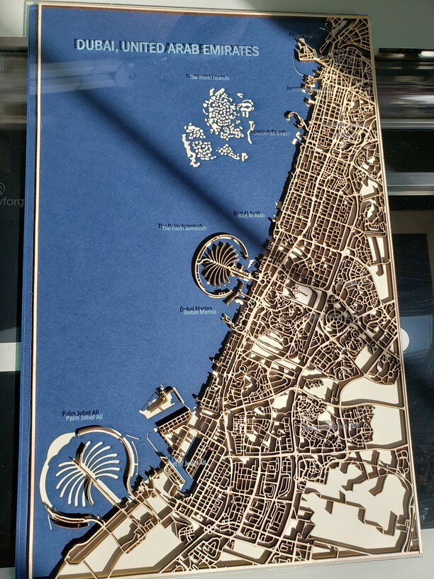
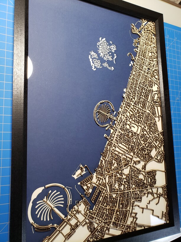
I personally like the map with the glass engraved labels but after seeing the draft unframed pic, the client said they preferred to have it with no labels, just a plain glass front. I asked them, are you sure, it will be bland, sure you want it that way? The reply I got made perfect sense. It was going to be a conversation starter piece and if everything was labeled, there would be no fun in describing the map and sharing memories of the different places/life events. I like minimalism, it is good and it is popular for a reason (s) (among many). Hope you enjoy. Cheers.
PS: I will still offer labeling as the client should be able to choose and be happy with the end product. But it is good to look at things from a different perspective once in a while. ![]() .
.
This is cool, I like both their rationale and your solution.
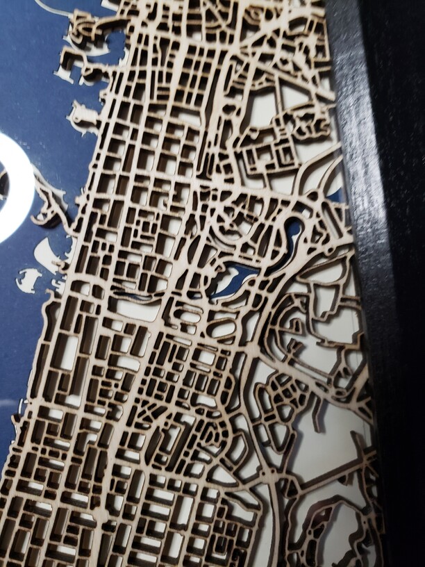
The fun part of having it behind glass is that they can label it with dry erase markers and change it up all the time.
This is very nice! I like the reasoning on no labels!
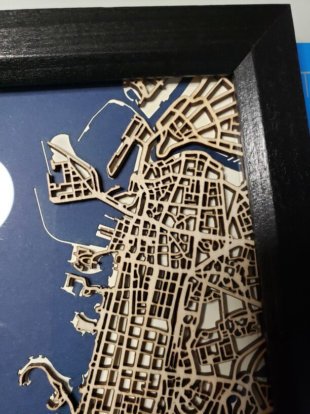
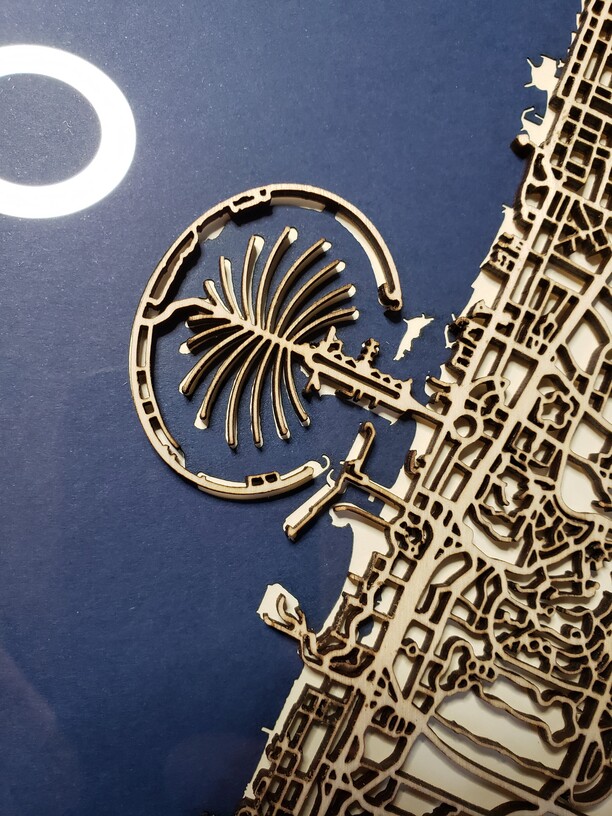
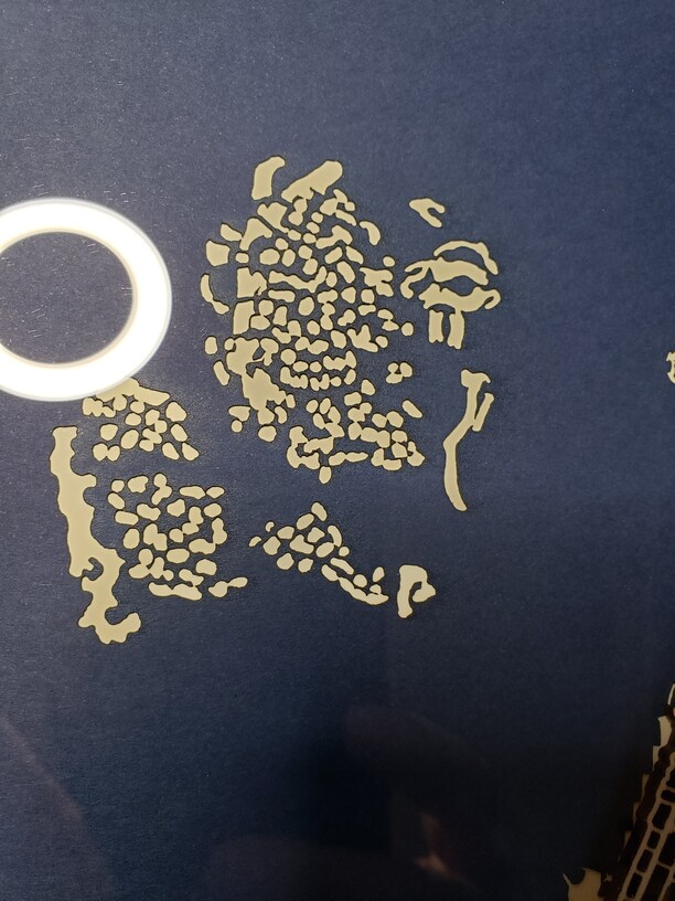
Those palm shaped islands are a dead give away. Pretty much everybody must have seen pics of those by now.
Beautiful work.
Yes, there is only one place with those islands, lol.
The World Islands are both fascinating and terrifying - both considering the cost, and the solidity of a manmade sandbank on the edge of the gulf? 
Though Clarence makes me laugh - of all of the Antarctic, the went with Clarence 
Your map is beautiful 
Yeah, as soon as I saw that I knew where this was.
Looks awesome. I like the labels, but understand why they didn’t want them.