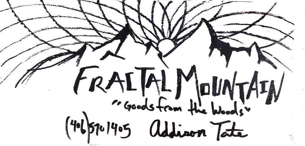
Man… I gotta start vamping up my graphic design knowledge. In the meantime, could anybody give me some pointers on how to separate the text that my friend drew on a piece of wood, from the background?? File attached, any help is appreciated. Trying to engrave some wood business card for him, just need the black lettering… 57503001_407931066665333_918635359347146752_n|666x500
Hmmmm. If you have Photoshop or Gimp you could try to do a color selection of just the narrow range of colors that compose the lettering and erase everything else.
If you prefer a more hands on approach, you could print the photo in black and white, then paint white all around everything but the lettering, then scan the cleaned-up photo in, save as png and upload to GFUI.
1 Like
I am messing with it in Gimp right now, thanks for the advice!!
not sure how to do the color selection, any pointers?
Sorry, I don’t have Gimp. In Photoshop it would be Select…Color Range. I’m sure there is a similar functionality in Gimp.
Convert to BW. Mess with curves until you have it fairly well contrasted. Use the magic wand tool to isolate it. Clean up with eraser/dodge/burn or whatever you like.
1 Like
Yessss. Convert to BW would be wonderful, how would one go about that?
I’m sorry, I have a load of CAD experience, but this graphic stuff is so very new to me.
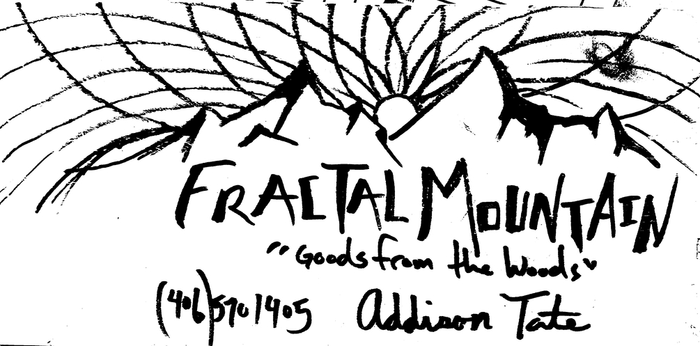
Ink extracted and converted to PNG. (Just Erase whatever parts you don’t want.)
Hang on, let me zip that…Discourse is converting it to jpeg.
text.zip (8.4 MB)
5 Likes
In gimp, it’s caled desaturate.
This was after cropping, desaturating and messing with the curve, it’s a good start.
5 Likes
ah this is perfect!! if you can explain the process I would be one happy camper. Have several projects that require the same thing!
So now that you see what both Jules and I did, you can get the idea about how this is a subjective process. Basically, I set my black/white threshold higher than she did, so she gets some more black where I chose not to lose the detail. Her lines are more “solid” with less texture variation, but even that is variable and subjective across the image.
1 Like
Can’t tell you in GIMP, I just used the Color Range selection tool in Photoshop. (So whatever the equivalent is in GIMP should work fine.)
thank you! love how fast responses come from this community. yall are neat.
1 Like
What I do is always run the Select tool at zero tolerance and if what it grabs is not enough carefully while pressing the right mouse button drag down, this increases the tolerance till you get exactly the right amount. If you go slowly enough it will show you what is being grabbed.,
I also copy everything to another layer and turn off that original layer, this saves the information against future need. When the Soviets decided that Stalin was a bad guy and ordered the destruction of all the statues one person whispered “we saved the head just in case” So I refer to saving data by working on a copied layer as “saving the head”
Also as you can set it to saturation or hue Then it will pick up the brown and ignore the black. For me color is data and that data can be used. Going to grayscale is getting rid of useful data. Also Edit > Clear makes that part transparent and much easier to select all that is transparent. If there is need a all white layer below will make that white while still transparent on the layer you are using.
2 Likes
This topic was automatically closed 32 days after the last reply. New replies are no longer allowed.