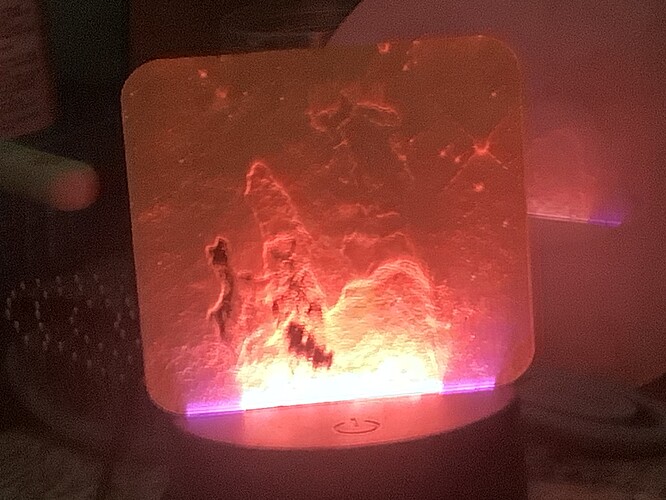
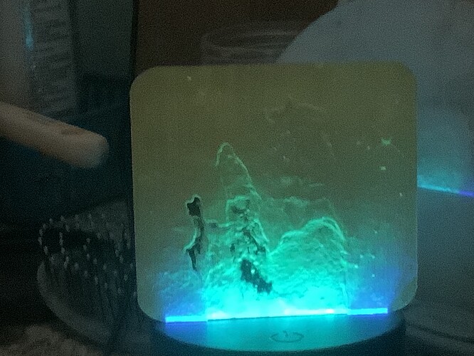
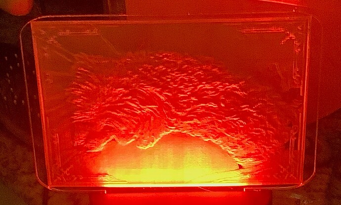
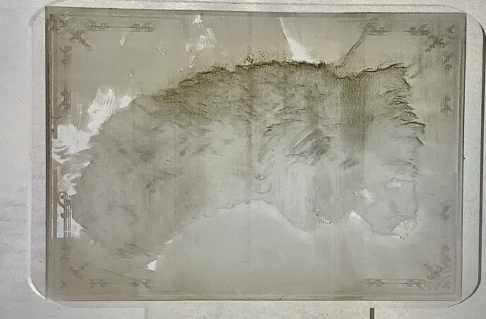
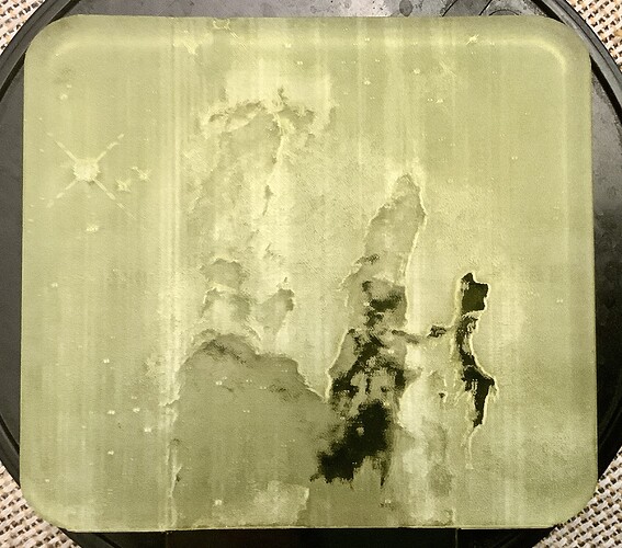
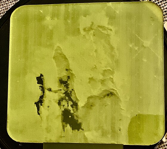
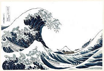
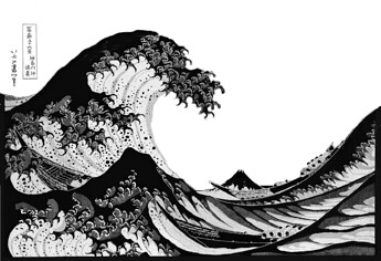
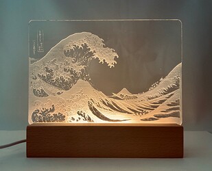
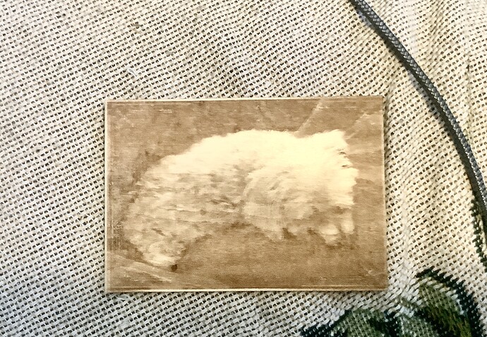
The first two are the Pillars of Hercules, the third, my friend’s dog,Max. I’ve been really struggling with this. Any criticism welcomed!
I’m not sure about the pillars, but I can see the great detail of the dog. I’m not sure how to make it stand out more. I think the orange light is distracting. I haven’t tried to do nightlights in this detail, so I don’t have much to offer.
I know from experience it’s really hard to photograph edge-lit acrylic, so I’m not going to criticize based on the pictures. They’re good if you like them!
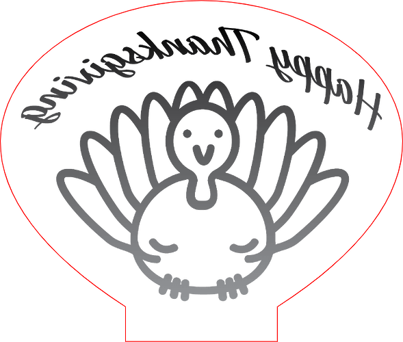
As an alternative, I’ll offer a tip: it looks like those are 3D engraves. Due the way the light works in those things, the depth of the engraving doesn’t really contribute much to the effect you get out of it. I would consider converting those pictures to line art or flat dithered images (fairly coarse - halftone might be a cool effect). What you can then use the depth for is to create a subtle gradient, engraving deeper at the top than the bottom. This gives the light a path to not get blocked and provides more even illumination. Finally, I find it looks prettiest if you engrave the back side, which means flipping the design.
The above is also a good example of what not to do… don’t expect the light to spread out from the tiny opening on the bottom to cover a large area.
Great tips! Thanks
The Pillars of Creation is instantly recognizable, even in reverse. However, a bit of gold rub on could really make them leap!
Love the Pillars!
Ditto to what @chris1 said, also keep in mind that the light won’t bridge a gap well, so you’ll get the most light to the top if the engrave is connected to it.
On the pup, if you can rearrange them so more of the body is attached at the bottom you’ll get less of that random glow, and more of your image. With the Pillars if you zoom in just a touch so the cloud formation is the full width you might see more of the stars above.
Will they photograph better if you put something behind them like a white piece of paper? Or maybe something black? (With regular room lighting) Just so we can see the engrave better?
Excellent idea. I’ll try it
It’s worth some experimenting to see if raising the contrast gives you a clearer image as well - there will be a break even point where you loose what the image is. Edge lit is hard!
I just find it frustrating because what works on one doesn’t help the next. I can’t find any consistency.
Working on this one now.
100% - there has to be a pattern, but other than going with solely b/w images, I don’t know that anyone has found it!
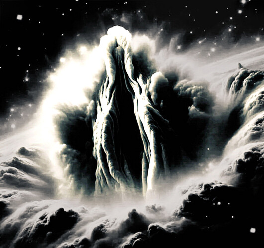
That’s SO cool looking! Yonic as all get out, but also beautiful ![]()
Yeah, honestly, I think the easiest ones are those that are black/white, or dots.
Beyond that it feels like hit or miss.
Also, do you know if you are using cast or extruded acrylic. I believe that the cast acrylic produces a better result.
That is a beautiful piece ![]()
I would have a few suggestions from my experience working on lights like that. One is to imagine myself in a flat parking lot with a huge design laid out and I have a flashlight trying to light up the design. The tall stuff close to me hides the shorter stuff to the back. So as I am trying to make the stuff in the back taller, I impose a gradient, dark on the top and light on the bottom, to have the points farthest from the light
Then the line between not engraving (white) and engraving (almost white) is a big one that I do not want., so I darken the lightest part of the image just a bit so everything is engraved, and make sure there is no masking to take up the lighter part of the design.
The third thing is the hardest and that is the LPI. Even 640 LPI will leave a “grain” that will spoil an image of subtle variation like an old B&W TV but the higher the LPI the longer it takes, Where I have a choice I run full power and increase the speed to balance both to shorten the time needed plus the higher power creates the largest spread between any two grays, and thus the best resolution. Throwing the focus off also helps some but I have not been very happy with it.
I hope this can help as I have not loved my results as yet.
I have been doing some night lights that I am pleased with. My process is:
- Find an image that I really like. Mostly I like art and most older art is in the public domain so I can use it as I want.
- After finding one I clean it up in Photoshop often removing stains and folds and unwanted particles, etc…
- Then I remove parts such as the background if I find them distracting.
- I try to maintain the artist’s intent.
- I convert the image to grayscale and increase contrast when necessary.
- The last step in preparing the image is to selectively convert it - Whites are black and blacks are white.
You can’t just take an image and engrave it, because you start with one medium and end in another. The image you start with is in color. The engraving is not. The beginning image is opaque. The final is not. You have to look at your pigment image and translate it to light.
Text and cartoons work because they are flat and all contrast.
I hope I have been clear and helpful about processing images for engraving. It’s not a straight forward path.
Definitely a beautiful job! I was looking to do the same (and may yet) but by asking Magic Canvas, I got several great images that are reminiscent of that image, however, not that image, but completely different and different from anyone else doing the same thing.
Wow, a beautiful engrave! Thanks for the advice.
