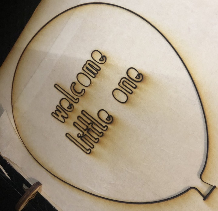
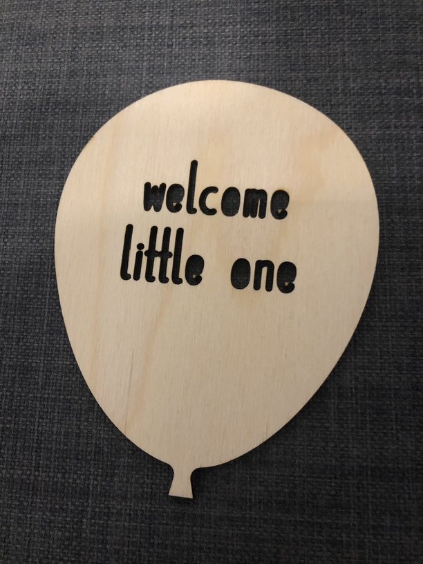
Here is a very simple balloon with the written “welcome little one”.
It’s a prototype to show a potential customer for a “big order”.
I hope you like it!
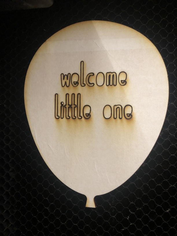
Here is a very simple balloon with the written “welcome little one”.
It’s a prototype to show a potential customer for a “big order”.
I hope you like it!
Did you want the centers of the o’s and e’s to fall out, or would you rather have them stay in place?
What you could do is put a little “bridge” connect each inner part with the outer background so it does not become a cut-out island. Then use a dark marker to color in the bridge so it is not as obvious.
Nice!
And may be bit picky here, but I’d also maybe try a different font that provides more distinction of the W and M and curls in the Es in the cut outs–as well as consider the idea if you want the centers of O and E to still appear & look for more stencil fonts or a bridge–but really cute as-is, too!
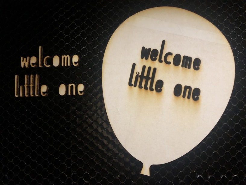
It was just a prototype! 3x smaller! So it will look different when done in the correct size!
But thanks!
I would suggest trying to “score” the letters instead of cutting them out. It looks nice and you can have shapes on the insides of the letters. Give it a try, you might like how it looks.
You might try a deep engrave and perhaps even spray with thick black paint before removing masking. This is similar where I did that.