Before I dive in, I have a few questions about the design Catalog, specifically centered around “per-print” purchases. I’ve searched for prior discussions of these questions, but the answers may be too dated:
The Catalog states that per-print designs can be re-shot if the first attempt malfunctions: exactly how many do-overs are allowed?
Sometimes I will do a test-firing on a scrap sheet of cardboard (thank-you Amazon) before dropping in the expensive material - is that workflow compatible with the per-print rules?
Are per-print layouts locked? By way of example, The “Just Add S’mores” drink coasters has three different sizes of coasters - what if I only want the smallest coasters?
What’s the latest on upgrading from “per-print” to “forever” - does the per-print purchase count towards the forever upgrade?
Are per-print jobs locked, or can I insert additional content, such as an engraved pattern onto the Catalog design, e.g. engrave an image onto the wallet design?
Jules, the freebies are unlimited use, so I expect more latitude in what you can do with them. I didn’t want to presume the same for the per-print version. Also, deleting unwanted elements answers half the question. In the “Just Add S’mores” scenario, can I copy some elements of the design to replace the deleted elements?
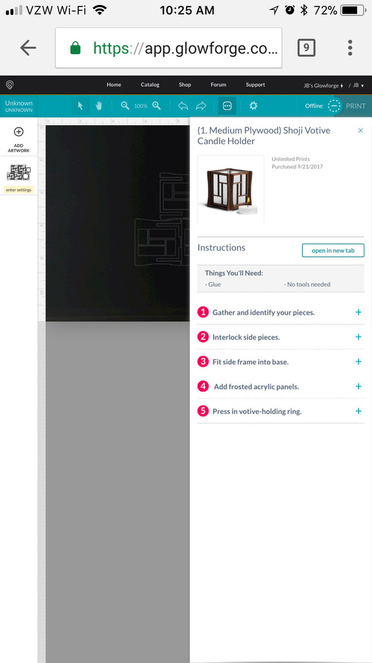
This won’t answer your question completely, but I’ve been able to copy pieces within a file. For example, I was able to cut 9 sets of acrylic windows for the Shoji votive holders in one go.
You get as many do-overs as it takes to finish the print. However given what I’ve seen of the GF interface if you don’t stop a print, or the interface doesn’t error, I imagine its considered complete and you would need to contact support to resolve.
Test firing is likely not included, the point of the catalog is that the files have already been tested for you. If you use proofgrade, that goes double. If you use your own material all bets are off, both because you would be far better off testing that material with a test pattern, and because some designs are made for specific thicknesses of product. Cardboard is all over the map.
Layers are normally broken down into separate files so as you finish one, per #1, it’s used.
You pay the difference as far as I know.
Nothing is locked, the layers are opened like normal art, you can add, scale, rotate etc.
How ironic, I had just finished purchasing a per-print design to confirm all the answers you provided, literally minutes before your posting! So you helped me figure out how to say it: per-print designs are purchased on good faith, and I’m betting your customers are the types that will honor your trust.
Since you asked for feedback:
When appropriate, do some of the designs come with instructions/build notes? I purchased the “Just Add S’mores” drink coasters and all I got was the vector data. In this case it’s pretty clear to me how to assemble it, but I can imagine some of the more complex designs would benefit from some assembly guidance.
A convenient mechanism to post build results would be nice, so before buying I can see how other people fared, and learn about any nuances about how to cut and assemble the design. There’s a lot knowledge accumulating in the other forums, and it would be nice if some of it can be more closely associated with the designs in your Catalog.
I burned a bridge by purchasing a per-print design. There doesn’t appear to a be mechanism to purchase the design again, as it’s listed as “Already Purchased”. So I have to decide in advance which level to purchase and stick with it “forever”.
The original reason I started this thread, was over my struggle to understand the difference between “per-print” and “forever” - that’s my first piece of feedback. Basing it solely on the number of prints might be pinching the wrong nerve:
Going from one print to unlimited is a huge ratio (infinite actually), so if I want to build two copies I’m in an awkward spot, as I can’t purchase two per-prints and the breakpoint is closer to three copies for purchasing unlimited prints.
“Unlimited prints” means I can make a hundred copies, but “not for commercial use or resale”, which really takes the steam out of the allure of printing as many as I want. It’s like you simultaneously don’t and do care what I do with the Unlimited Prints purchase. I suspect y’all are trying to sort out a licensing model in the background, but this is an awkward restriction to park it at until you figure it out.
Suggestion for the Unlimited version: hand over the raw data (like an .svg file) and call it the “Pro” version. I look at many of the designs in the Catalog and think “that’s nice, but…” - if I could tweak some of the designs more to my liking, then they have value to me as a way to jumpstart me to building what I really want.
While I appreciate your Catalog and will spend my credits there, you have a community of users that are producing some incredible, and free, designs that will leave your Catalog in the dust. I would point to better documentation and raw data access as ways to add value over user-contributed designs.
YMMV, of course, but I’ve given away 20+ votive holders as holiday gifts so far. There’s definitely a market for non-commercial unlimited use.
I see your point, but would give long odds against this ever happening. You or I certainly wouldn’t do this, but a quick look at Thingiverse and Etsy show how little regard some folks have for IP & copyrights.
In a way, I agree with you. I see the catalog in its current incarnation primarily as resource for entry-level users and non-designers, that is, as source of proven designs that all but guarantee success when printed with Proofgrade materials.
jbmanning5, thank you for pointing out where to find the instructions!
The ellipses… of course that’s where the instructions would be located. I guess I’m beginning to age out of modern UI design. I’m accustomed to seeing ellipses strictly on cramped mobile displays, not the computer monitor I use to pilot the GF. I couldn’t help note your phone’s browser stacks the ellipses vertically (which is typical, along with horizontal bars), rather than the graphic GF uses - copyright issue?
So a mobile phone display is the common denominator for the GFUI. Yeah, I’m definitely ageing out here. The GF server farm knows where the pages go, so I wonder what percentage of owners are actually using their mobile phones.
One last gripe about the ellipses catch-all button: drop-downs generally have static content, and gray-out contextually irrelevant entries. In the event there is a dynamic change in the content of a drop-down, a distinctive annotation is placed on the icon to gain the user’s attention. Just say’n…
In case @dan is still watching: it would be helpful if there was a note in the purchase confirmation email stating where to find the build instructions - they’re very nice instructions and I should be badgered to check them out. Also, including some general tips on cleaning up the prints in the instructions would be appreciated.
I’m sure they do - basic analytics. Fwiw, I never use my phone and rarely use a tablet (only if sitting there running a job repeatedly from same file).
I think that would be a great spot for user notes on our own uploaded designs.
@dwardio, I concur that monetizing IP can be challenging, especially in the growing “maker” economy.
As I spend money on design IP, I can’t stop thinking about what it cost to get to that point. Using the Shoji Votive and the current ASP of a Glowforge as an example: one votive holder costs $2,998.49 each and 20 votive holders cost $150.30 each. While it may seem like a ridiculous example, it goes to my concern that GF might be squeezing the wrong stone for revenue - we’re their new best friends, and should be encouraged to distribute as much laser-cut stuff as possible to potential future GF customers.
On the other hand, maybe GF’s goal isn’t to sell hardware, but instead create an army of 10,000 fabricators and harvest royalties off the work we produce. I’m not sure if we can be trusted however, given we’re all armed with frick’n lasers (insert bwahaha emoji here)
Actually it would be a bit forward thinking of them to approach it from that way. I’m doing that with my applications now - decomposed all the transactions and applied an 80/20 simplification rule along with a design consistency approach. Wherever you use our applications on whatever devices it’s going to be the exact same user experience within the capabilities of the device. (And device used will control what you get presented to do and you won’t have menus taking you places that don’t translate well to the device you’re using.)
That means hamburger (stacked) menu on the left, olive (3 stacked dots) on the right, big buttons, swipe friendly, gear icons for settings, etc. 90% of the applications you use now are mobile - except the ones (generally) you’re required to use a desktop for at work. Special cases (like CAD/CAM, etc) still require a large device but even those the user experience could be helped by more simplification. The devices/app shouldn’t make you choose between things it can decide for you, shouldn’t make you see or skip fields that aren’t relevant to you at that point in time, shouldn’t make you navigate through something every single time you touch it because once in a hundred times you’ll need it.
Our 80/20 design approach is to make sure you can do 80% of whatever it is you’re trying to do on your touchdown page. Then for the other 20% you go to another more detailed screen where you’re going to do 80% of whatever is left and then the 20% of that is going to have you go down another level. The key is simplifying the transactions all the way through the chain so you’re not bogging things down with stuff just to fill in a screen.
Take a look at your banking app on your phone and try to check balances or make a transfer. Then go to the desktop full-web version and look at what you’re presented to do the exact same stuff. The desktop guy put a lot of dreck up there simply because he had room. Working in a tablet or phone form factor enforces a discipline of simplicity. Not too many people have asked that something be made more complicated - systems designers are starting to figure that out.
Whether the GFUI is a well-matured and good implementation of that principle is a different story but I’m encourage they’re at least thinking about it.
I like that jargon: hamburgers and olives - it sounds a bit like a happy-hour diet.
I’m a CAD/CAM person, so I’m accustomed to some pretty elaborate menus. Over time I memorize the contents of all the drop-downs so I can quickly navigate to the desired function. The grayed-out items in the menu may not be relevant at the time, but I make a mental note that will make them easier to find when they do become relevant. So it’s unbalancing for me when the content of the menus change, leaves me thinking the menu icon should be the image of a box of Cracker Jacks (or a Kinder Egg if you’re in Europe).
So I’m learning to periodically click on the three-olives-on-TV icon in the GFUI, just in case there’s a surprise goodie inside.
That’s the rub - the icons don’t really mean anything (intrinsically speaking). Everyone knows that the diskette icon in the left corner of Windows applications means “file save”. There’s an entire generation (maybe two) that have no idea why. They have never seen a diskette except maybe in a museum
Think of the phone handset icon you see everywhere - it has relevance to those of us who remember when phones looked like that, but to anyone under 30 it likely has no meaning except because it’s used to represent a phone. To them a phone is a rectangle.
You have F-keys on the top row of your keyboard because IBM once made something called a 3270 terminal.
Tech is really messing with how we represent the world around us and the symbols are becoming more arbitrary (even though some of us may think they’re perfectly rational representations).
And millions of emulation save state gamers thank them. As do I when I want to kill a frozen program in win…or when we older people used to tell the youngin’s in WoW that Alt+F4 was the key-bind for quick healing or something ridiculous like free gold…and giggle to watch them Immediately go offline. That and /gquit did…anything other than quit the guild…we were evil…