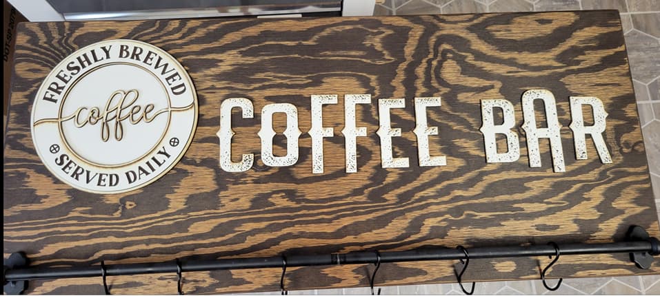
I made us a coffee bar sign. Pretty happy with the way it turned out. I originally wanted the “coffee” in the round sign to be engraved, but I think I actually like it better this way, although I had to cut it out of it’s circle, which actually was easier than I anticipated. I didn’t mask the whiteboard, because I knew it could be wiped off pretty easy, but it really charred the edges and I couldn’t get it all clean. But my husband really likes this effect, says it looks like coffee spilled on it. And the little dots in the letters look like coffee grounds.
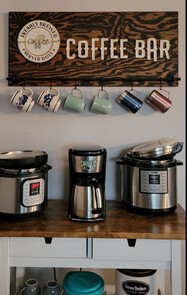
He used a piece of 1/2" plywood he had in the shed, and I made a couple of the the “keyhole hanger” posted in the Free Designs by @jbmanning5, which I had downloaded when I first got my GF. The rod is actually two planter rods from IKEA that we bought years ago and used to have on our deck, but took down. He put a metal rod in the planter rods to give strength to it and to keep them together. He also made the hooks out of high tension wire we used for our goat fields. We love repurposing stuff!
And here it is up. The Farmer Brothers Coffee can is one we’ve had for many years, and we keep our coffee beans in it (we buy it in 5lb bags), as we fresh grind our coffee every day. So when our sign says “Freshly Brewed Served Daily,” it’s true!!
Thanks everyone! I think I’m going to put a pic on my Square site catalog to see if I can sell some.
I imagine it could be done! Though we use the Instant Pot on the left is for our weekly yogurt making, and this gives us a nice place where it’s not in the way while it’s doing its thing. The multicooker on the right is what I use for any other foods, especially hard-boiling our eggs, farm fresh are harder to get the shells off unless you know just how to cook them, and they come out perfectly using the multicooker. And as we always give eggs to our neighbor when we have enough to share, and he can never cook them properly, I’ve started giving them a dozen hard-boiled ones as well as fresh!
@ptodd, thank you! I smile every time I go get coffee in the mornings! It just kinda brightens the morning, and I can’t get over the fact that it’s something I actually made!
@RyanD, the wood is sanded plywood from Lowe’s. It’s the same wood we used for our flooring (we cut it into 8" wide boards and used flooring nails to put it down; nice rustic look, which is what we love), and the same stain. We used the same stain on the cart top when we bought it at IKEA years ago.
The lettering I used was “Wave Spurs” from either Creative Fabrica or DesignBundles, I don’t remember which. The dots are on the pattern, but I had to go in and change all the dots to a fill color so they would engrave as a whole dot rather than just an outline of each little hole. I think it’s one of my favorite fonts now!
@Thumper369, it’s one of the reasons I love this forum so much. Had it not been for this wonderful group of people, I never would have had the courage to try to do my own designs, and although this one wasn’t tough to do, it’s still a new process for me.
@cynd11, thank you!! As I was trying each font in Silhouette to see which one I wanted, when I saw those speckles, I immediately thought “coffee grounds!” and knew it was the perfect font for this!