Has anyone ever had an issue with cursive upstrokes in a word?
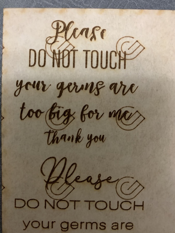
I have made the font thicker and joined all paths. It looks ready to go in illustrator but then when engraving some of the upstrokes will be non existent. And for some words it will just be a few not all of the upstrokes that are not thick like in illustrator.
If they are extremely thin, the laser might not engrave all the way through the paper masking down into the wood. You can try doing an offset path for the thin areas to fatten them up. (Have to do that sometimes with certain fonts.)
Or you can try removing the masking before engraving, but they might still be too thin. Just give it a try both ways…see which one you like.
I would try a quick and dirty trick before you mess with fattening the font.
(Only for vectors which looks like you’ve already done)
Run the operation TWICE, once as the ENGRAVE as you’ve done. Then repeat the same artwork in the same spot as SCORE. Test it and see if you like the result. This has worked nicely for me when I’m feeling too lazy to adjust the artwork file and cleans up any jagged edges when I run lower LPI engraves.