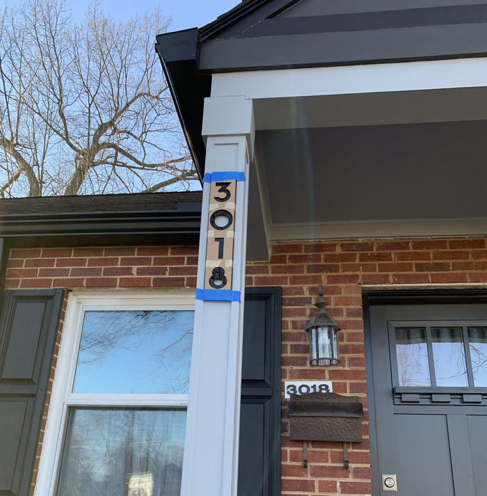
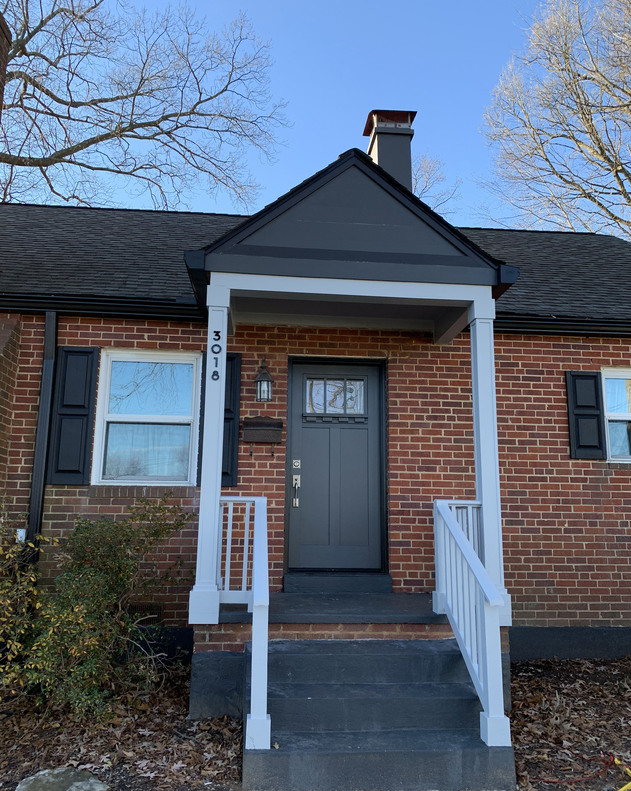
So… after we finally got our porch rebuilt, it was time to put some new house numbers up.
we looked at some numbers online and in home depot/lowes. we liked a few, but nothing was quite right. and i hate the idea of seeing visible nails/screws, which all of them seemed to have.
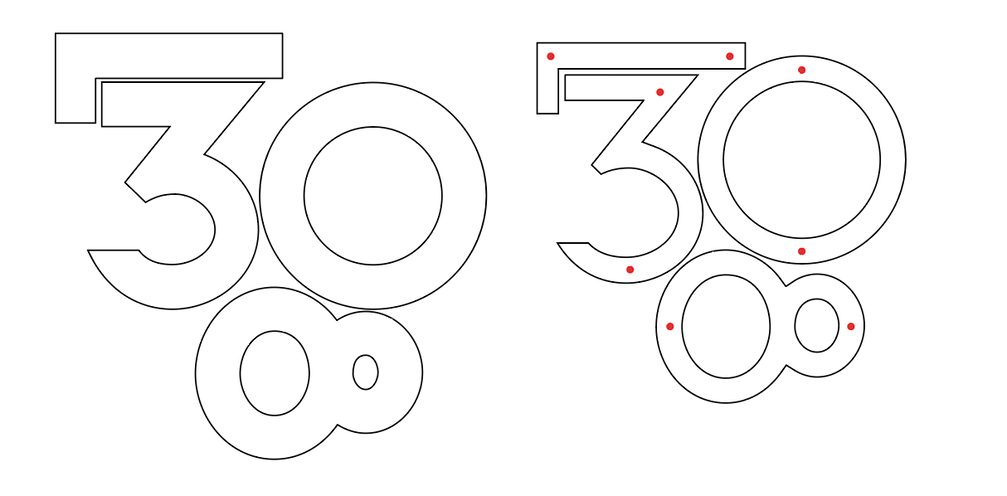
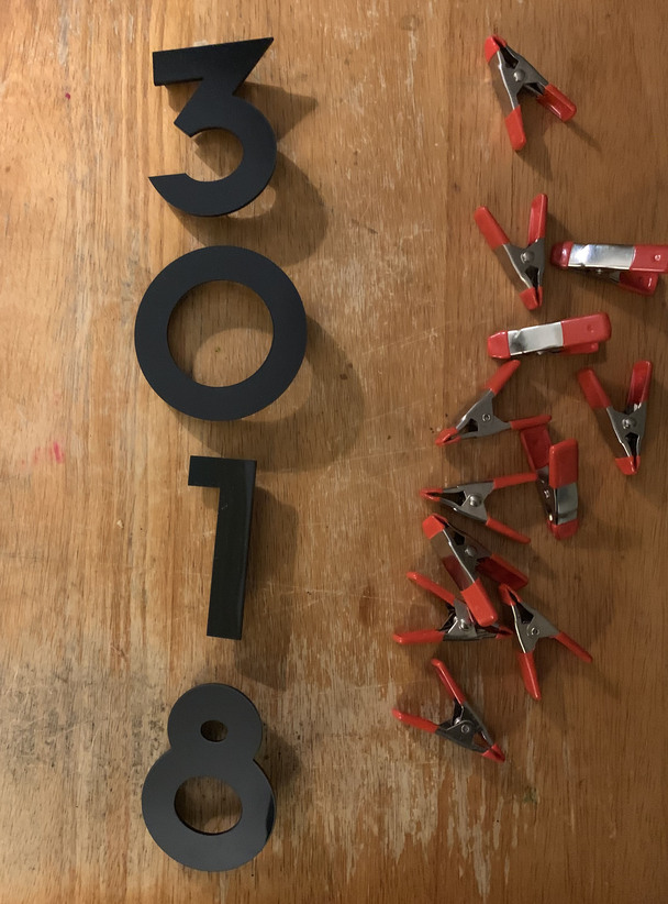
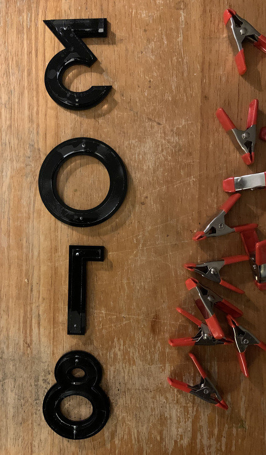
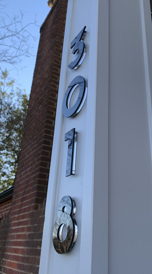
so time to pick some fonts and make my own numbers in acrylic. we decided on some shaker style for the details on the porch, and I ended up choosing P22 Arts and Crafts for the font (available in adobe fonts).
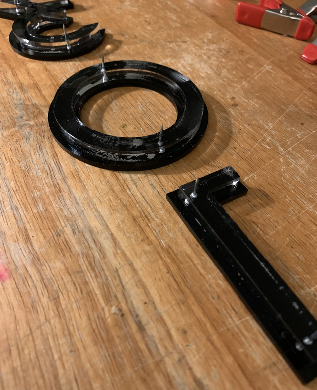
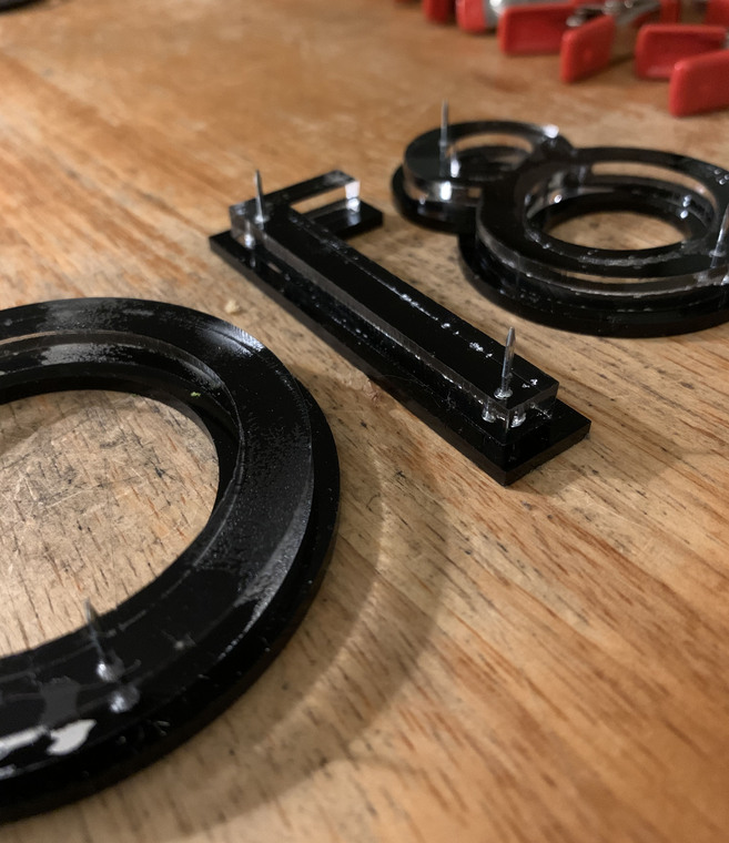
then off to HD to get the short nails, and then create a second acrylic layer, just a little smaller. used some calipers to measure the nail shank and the nail head. set up a cut for the shank and an engrave to sink the head in so the two layers of acrylic sit flush.
next up, time to make a jig in cardboard. four layers to accommodate the depth of 1/8" black, 1/4" clear acrylic backer, and the nails. no pics of it by itself, but here it is mounted on the house.
hah, i brought that up and my wife isn’t a fan of the idea. but there would be some power issues, too.
nobody’s gentrifying this neighborhood. if anything, it’s become significantly more diverse. but i will say it’s the best damn looking porch on the block, if i do say so myself.
it was. i’ve seen where a signage company drilled and glued in nail fasteners into a single layer when they installed the logo signs in my office. i considered trying to do that, but thought the offset numbers would look a little better and make the process more stable in this case.
Did you glue the front, black acrylic to the back, clear acrylic or is the engrave that the nail head fits into just tight enough to hold the front, black numbers on to the clear acrylic back?
no, the only thing the engrave accomplishes is allowing the nail head to sit flush to the surface of the clear acrylic. once the nail is in and the back is aligned with the front, i used those clamps to hold the two pieces in position, and then flooded the space between with weldon #4.