If you cut out letters in a logo or name - how in the world do you align them on the backing material so that they are not crooked and are in a straight line.
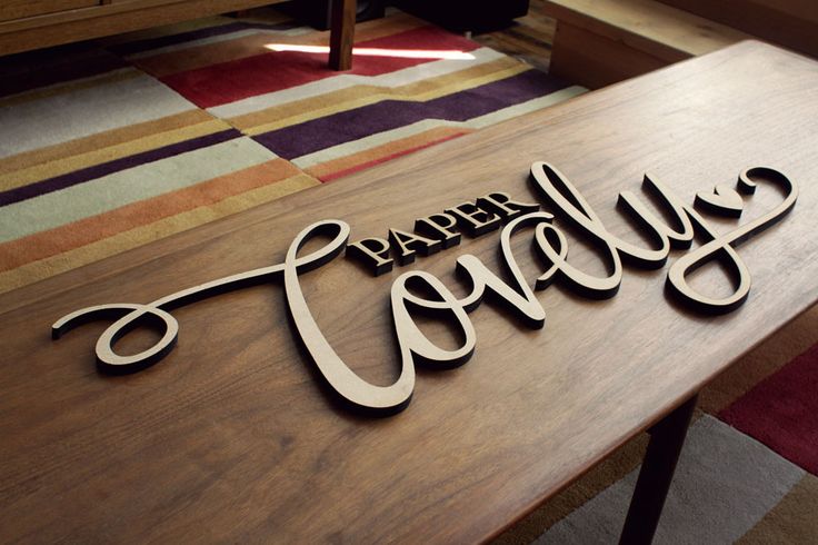
For example, in this random image I found - I can see how the cursive letters are connected, so they are one piece… but the word PAPER or non-cursive letters… how is this done?
I’ve done one of two things - either engrave a light line on the backing material to use as a glue guide, or just cut a placement template out of some other material, lay it down, and glue the letters in the holes.
I was thinking use the same file you used to cut the letters and convert to engrave to enable a shallow engrave as a placement guide. It does look like the backing may be too large (long) for the machine, can’t tell scale in the pic.
Do it like you would a vinyl sign. Use a piece of tape/transfer paper to pick up the letters out of the gf. Apply glue to the backs of the letters, lay the tape/letter/glue construct on your substrate, let glue dry. Then peel the tape off. Voila, aligned letters.
I did just that: used painters tape… For a project I worked on, I had 2 pieces: maple hardwood as the base and some darker veneer - and I needed perfect placing of the veneer…
So I added 2 rectangles to my veneer cut - then put painters tape over my veneer cut before removing it from the GF - removed the backing of the veneer except for the 2 rectangles. This allowed me to align the text horizontally with the side of the maple background and vertically with the engraved text.
I do it all the time with just a score outline, no one ever notices the score after something is glued on it.
One thing to remember for this; if it looks right it is right. Maybe the math doesn’t work out or the letters aren’t spaced perfectly down to .010", ect. No one is ever going to notice if when you step back you look at it and go “it looks right”.