
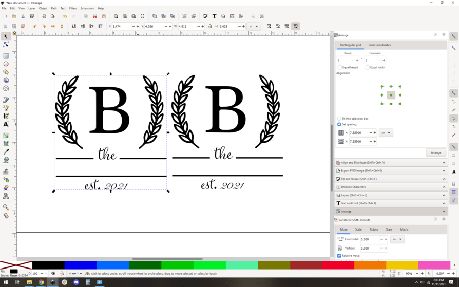
Hello everyone. I searched for information on this but I just couldn’t get what I was looking for or direction on what I specifically was trying to do. I have attached a design I have and I would like to separate the letter B and the leaves around it from the rest of the design. I traced bit map, tried to ungroup but nothing happens. I then tried Break apart but then the whole design gets filled in black. Help would be greatly appreciated. Thanks!!!
1 Like
OK so is this the starting point? A png? Hang on, this is pretty straightforward.
2 Likes
First up, import the image into your inkscape window, sounds like you have that under control. Then, trace bitmap.
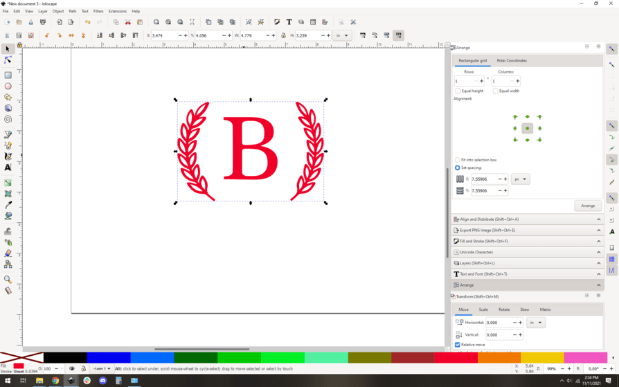
This makes a second vector trace right on top of your existing image. I dragged the vector to the left.
Now I delete the original image and just so I know it’s different I change the fill color to red. Totally optional just helps keep my head on straight.
Now you do your break apart, and sure enough you get this mess:
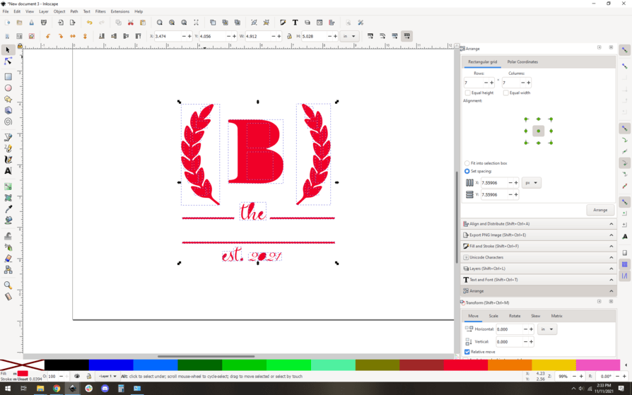
All you did here was separate all the individual path segments into their own objects. They’re all red-filled, so they look like a blob. Not to worry.
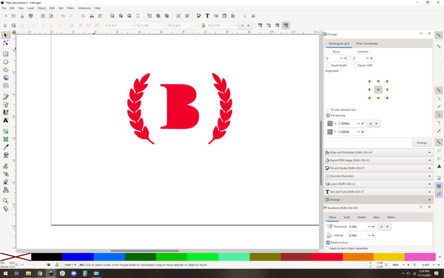
Delete the blob parts you don’t want:
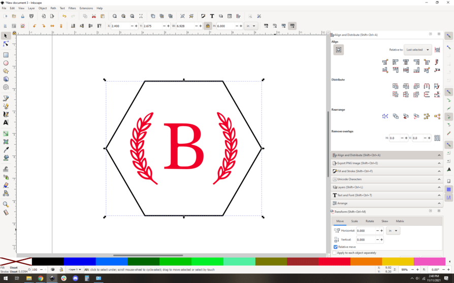
And now, you want to do the opposite of “break apart”, which is “combine”…
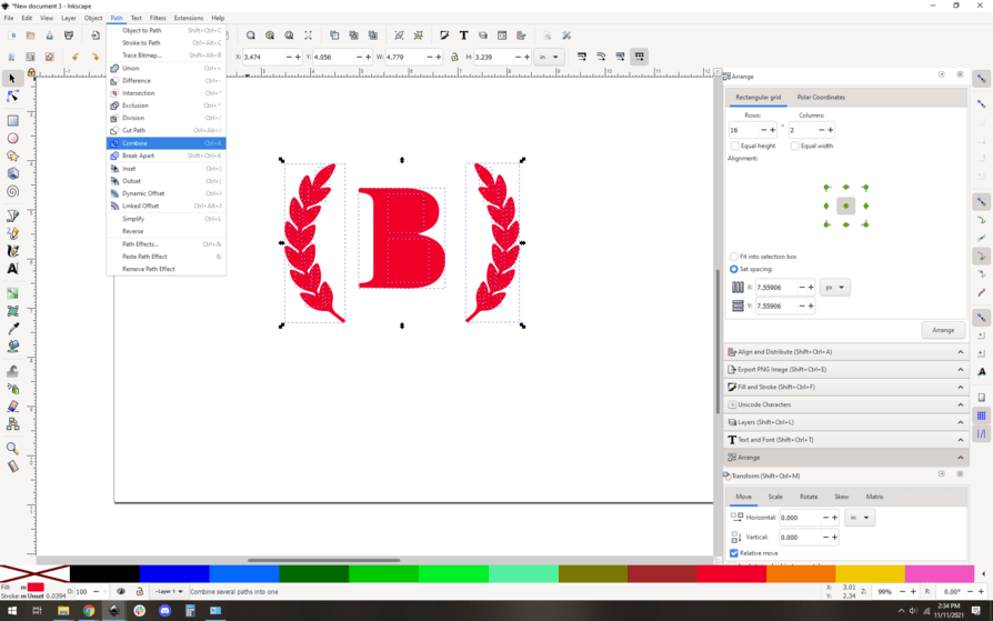
Which yields this:
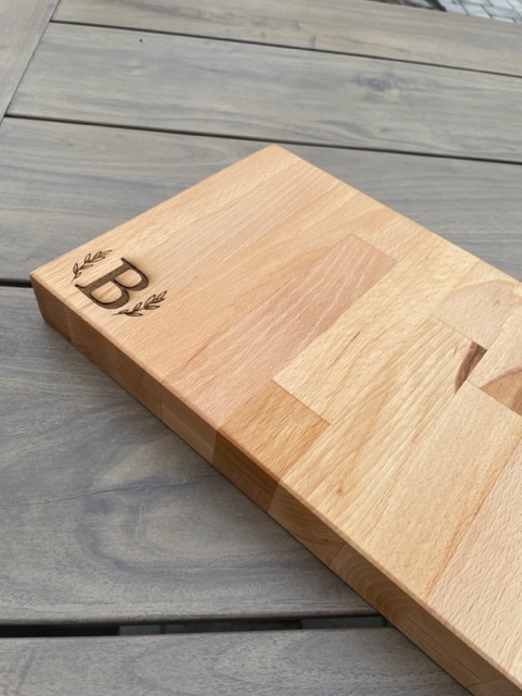
And you’re mostly done! If you’re planning to engrave, you can just scale it and whatnot, maybe surround it with a cutout shape, and you’re ready to go. Here it is in a nice 6" tall hexagon.
So yeah, combine and break apart are key concepts, you were really close.
You could have alternately gone into node editing mode and manually deleted the nodes of the path in the parts you don’t want, but this way is a little simpler to do for something like this.
10 Likes
Gimp makes it easy…,

3 Likes
@evansd2 has got you covered for sure! There is another way for something like this. You might know that sometimes fonts come with “extras”. They are a set of little graphics. One example is a font called Butter and Garlic. There are many fonts with these extra frills. You could recreate your graphic using a “B” from a any font you like and the fancy leaves from the font extras (or perhaps even from the icons in premium (if you are a subscriber). If you are using the fonts, then all you have to do is use Object to Path and turn them into vectors and arrange as needed. The technique described above is top notch, but there are lots of simple little graphics like the one you have shown.
2 Likes
Ah that’s cool. These are usually called glyphs… I’ll have to look at that font, sounds interesting.
Me, I’m lazy and would just search google for “monogram inurl:svg” or “wreath inurl:svg”. There are so many free options out there.
2 Likes
WHo knew! This particular fonts has a lot of them. One for each capital and lowercase in the alphabet. I have 1 or 2 more with glyphs. Butter and Garlic has the most I think. Others have swirls, etc. Yep, tons of monograms and wreaths, too! thank goodness. The world is making my lasering easier!
1 Like
There are fonts whose entire set of characters are silly glyphs, like dingbats. Then there are fonts with glyphs that are swashes and whatnot. It pains me to share these because I really don’t love the current “swoopy font with too many swashes” aesthetic that seems to be so popular these days, but if you like them, knock yourself out:
It’s definitely easier than trying to recreate that look by hand.
3 Likes
This topic was automatically closed 32 days after the last reply. New replies are no longer allowed.