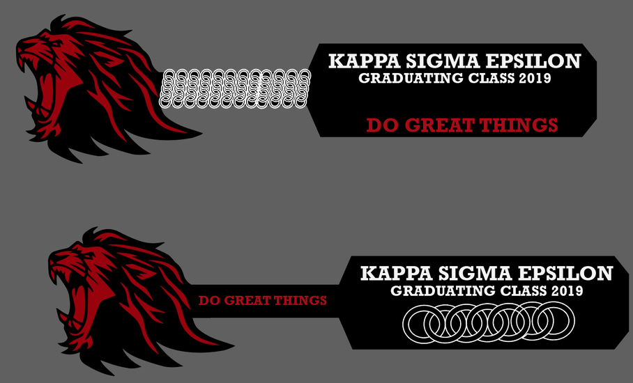
Designing a fraternity paddle for someone. I have the lion part down. Does anyone have recommendations on font / how to arrange things to look super nice? I like the body, but im having trouble with text and fonts and sizes etc. Going to be lasering a lot of things for this then painting.
6 Likes
I personally prefer the bottom design. You’ll have a much quicker production time with that one as well I believe.
One note to fix your design, I noticed that your rings need an edit in the next to last as you have an overlap.
1 Like
I agree, I prefer the second one as well. The rings on the middle bar are a bit distracting. The fonts look fine to me.
In my ignorance I had thought we moved past this in today’s culture.
Looks like beating the rookies is still a thing (sigh).
2 Likes
lol they are decorative
I agree with the others, I prefer the second. It isn’t so busy. Those middle rings on the first paddle make me feel as if I’m being hypnotized.
1 Like
I agree the second one wins. As https://community.glowforge.com/u/Goobdoob mentions a little editing is needed on the rings.
I like it!
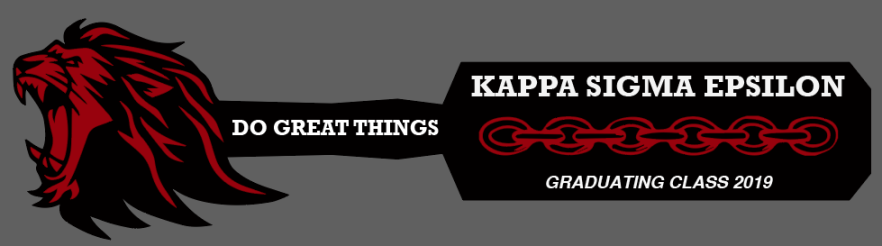
Yep! That’s the best one! 
I like the latest version.
For the “Kappa Sigma Epsilon”, I think an Old English font would look nice.
1 Like
Ooh any reccomendations? We are going to use a milling machine because our laser isnt big enough lol.
1 Like
If you find something that matches there logo, that would be nice.

I just found a few of these free fonts that are kinda close.
https://www.1001fonts.com/fenwick-woodtype-font.html
https://www.1001fonts.com/english-towne-font.html
1 Like
This topic was automatically closed 32 days after the last reply. New replies are no longer allowed.