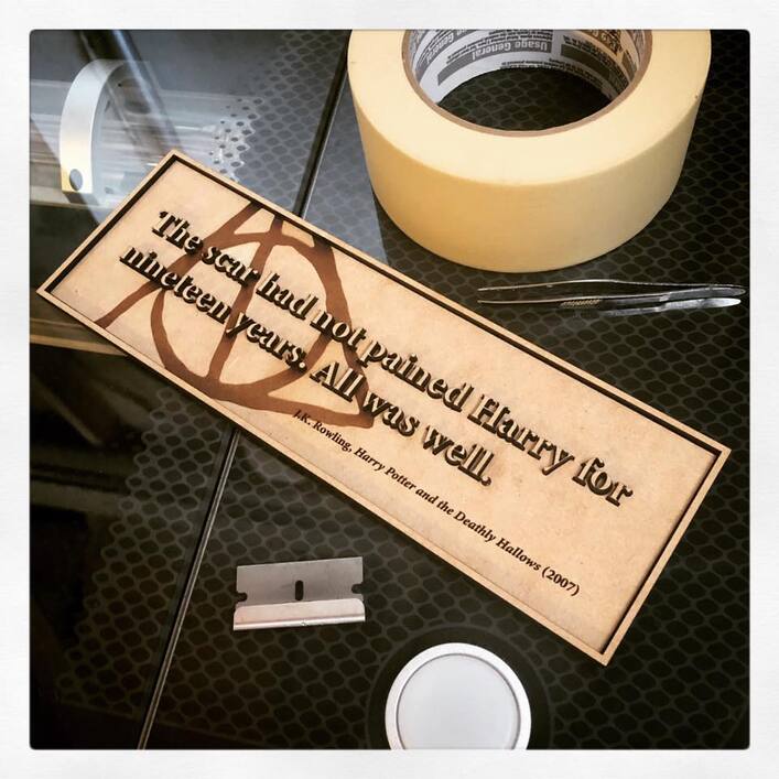
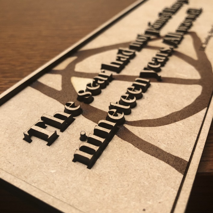
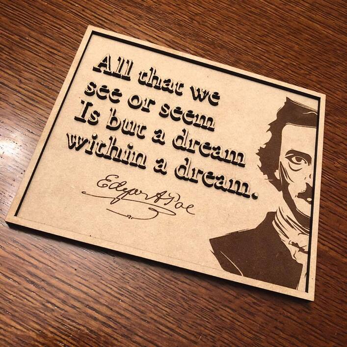
This is not a particularly original technique, but I’ve applied it in some ways that generate interest, so I’m writing it up here.
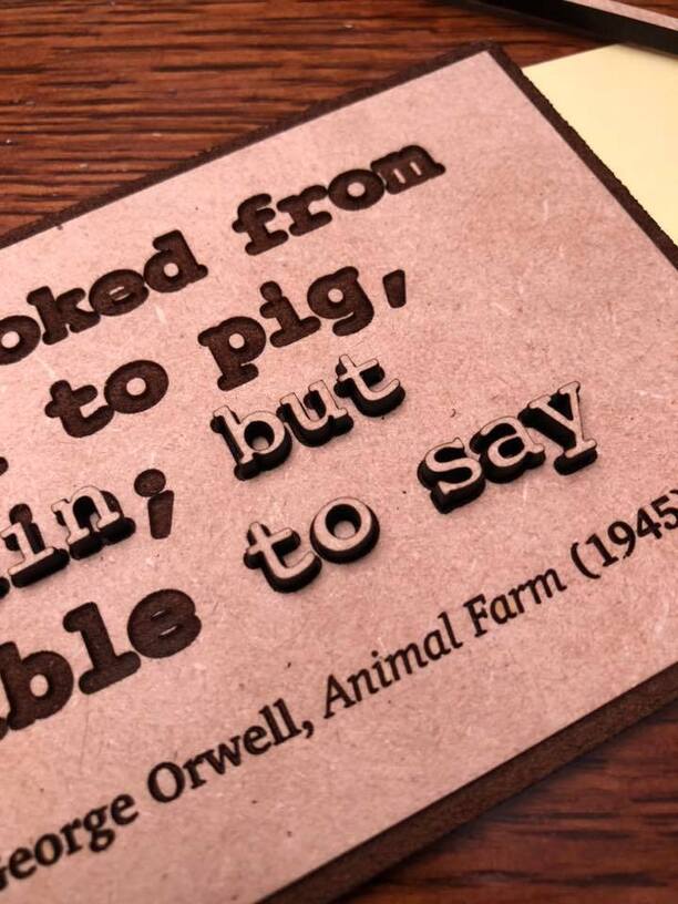
As an art project, I wanted to do a series of plaques with literary themes - specifically, great first and last lines from novels. I played with 3D Engrave, but it wasn’t creating the effect I was looking for. I tried some things with a base layer and cut letters glued on top, but didn’t want to comprehend the hell of alignment that would bring.
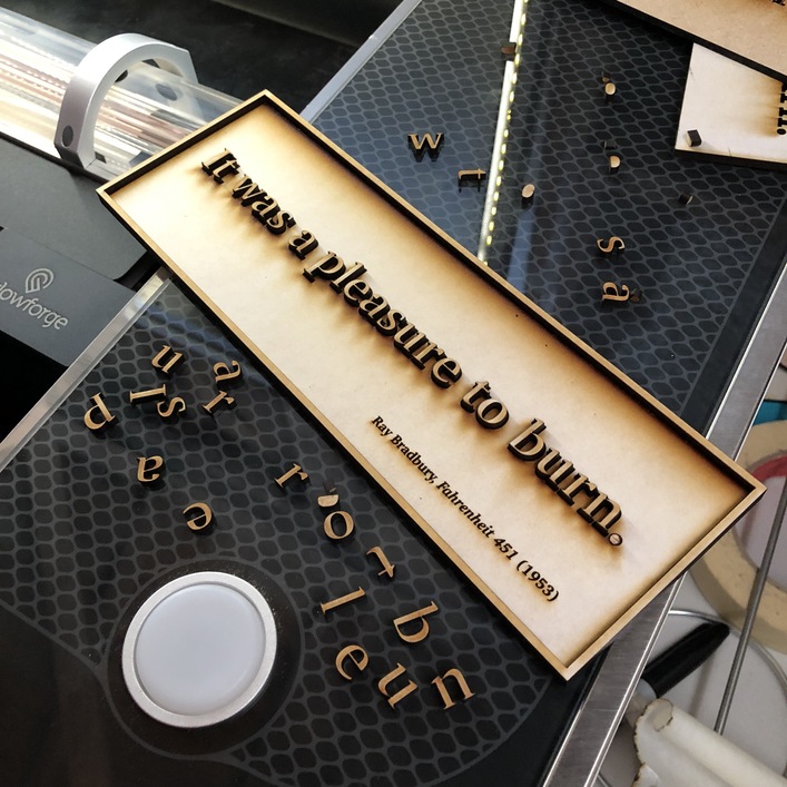
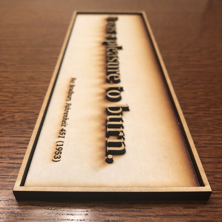
For another project, I was researching kerf and the thought struck me: I can use the standard SD Engrave to create a “trough” for my to-be-set letters if I make a pass on the first layer after expanding my text’s path by a point (I use Illustrator).
These are fantastic. I used a similar technique when making a sign for my house. Carving out a spot for the letters to sit in really helps with the alignment, as you say.
Very nice! I like your design eye and think these are very nicely done.
If you’d like to sell more, I found your listings and think you may benefit from reading up on some Etsy selling basics to improve your listings’ visibility and likelihood of getting found in searches. There are some pretty easy things you can do/tweak to make the most of title, description, and tags.
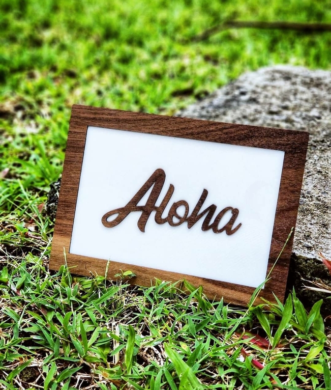
I’ve also done some signage like this, but I’m really liking your twist on it, especially adding the graphic to the background! For mine I had actually engraved into the base like you, but also engraved the back of the words and had mirrored them for the cuts. Here’s an example of mine:
I started doing it with keychains so that the words didn’t stick out, but like I said, yours are actually visually appealing the way you’ve been doing them!

 really cool work - I’ll give that technique a shot.