Okay be warned this is a long one.
TLDR version:
Rules of thumb for engraving & cutting
- When cutting, leave power at 100% and modify speed to match the material. Exception (pinky rule?) Leather and fabric (& paper) won’t handle 100% power well, test for those materials separately. This heuristic is for wood & acrylic. Another Exception: Acrylic can sometimes benefit from 2 lower power passes to create a cleaner edge like flame polishing.
- When engraving, use the fastest speed (335IPM) and adjust power to get the depth & intensity desired. Pinky Rules above sort of apply here as well.
- These rules have not been validated against situations where defocusing may or may not have an impact. Changing 4 variables at once leads to inconclusive results so definitive defocusing results await further testing.
- Rules of thumb (or pinkies) are generalizations and will not cover all situations, materials or intended results. These are meant to provide a start or easy way to generally achieve good results without multi-variate time consuming testing. These are meant for folks who just want to make something.
For inquiring minds here’s how I got here. You can use these results and tools to tweak your own efforts to dial in your desired settings.
With the new power schema rolled out I took the time to run my engrave calibration tests. The intent is to use a template (attached below) on each material I generally use so I can have a handy reference for engrave power & speed settings. Two other variables can be adjusted for engraves - lines per inch (LPI) and focus height - but the relative results will be the same at different LPI settings. Focus settings will be addressed in a later set of posts.
I settled on 270LPI for these tests because they’re the mid-range of what’s available and yield pretty decent results especially in relation to job times as the LPI settings are increased. Consider this the middle of the road for testing.
Since I can’t possibly test for 100 different power settings individually and because from experience small increments often don’t make appreciable differences in results, I’ve designed my template to show 13 different power levels. That also happens to be the same as the number of colors in the @marmak3261 palette which makes it a little less tedious to set up successive runs in the GFUI. Unfortunately, I had to create a 14th because while I originally intended to use black as both an engrave and a cut line color (doable) I cannot subsequently move the black engrave block separately from the black cut box. So I chose #00000F as my first color. (And I created a 15th for the end of the spectrum for the boxes in Rows 2-10 that I’m using as placeholders and don’t want to engrave - I chose #FFFFF0 which comes after yellow in @marmak3261’s palette.)
I striped 13 power levels across the top, ranging from 1% to 100%. I did not have a setting on the PRU for full power (as different from 100%) although that is alluded to in the recent posts settings announcement. I expect that would best be reserved for cutting anyway.
I then decided on 10 speed levels which I laid out vertically. That gives me a 10x13 grid of speed vs power to test and when done I can look for a suitable target result for a project when I’m engraving and pick off the settings I’ll need.
Mechanically the template consists of a grid of 130 equal sized boxes, engraved titling and an outline cut box. This takes up a hair less than 6x12" because my test Baltic Birch is usually 11.75" square so this way I use half a sheet. More speed or power settings could be tested using a bigger piece of material but I’ve found diminishing returns from more data. I expect you will too.
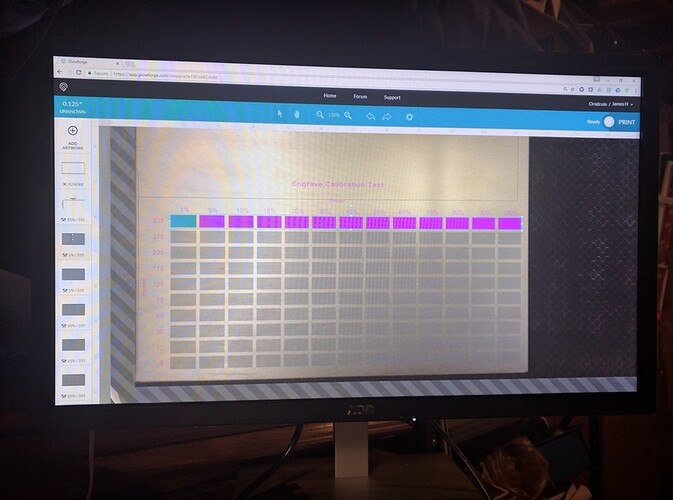
Here’s my grid laid out in the GFUI.
First thing you’ll notice is just the first row is highlighted with power and speed settings made in the UI. It’s theoretically possible to do this for all boxes in one pass but that would require 130 different colors so their individual parameters could be set. The best I can say is that it’s nearly impossible to keep track of that in the design software much less in the GFUI. I’d also be willing to bet the GFUI would not allow that many as it would make a very complex drawing. I could be wrong on the latter point but the former precludes me from verifying my GFUI limitation supposition.
So here’s STEP 1: Set the engraved text titling to 50% power and 175 IPM. Why? Because I said so. ![]() Seriously, it’s halfway in the range. I had reasonable experience to tell me it would likely be fine - neither over burned nor unreadable.
Seriously, it’s halfway in the range. I had reasonable experience to tell me it would likely be fine - neither over burned nor unreadable.
STEP 2: Set the bounding box cut to Ignore. We’ll enable it at the end to cut out the handy reference board. Skip this step and delete the cut if you’re using a whole piece of material.
STEP 3: Set all of the boxes in Rows 2-10 to Ignore. You’ll find a single thumbnail for that at the end of the stack on the left in the GFUI because I used another color whose hex code put it at the end of the rainbow next to white. (#FFFFF0)
STEP 4: So now we’re left with 13 boxes that have no operations assigned but their thumbnails in the GFUI should match the order of the boxes in increasing power. Choose a setting for LPI (I picked 270 - again, a middle of the road setting and good results in wood). This is the only time we need to set this as we’ll leave it the same for all the repetitions. So this first time through I click them in order and tell the GFUI that they are a manual cut, power level that matches my label, speed that matches the row label (first row they’re all 335IPM) and 270 for the LPI. I leave the focus at the default (which gets set when you pick or specify a material). I step through every box up to 100/335 and push Print. It churns and tells me I have about 20 minutes and the big button glows. Press that and wait.
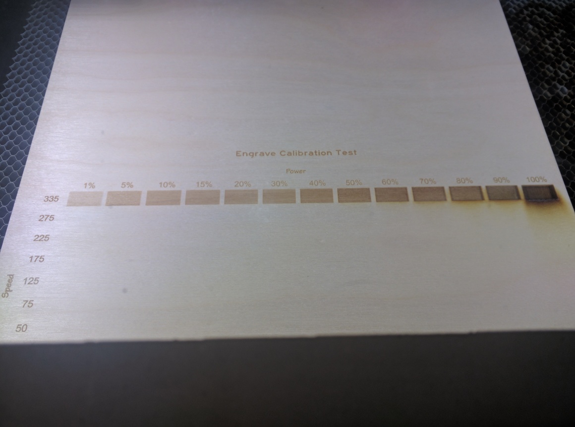
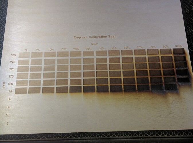
Notice that the last square (100%) is already iffy for most uses and is throwing off a fair amount of spew. Don’t worry, it gets worse. ![]()
Now, admire the engrave but do not open the lid or move the piece. We’re going to engrave Row #2.
STEP 5: But first, go to the label text thumbnail and change it to Ignore so you don’t engrave it all again. It wouldn’t hurt as it’ll just be a bit darker from a second pass, but it will eat up time.
STEP 6: Using the mouse, click and drag over just the engrave boxes in row 1. If you get them all you should see a blue outlined bounding box surrounding the group. If not, click again and try again. Once you get a blue bound box you can move them down one row. I use the arrows. If I use the mouse I tend to introduce horizontal movement as well and all the boxes won’t line up in a nice orderly grid. (That could be construed as OCD, but let’s not label me☺️) Using the arrow keys it’s a matter of clicking the down arrow 26 times to get it to align with the next row. Now you can see why I have all those ignored rows defined in the design file - it helps me line up the rows properly. Just dropping the engraved boxes on the gray ones in the next row takes care of proper alignment with the labels & grid.
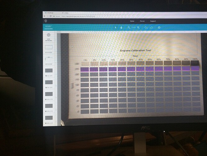
It should look like this.
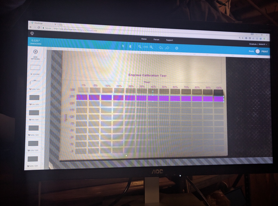
Notice though, that the thumbnails still indicate 335IPM. If we print now we’re just repeating the last row’s test. That means we need,
STEP 7: Here’s where tedium starts (later we’ll see where tedium comes to die, but now we’re just starting). In the thumbnails we need to change the IPM setting, and only the IPM, from 335 to 275, the next speed setting on our list. Why 275? Well because. Okay, there’s really no magic about the speeds I picked, just ones that spread fairly well across the spectrum and fit in 10 rows. You could choose more or less. My next template - the combined speed & focus test will have less as you’ll soon see why.
When you open the thumbnail, double-click in the speed box. On the first one type 275. Then double-click again and press Ctrl+C (on Windows…don’t know about Apple, I believe those just work, something about unicorns and fairies being involved I presume ![]() ). Then on the next thumbnail, double-click on the speed and then hit Ctrl+V to paste the 275. Sure you could just type 275 but that exposes you to mis-typed numbers and the horror of extra keystrokes. After you’ve done it for the 117th time you’ll appreciate the Ctrl+V shortcut.
). Then on the next thumbnail, double-click on the speed and then hit Ctrl+V to paste the 275. Sure you could just type 275 but that exposes you to mis-typed numbers and the horror of extra keystrokes. After you’ve done it for the 117th time you’ll appreciate the Ctrl+V shortcut.
It should now look like this where the thumbnails show the new IPM and the boxes are outlined in magenta.
When you’ve worked your way through them all you’re ready to press Print. When the BB (big button) glows, go ahead and push.
Wait. But, this is a quickie (13 minutes) because all the labels have been engraved. Rejoice because it only gets slower from here until that last soul crushing 1:25:40 shows up on row 10 ![]() Did I mention tedium?
Did I mention tedium?
REPEAT CHORUS FROM STEP 6 Repeat changing the IPM to match the row setting. Pretty soon it becomes obvious that after the first couple, you’re not getting much except moving the engrave-of-uselessness (the setting that eats through your material) to the left. In fact the 100% power engrave on the 5th row is doing a fine job marking up the honeycomb. So on the 6th row (75 IPM) we set the 100% power engrave box to Ignore. That’ll save us a few minutes because if it burned through at 125IPM, it’s going to burn through at 75.
In reality, it started penetrating the board way back at 225IPM so for 1/8" 100% isn’t worth much beyond the initial 335 high speed setting.
We continue the process dropping engraves at the higher power end by setting them to Ignore as we see them burn through the row before. If you pay attention and watch the laser go back and forth and back and forth and back and forth…oh, where was I? Oh, if you see it burning through you can hit the Cancel button in the UI or open the lid and save yourself the time it will take to burn through other boxes. That’s why in this picture you’ll see some were only engraved half-height. I had awakened from my stupor and realized I could get a jump on the next row by stopping the insanity.
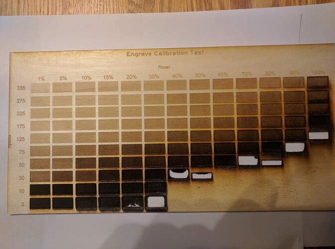
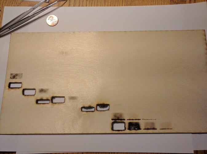
At the end this is what you should have.
Honestly, except for the artists who might want to distinguish between toast, light toast and slightly darker toast (and burned toast), there’s little to be gained except engrave depth to using any speed slower than full speed on Baltic Birch plywood. You should find there will be a speed at which you’re only achieving the same result but at lower power on any material in fact (except stone). Since the tube doesn’t care, optimize for speed because your remaining life minutes are limited. At least mine are. Probably.
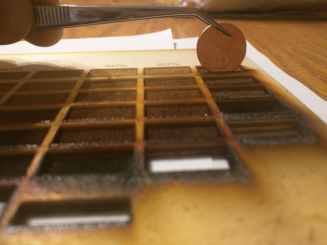
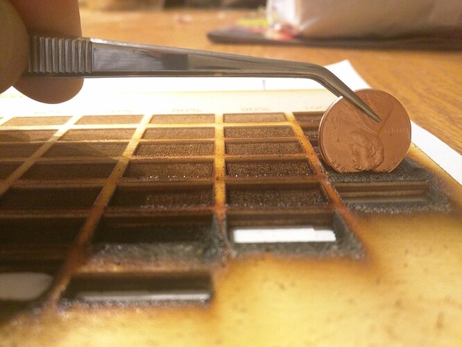
You can get deeper engraves at slower speeds as can be seen in the following two images but you’re flirting with burn through. If you want to do this, make sure you mask because the spew is obnoxious and sticky - it’s not going to easily sand off.
Here’s what some of those almost burned through engraves look like. Really nothing the mechanic in my soul can use, but maybe the artistic among us can make use of the feathery results, I’m just not that creative.
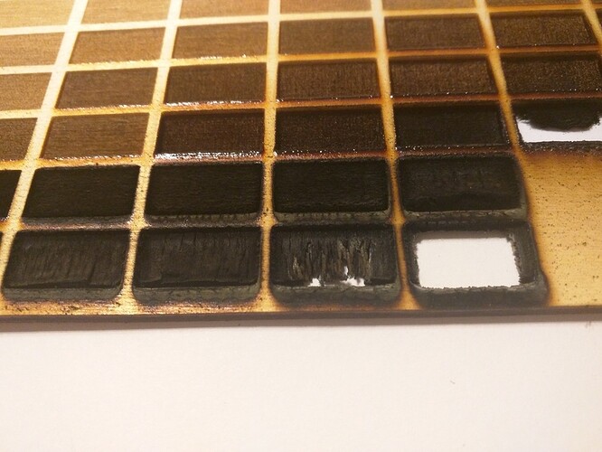
One last pic to support my decision to adjust power & not speed is this view from the back. Even on ones that didn’t punch through I did get perforation (which could be a cool technique for letting light through on tea lights or lampshades maybe).
The whole thing took about 6 1/2 hours to run. That included a few minutes (not sure how long before I noticed) of the last row that the GF had given up providing pew-pew. It had been running fairly constantly for 5 hours in my 78 degree basement and was just going through the motions moving back and forth but not lasing. So I gave it a night’s rest and re-ran the last row the next day.
STEP - THE LAST: The final step is to set the last few engrave boxes to Ignore and enable the cut lines. I had moved those on my run (don’t recall why but I think it made grabbing the engrave boxes easier) so I moved them back down and cut out my engrave test template.
In non-PRU test mode I would have stopped after the 3rd row (& about an hour). There’s nothing to be gained from running it slower to get the same or virtually identical results at lower power. That would leave me with a grid with empty rows ![]()
But that also gives me an opportunity to test the effects of defocusing. I’ll switch the last seven rows to be variants on focus. Like photographers bracket f-stops, I’ll run a series with a couple of steps above and below the surface. I expect that will be most useful for acrylic based on other reported results. That template and testing will wait for another day.
EDIT: Here’s the Template
