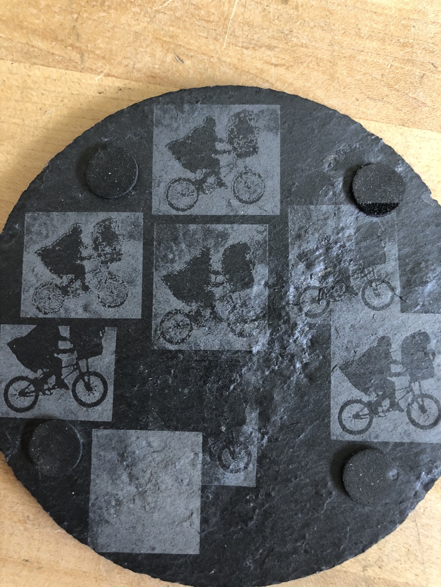
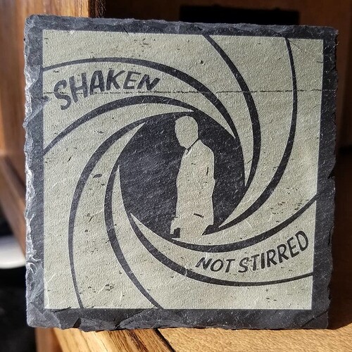
I was inspired by Jule’s post on multi-tone slate drawing. My attempts took way too much effort to get the balance right, but I got there in the end.
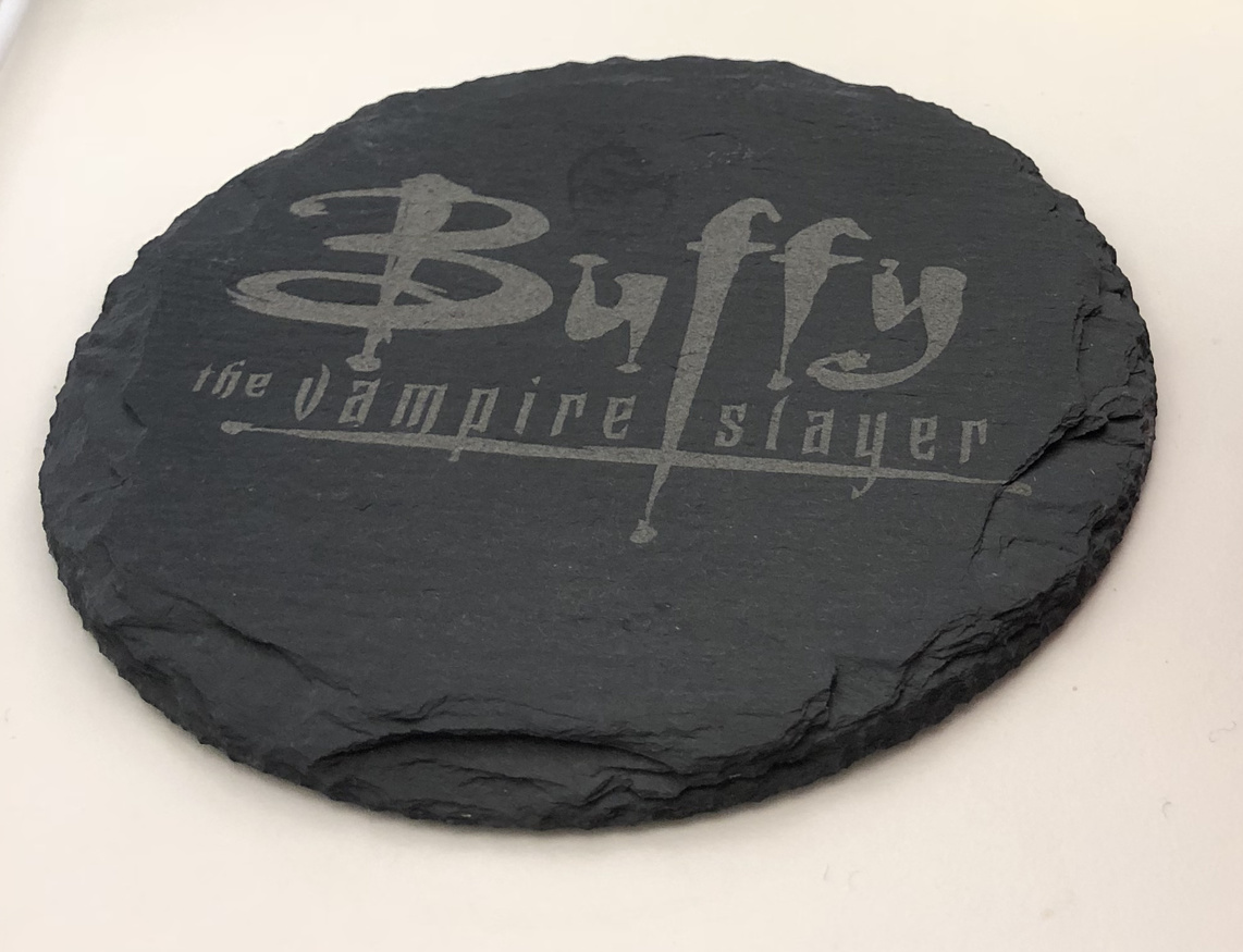
One colour looks great and is easy to do (following Jule).
Then I decided to try for a full tone range plus un-burned regions for contrast. These round slates are around $1 each from Amazon, so I could afford to experiment, which was lucky - it took me around 4 coasters before I got the image and the GF settings right.
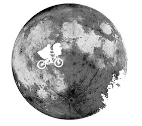
The shape and texture of the raw material lends itself to spooky or space themes. Here’s a movie I love…
The media was prepared from publicly available posters as well as high quality moon pictures from NASA. I put them together in Affinity Photo for Mac, my final version had like 25 layers (most of which I could probably remove now). The bike and the tree silhouette is 100% white - meaning the laser doesn’t touch that part at all. I didn’t reproduce the full range of contrast in the end - the big crater at the bottom (nearly full black) doesn’t really appear. I think it still works.
Lessons I learned
The Material
- slate is slightly shiny, the engraving isn’t visible from all angles.
- the engraving seems quite durable
- getting it wet or greasy can decrease contrast temporarily
- there are little shiny specks which make it extra awesome.
Media Preparation
- alpha in images can cause unexpected noise in the output that you can’t see in previews. I recommend to remove alpha blending to make sure you can see what will be rendered.
Burn considerations
- full white parts of the image (no burn) must not contain compression artefacts or noise - this will ruin the super contrast you get between burned and non burned part of the image. Avoid jpg (and alpha).
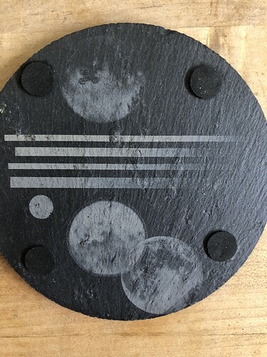
- it’s a good idea to burn a gradient at different powers on a scrap of the same material (e.g. the back of the coaster). This will help you calibrate.
