That is the coolest! Well done!!
2 Likes
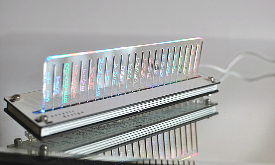
Like there pastel colors!
2 Likes
Very cool! Fun to see non-traditional clocks.
There’s an individual on reddit that uses a community glowforge and isn’t allowed access into the glowforge community forum due to not owning their own. They were wanting to contact you about this plan.
Ah, I’m not on Reddit so I can’t reply there.
His request is flattering but I’m keeping this plan for myself.
1 Like
what evansd2 said.
3 Likes
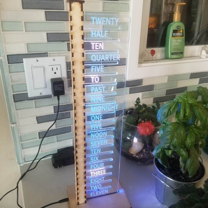
i suspect this one predates mine. It has a very well developed UI on he backside. all sorts of user options. mine has 2 buttons, one for hours one for minutes.
1 Like
That is amazing!!
1 Like
Clever - love it!
1 Like
I think I’m going to have to make one of these one day.
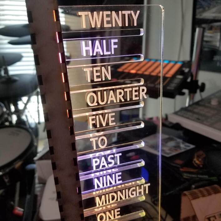
Update: I located some RGBW LEDS in a 144 per meter configuration and made a couple clocks based on those. Used white for the words that tell the time. That really makes the time stand out in lighting conditions where is was previously overwhelmed. In prior designs, I used the color of the LEDs to indicate the minutes (purple = +0, blue = +1, green = +2, yellow = +3, red = +4). For this new design, I applied the same color code to the balance of the LEDs. The result is a white on color result. I really like the look of this and it works better in brightly illuminated spaces.
It then occurred to me that the old RGB strips could also make white if asked (duh). I applied similar approach and got something very close to what was obtained with the RGBW leds. So, I have updated a few older clocks that only had RGB strips with this new design. They are not quite as bright but far easier to read in a bright room than previously. Why did not think of this sooner?
Then I got tricky.
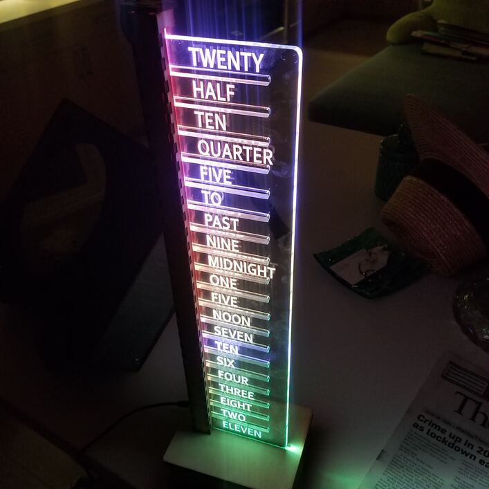
I took advantage of the linear layout to use a gradient within the background color to show progress within the minutes. At the start of a minute, the topmost LED is set to the base minute color (see above) and the bottommost LED is set to the prior minute color and a gradient is applied to the LEDS in between. As the minute progresses I advance the color of the bottom led towards the color of the top led and adjust the gradient. This is timed so that the top abdbottom will be the same color at the end of the minute, which means the gradient is no longer a gradient. Thusly, one can judge how close the clock is to the next minute by observing the amount of gradient.
Then I got even trickier, and added all sorts of variants to this (bigger gradients, no back ground leds ( i.e. white only), solid color background leds ( some people really like orange or pink) , slowly changing background leds…). The mode of display is selectable via the 2 button interface that is normally used to set the time. Normally, one button advances the hours, and the other button advances the minutes. The tricky part is that pressings both buttons will set the hours to 12.
This can be helpful when setting the time. Pressing both buttons when the hours are = 12 will result in the minutes being set to 0 ( also helpful) . Now, pressing both buttons when the hours =12 and the minutes = 0 will advance the color mode and store that to memory. I use a bit of non volatile memory to keep track of that setting when power is lost so one need not reset this after a power failure or clock movement. The clock is maintained across power loss via a coin cell battery.
All in all, a solid bit of geekery that worked well. Some examples:
RGBW LEDS, Solid background (no gradient) still need to remove some masking
GRBW LEDS, Solid background in brighter light.
RGB LEDS, Solid background
RGB LEdS, Gradient background (double gradient , if you see 3 tones it is early in the minute, if you only see 2 tones, it after at least 30 seconds)
4 Likes
Solid geekery indeed! I love this.
This is all pretty cool, but I’m confused — why does knowing the proximity to the next minute matter on a five-minute resolution clock?
I hope that most people who have one of these do not need to know the time more accurately than that.
But having this feature does something to talk about when selling such a piece and it gives an excuse for the color changes.
And since the clock does a small light show on the hour and on the half I (a kookoo sort of a thing), it is helps alert an owner or potential customer to that fact that the light show is neigh. OTherwise, they would wait for some indeterminate part of 5 minutes which gets old. If the clock says “5 to” or “25 past” in red, they should start paying attention. If there is a gradient and the gradient looks close to solid red, they are about to see the show.
So, not useless but only marginally useful at best
2 Likes
Right still confused though. Your cycle is every minute or every five?
My design cycles the rainbow every five so you always can tell the time to within about a minute once you know that.
You know, you could put some masking tape on the edges just to see if edges would make a difference. Then you know and it just peels right off
1 Like
i typically changed the color every minute in a cycle of 5 colors, going out of my way to have it be stepwise vs continuous. That gives the time to within a minute if you know the color code. This gradient tweak, builds on that to also provide a sense of where within the minute you are. An alternative is to use a rainbow that cycles over the course of 5 minutes , which you use. More than one way to skin a cat, each with a different appearance but similar data presented.
3 Likes