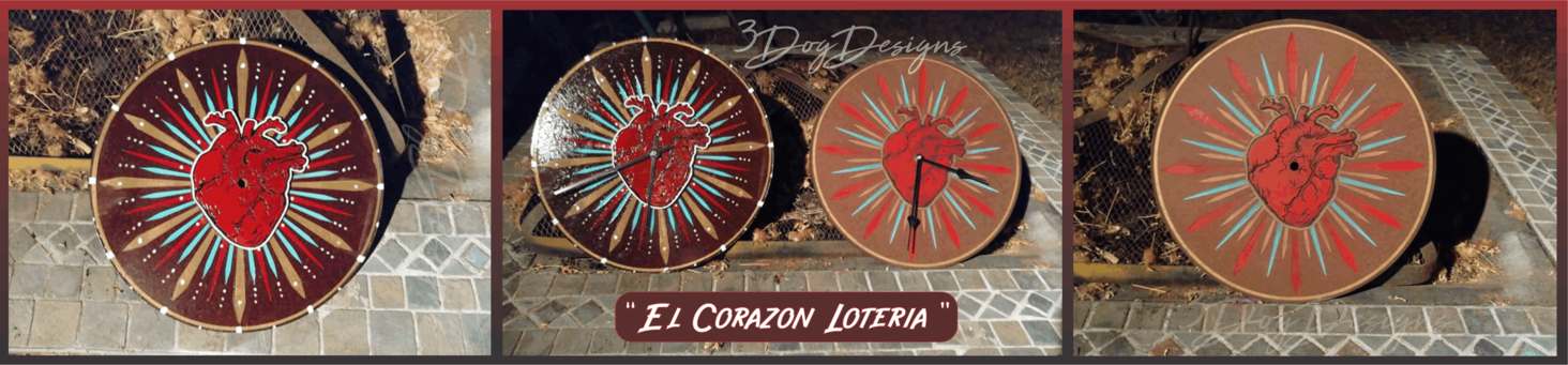
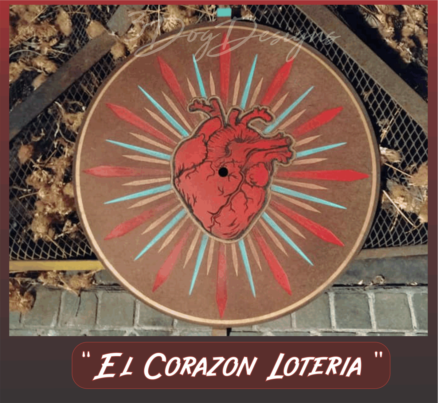
I’m working on a “Loteria” series and el corazon (the heart) is my first one. The shiny one on the left was my POC and I screwed it up. Instead of throwing it out, I changed it up a bit and did a thick clear coat to see how it’d look. I’m not particularly fond of it, but at least now it’s not a total waste. The one on the right is the more folk-art look I was going for.
I hope to make an arrow for the hands, but finding the right material for it is a work in progress. I was originally thinking thin acrylic would work, but now I think they’d be too heavy. Maybe thin copper sheeting? (Suggestions are welcome.)
Gorgeous. I’m not sure where you screwed up on the darker one!
As for hands, I’d suggest you go with light coloured ones, the black pretty completely disappears (at least in the pictures). I think copper will be heavier than thin acrylic, but it would look lovely! Also copper paint is totally a thing so you could use the hands you have…
Aww, thanks. I guess it looks OK, even if it wasn’t my initial vision lol. I think I’m just more aggravated after working on it for hours to have it ruined at the very end and having to make another one.
It’s hard to see , but the dark one has two layers with the heart sitting on top. The VERY last step was for one more engrave of the veins and damned if I didn’t see the irritating fill-rule bug and instead of just engraving the veins, it etched away the entire heart/paint. Luckily I had a completed heart from another project cut out and I was able to slap it on top. The white edge and thick clear coat looked weird against the subdued clock face so I had to improvise and some white embellishments to the face and shine it all up. At least the next one only took half as long since I had the layering and ordering all figured out. It still took a lot of time and masking though.
(Please, please @dan can something be done with the fill bug. I had to go back and forth between the GUI and my program several times to reverse paths on different elements. It’d be almost acceptable if you could design for it, but I’m not sure what the issue is. It sure cost a lot of extra time and aggravation.)
I agree about the dark hands and the plan is to have the hands be a yellow arrow like this. I was hoping to glue something on top of the pre-made hands, but they’re awful flimsy. Gonna have to experiment a bit.
 I think I’m just more aggravated after working on it for hours to have it ruined at the very end and having to make another one.