Engraved cardstock fun times

Dude, you can’t say, “Don’t…” and then expect us not to do it. It’s pretty much just a challenge to click here. :laughing:

Hurry with the pics though!

6 Likes

Great result.

4 Likes

OMG, that looks great!! Where did you get the cardstock from, do you remember?

5 Likes

Wow! I can’t believe the shading and detail you were able to get. This would looks so awesome in a shoji lantern and it would be especially cool if the images could spin. Nice work. (As always.)

5 Likes

It’s a big fat book of cardstocks, let me see if it was amazon… check my purchase history.

Yup, here you go:

https://www.amazon.com/gp/product/B00DGI1V6U

7 Likes

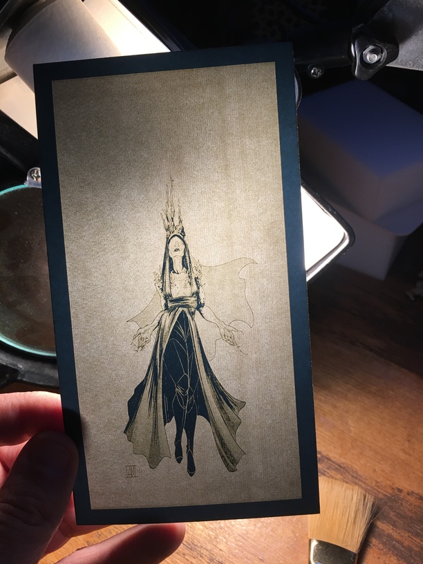
OK so I ran it again. This is even crazier. I’ll post pics, let me get them off my phone.

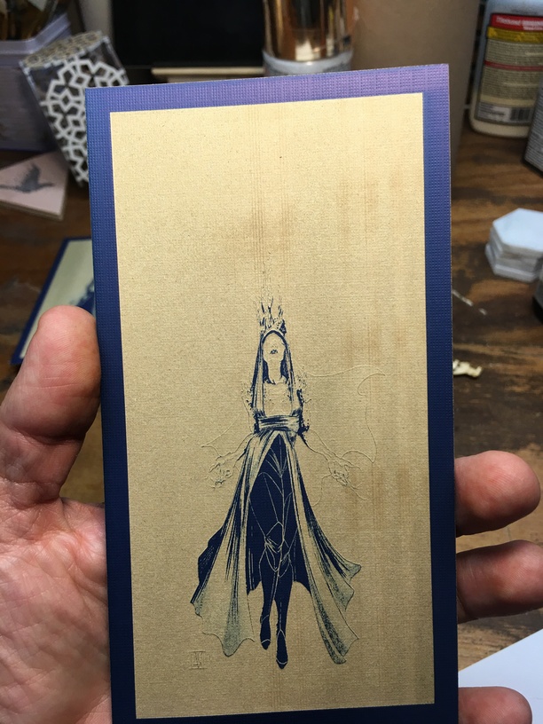
OK so it’s at higher power. I lost some detail in the blue, it “over engraved”.

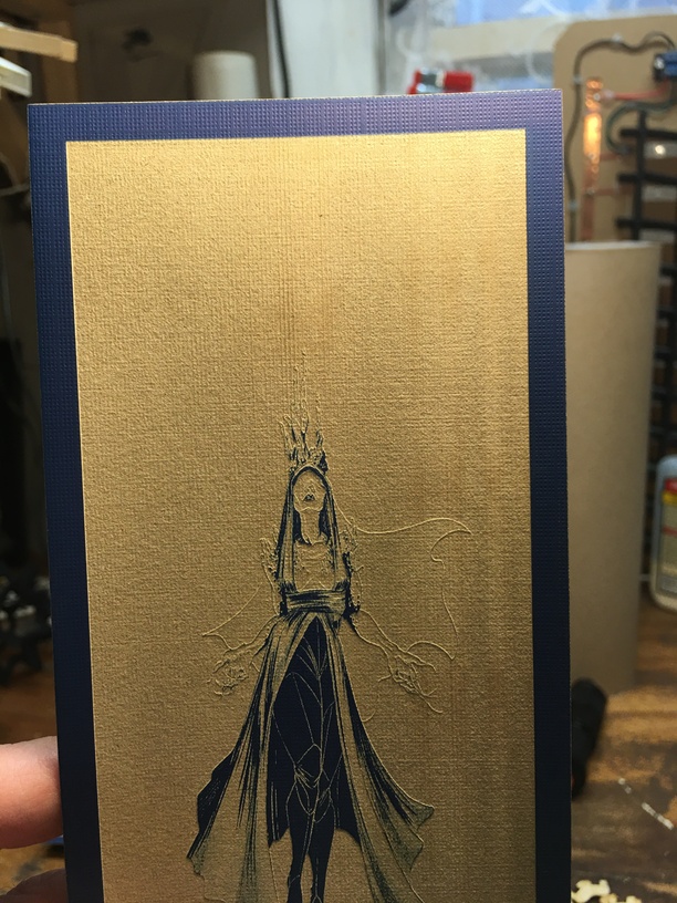
However, this was a vary power engrave, so it preserved that lost data as depth, which you can see at oblique lighting angles.

So you flip it and backlight it, and it’s cool…

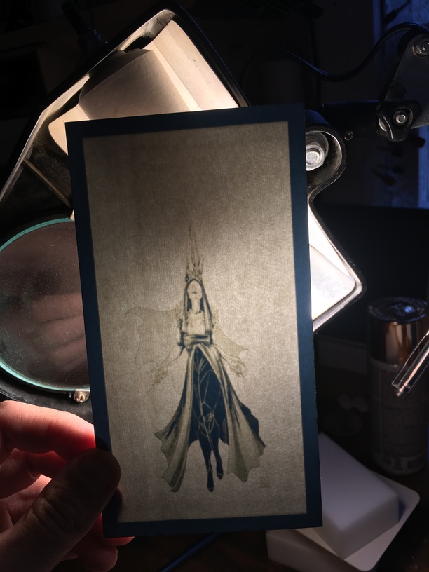
But it’s even better when backlit and looking at it from the front. It’s far more crisp, and her veil becomes truly wispy, it’s amazing in person.

27 Likes

So you etched away the blue… looks like that probably took awhile, even at low power/high speed…

4 Likes

Without getting into settings, it was about 30 mins to do it, comparable to any other medium lpi engrave. It’s 3x6" engraved area, and 3.5x6.5" overall.

3 Likes

Oh yeah, this one is much better backlit! Her dress has so much more detail in it. Too bad you can’t have the best of both worlds and could preserve some of the blue in the front engraving and maintain the clarity of the second one. I wonder if you could find a good middle ground by splitting up the engraving into a couple of separate sections that could be run separately? (Background, dress, thin outlines of arms/cape etc.) It’d be a real pain in the arse, but an interesting concept.

4 Likes

So, in theory, you could make your own engraved monogrammed stationery too. Really cool (although personally, I’m really liking the backlit lantern idea).

1 Like

If you backlight it with the blue up front you get the clarity in either version.

9 Likes

I kept staring at it trying to figure out how you painted it blue. Took me until the last sentence to figure out it was blue cardstock that you engraved away showing the white. Sometimes I can be pretty slow LOL

It really is beautiful.

4 Likes

These are really wonderful. I’m glad to see what you did…I’ve been using cardstock more and more lately…and have a pad of two-tone stuff very similar to what you’re using. I am inspired.

2 Likes

You could probably do something similar with white core matboard but I guess it would be harder to backlight.

2 Likes

Great look.

2 Likes

Just WOW.

4 Likes

I think the bonus here is that you’re really operating at high speed and low power, so the paper doesn’t char. I’m not sure if matboard would do the same. Unfortunately I don’t have any; I almost picked some up the other day, now I wish I had!

1 Like

You have to really get the settings dialed in or you’ll brown the underlying white core. It’s definitely an iterative testing process (& one where I curse the arbitrary power & speed units that make it hard to shave off 10% of the last attempt’s settings :slightly_frowning_face:).

I also found that the settings changed by top color - I think there are slight variations in the thickness of the top paper based on the color. I would get a nice white exposure on one color but then get toast using the same settings on another. And it wasn’t a dark vs light color thing - navy blue settings on black gave me toast color but navy blue settings on dove gray gave me a paler light toast/mottled white.

3 Likes

Doesn’t that make sense? The black would eat up the laser energy more efficiently than dove, in theory. I mean we’d have to know the albedo in the co2 laser frequencies, but I suspect the dove color is more reflective to the laser than the black given your result.

Counterintuitive to me. If Navy gets white and Dove gets light toast, intuitively I’d expect Black to reveal white or maybe be a gray off-white but not a darker toasty brown than Dove. Toast/brown suggests it burned through the top layer and was now burning the white core. So more brown suggests more energy hitting the core. The results across 2 dark colors and a light color that doesn’t seem like a predictable pattern. If the black showing brown makes sense, then the Navy should show toast and the dove show white. Or vice versa. Since it doesn’t do that I concluded I needed to test each color instead of relying on heuristics to make a setting I was reasonably certain would work.

1 Like