I know it was answered but every time I see a box I gotta say,
“What’s in the boooxxx!!!???”
7 Likes
Well, they turned out just fantastic! Nicely done!
1 Like
Well done man! Amazing amount of individual customized engraving. The basic is a wonderful tool!
"When one door closes another opens - it’s the time in the hallway that sucks."
It doesn’t have to though. Rest assured you will spend much of the rest of your life working. Try to enjoy the slack time, it won’t last.
6 Likes
Those are so incredible! I am so very impressed!
2 Likes
Like I needed a reason to want my Glowforge any more than I already do  those look absolutely great!
3 Likes
Wow, that stack of them…
Making me think about the “sponsor a brick” type of community/school fund-raising projects.
7 Likes
These came out great! What’s equally nice to see is the Glowforge being put through some serious production work. I have high-hopes for my Pro.
3 Likes
This is mind-blowing. Your skill and patience really shine through in this entire table’s worth of beautiful boxes. Please keep us updated on your future projects!
6 Likes
Can you tell us a bit about which kind of wood you used and settings? When you come back from vacay of course…
These are gorgeous!
@ianauch This job’s history with the notes and pictures you’ve provided are priceless. I’ve actually taken the time to open up my OneNote program (something I don’t do often) and jotted down all sorts of notes you’ve provided. I have a few questions for you when you’re back from vacation if you wouldn’t mind. I can find you on slack too if that will work for you.
Again, amazing job and I look forward to seeing what your side business is as well.
1 Like
Wow! Amazing!
Here is a photo of one of the boxes as they were shipped out.
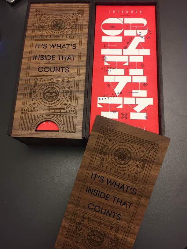
Really love how they turned out. It was a fun project but I’m glad it is done.
36 Likes
It was just the PG walnut plywood. As far as the setting go it was mostly the default settings.
I did have to up the power a little bit once i reduced the LPI in the final runs. Other wise it looked a little light on the engravings.
3 Likes
I would be happy to answer any questions you have. I am in the GF slack group so you can find me there or just PM me if you don’t want to ask them here.
1 Like
I never got a chance to comment how much I liked the slide cover when I saw your troubleshooting post, but I really like how that came out on walnut. Really attractive!
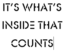
Can you tell us what stencil font you used on it? It almost looks like Futura Stencil, but the tabbings are all wrong…
This is Futura Stencil:
Reduced to only retain internal structure:
1 Like
Thanks.
I’m not sure what the font is since it was converted to outlines by the time it got to me. I’ll send a note to the designer and ask and let you know.
1 Like
Not just the tabs. Take a look at the W, the A, and the N: Futura has pointy bits where the boxFont has flat ends.
*of course, many times a designer will start with a standard font and alter it for a specific project, or use an existing font from which to build a new custom font. It could have started as Futura, and it is not necessarily a font anymore.
2 Likes
I also noted that the design’s font looks slightly more expanded, the rounder letterforms are wider.
You’re probably right, it’s probably more likely a standard font that was just given an abundance of tabs by hand.
The font was Ano Stencil.
13 Likes
from an environmental graphics professional of 25 years, stellar work my friend.
1 Like