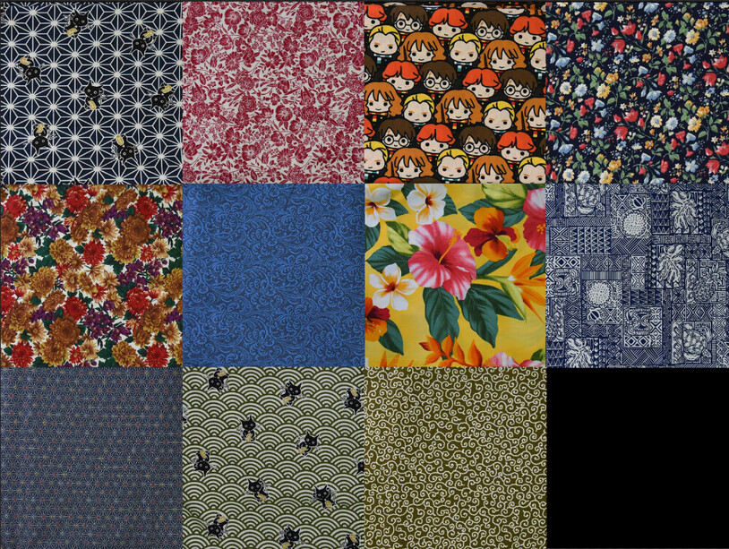
Alright, so I went out and bought a bunch of fabric, and admittedly, I went a little overboard! I haven’t been in a fabric store since I was a kid, and to see the hundreds of options available was just so exciting. Grabbed what I thought I might eventually want to use, and brought them home. My mind’s eye is okay at visualizing what a wallet is going to look like with mix and match colors, but that doesn’t mean that everybody has the same ability, or that mine is perfect at it. Popped open Photoshop and made some layers to edit each section of a possible wallet. First I took pictures of each type of fabric I have:
Then I grabbed my design out of Illustrator and copied it over to Photoshop:
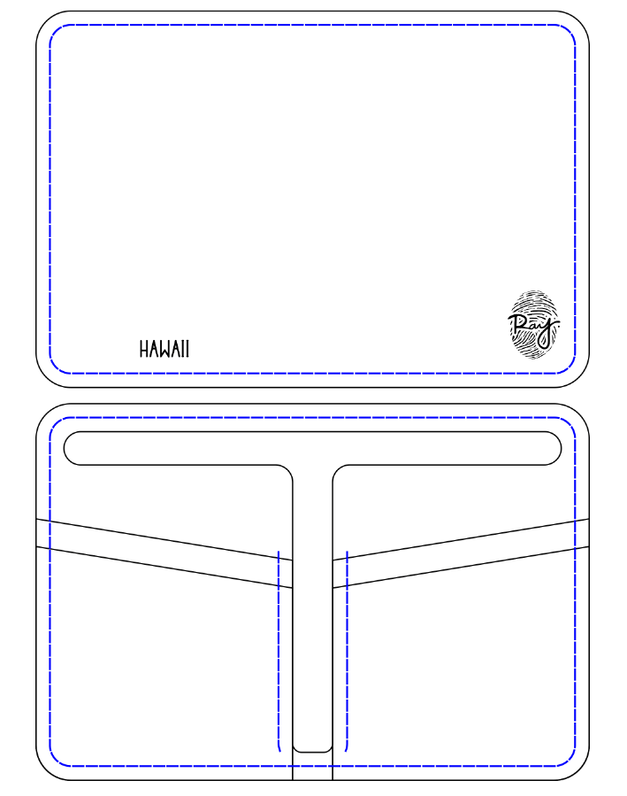
The thread lines are exaggerated, so that I can edit their color easily. With that, the basis of mixing and matching is ready to go. So say I wanted to make a wallet with the green japanese waves and cats. If I figure out what colors I’d like to test out, including the thread color, then I can come up with this:
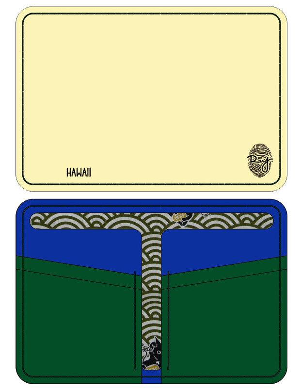
Put this to the test and made the wallet up above, here’s the example of what I thought it would look like:
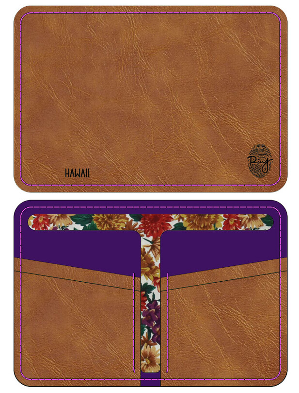
I grabbed a leather texture from google, that’s why this one looks so detailed
Gotta say, that’s pretty close. I eventually plan on adding a customization option like this to my website that I’ve been working on, so for this to be working so well feels great. Anyway, thanks for the support ![]()