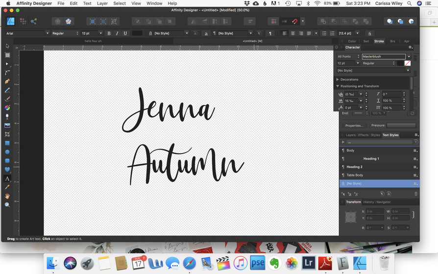
Does anyone know how to easily make a font thicker? There is no faux bold or bold option on this font. This is Masterblush. I love these handwritten style fonts, but those thinner areas are just so fragile when laser cut.
I have to make a lot of these, so I don’t really want to spend a lot of time on each one. In fact, I’d be happy with a font suggestion that looks similar, but isn’t quite so thin in some of the areas.
1 Like
I don’t use Affinity so no specific help there, but in Corel I’d use the contour function to thicken it up.
2 Likes
Maybe unfocus the laser? I just bought the Affinity suite so no specific help from me either. Can you create outlines and then stretch them. That’s what I would do in Illustrator.
I don’t use Affinity, but I did a quick search on YouTube and found this, towards the end you see he adds a shadow. (I’d do a small shadow and use that for my words.)
1 Like
Try search for similar fonts here:
https://www.whatfontis.com/similar-alternative-fonts.html
I’d make some suggestions, but I’m really bad at it 
2 Likes
Offset path.
Object > Path > Offset Path
4 Likes
I’ve never seen this in AD? Really…where is that?
I use AD. You might just try making that into a ‘curve’ and editing the parts with the node tool, that need to be made wider.
Oops! I didn’t look close enough. That’s Illustrator instructions.
This may get ya there though?
2 Likes
I agree with @jbmanning5 and @hansepe. If you don’t want to take the time to edit them and make them more unique or thicker on your own then definitely try what @hansepe recommended. That site is extremely useful.
1 Like
Thanks for that link. I’ve done most of the first steps with expand stroke, etc. but I’d never progressed much past that, so that’s fun and something that I’ll practice with. 
2 Likes
In illustrator I add a stroke in the same color and adjust the stroke width until I’m happy with the look.
Then outline the font, expand the whole thing to outline the stroke, Pathfinder the whole thing into one cohesive shape. Is something similar possible in AD?
1 Like
I always adjust nodes to make the thin areas thicker. Yes, it does take time … but, cuts are so much better.
2 Likes
Somewhat offtopic but: The fact that offsetting is not a core simple function in AD is the main reason why I think of it as a second-tier tool for working with GF designs. Offsetting is key to any sort of kerf adjustment.
3 Likes
More on topic: offsetting will work to get a cut that is strong but it also changes the proportions of the font, and that distortion increases the more you offset. The design of a typeface hinges on relative proportions, and while you may or may not notice the difference at larger scales, you probably will lose some of its character at smaller sizes.
This is probably something that most people won’t notice or care about, but there it is. The ideal solution is to probably find a font family that works well at the scale you want, you’ll end up with a truer end result.
Also worth mentioning: “too thin” depends a great deal on your use case. Engraving can resolve features down to about 180-200 lpi in most materials, whereas cutting will depend a lot on what sort of materials and use you’re planning. Quick example: cut a 2” diameter 1/10” thick ring out of 1/8” acrylic: it’ll be decently strong. Try that with 1/16” hardwood and it’ll snap in half along the grain if you put any strain on it.
Just things to consider as you think about how to tackle this.
2 Likes
It’s indeed a tricky balance.
It can quickly ruin a font, or in some cases, make something unique that really works (tons of fonts are manually edited for logos and such where the original font just serves as a basis).
I guess kind of the rule of thumb here is that it either works or it doesn’t.
I think one of the more popular uses of offset is to create just an offset cut line outside of the typical font - from there, you could engrave the inner portion (original font). That would serve to thicken thin pieces but the engrave itself will draw the attention.
Right, so I decided to illustrate what I meant because I feel like it was a bit academic in writing:
Here I took a standard time new roman uppercase “o” character in 64 point size (0.615" tall) and measured the thin portion at the top as 0.032" thick. That’s pretty skinny, so I decide to beef it up. I convert to a path and outset by 0.004" (typical kerf adjustment for a really tight fit), and not the thin portion measures 0.04". The font isn’t changed much but it’s still way too skinny for what I want to do, so I decide to ramp it up and outset by 0.05", thus making the thickness 0.132. Now it’s nice and thick and strong, but the font is greatly altered. I measured the ratio of thick to thin sections of the font and showed them as ratios and as colored rectangles:
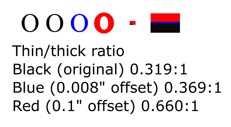
So, if you want to preserve that ratio (and thus the look of the font), you can’t just offset and expect it to look “right” past a certain point. The heavily offset red O looks almost nothing like times new roman. While I may think this is a plus (TNR, ew), if you love your delicate caligraphic font’s character, you can easily lose that in offsetting.
2 Likes
This will maybe get you part of the way there if you want to keep the font.

Don’t forget to combine the paths after you create your curves or you’ll have some other surprises waiting for you.
1 Like
Same with me. But, I’m looking forward to trying the new process that JB was talking about and that I read about in the link.
1 Like
I think you might be right…but, just as with certain functions of the Glowforge, we who use AD can find some workarounds…even though we shouldn’t have to.