So this file is pretty good as is, but I do have a few pointers.
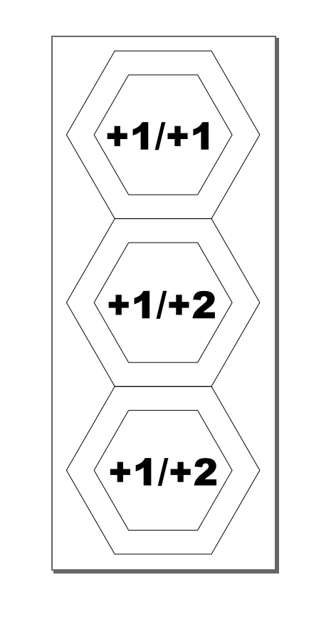
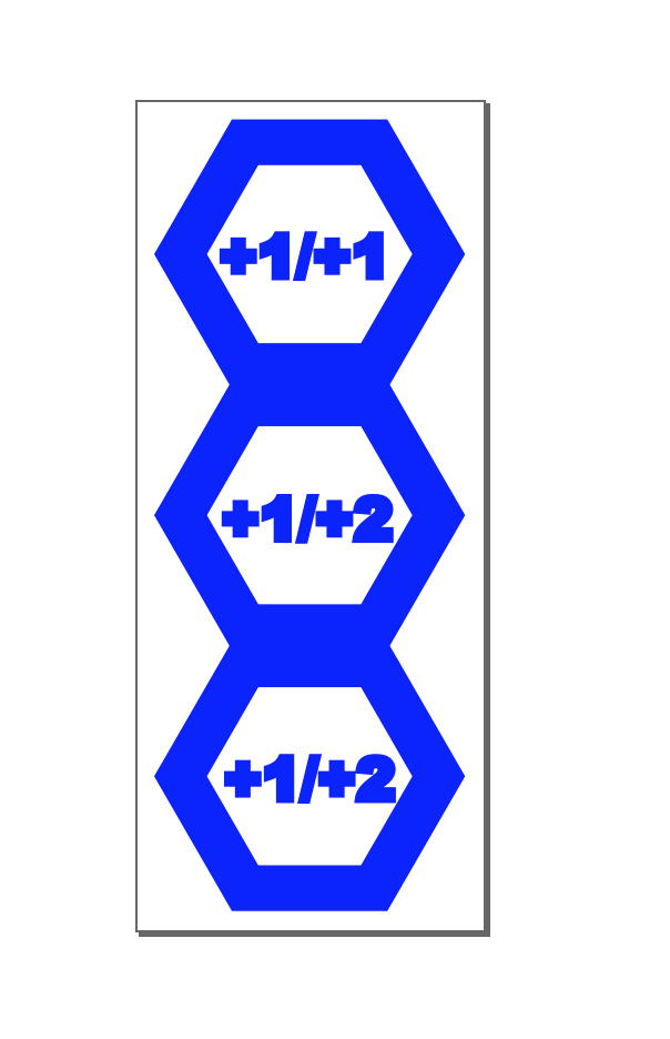
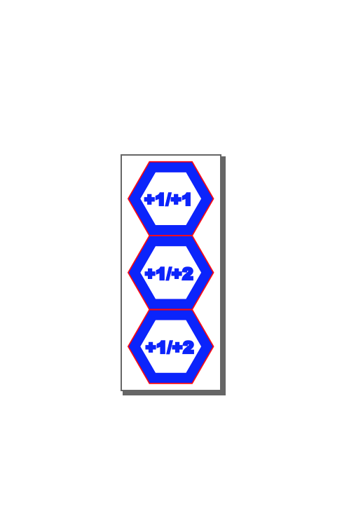
Your numbers have a stroke assigned to them. This isn’t a problem but it does give you an incorrect idea about how the engrave will look, as stroke width isn’t in the engrave. As such, your letters look bolder than they will turn out. Check it out, original with stroke on the left, without stroke on the right:
It’ll turn out more like the right than the left, by design.
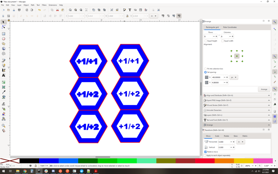
Next, orientation. In general it’s more efficient to arrange your engraves to be mostly horizontal. It’s not a huge difference in most cases, and in others it will actually be faster vertically, but as a rule of thumb, lay it down wide instead of tall.
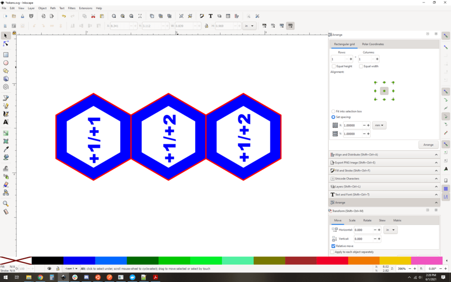
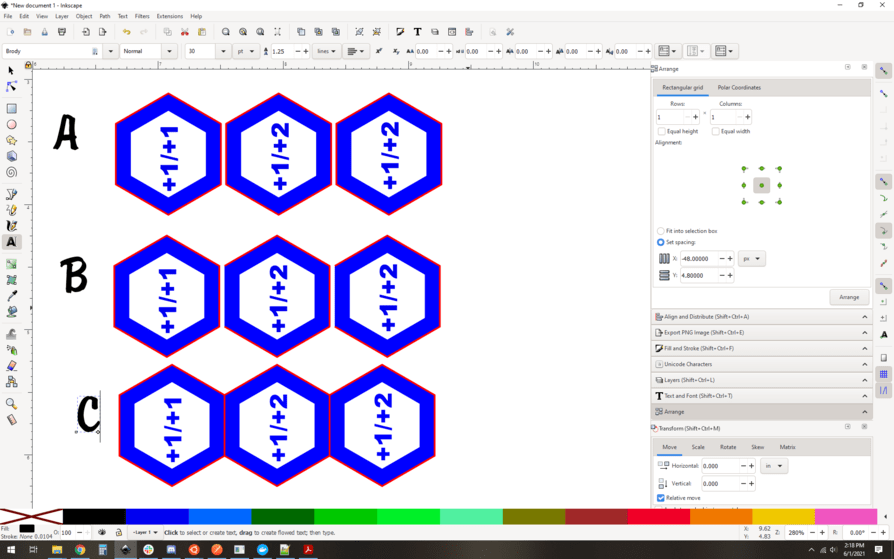
After that, now you worry about double cutting. In places where your hexagons match up, the red lines are on top of each other and will cut those areas twice. For this design that won’t present a significant fire risk or anything, but it will probably make that edge darker and have slightly wider kerf. it’s a minor thing, but best practice is either to separate the pieces by about a mm of space (A) or remove the offending segments (B) and then snap them back together (C)
I prefer (A) in general. It’s less efficient on some levels, but I like to know what I’m doing for sure at a glance and also to ensure that the pieces are all the same.
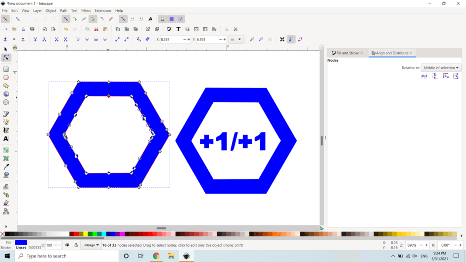
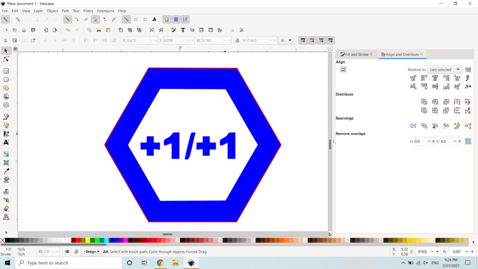
And lastly, path management. I like to use union to make my paths all combine into one path when they’re a “unit”. So I select the blue hexagon and the +1/+1 shapes in the left one, and do Path->union. now they’re one path. I then select the red hex surround and group them. Now it’s a token group. Repeat for the other two, and now you have three groups, each consisting of two paths, a solid blue filled path, and the red outline. Ready to cut.
Here’s the SVG on a full-bed sized page size:

(Right-click here to download the SVG)