Control gives me away as pc, more or less!
I’m pretty handy in an Linux terminal too, I use Cygwin in my day job.
Control gives me away as pc, more or less!
I’m pretty handy in an Linux terminal too, I use Cygwin in my day job.
Instead of doing a ‘path combine’ I do a ‘path union’. That avoids problems due to winding rules and their interpretation if you have overlapping letters.
that’s the opposite of my instinctual guess. especially for people who are long-time PC users (think pre-windows). windows has always been a heavy kbd shortcut system, since its roots are DOS, which had no mouse. mac OS was always more mouse-based.
Just what I’ve learned from tutorials and so it all seems obvious. I’m one of those weird people who like manuals and written tutorials. It’s easier to develop ‘muscle memory’ and work out my understanding by playing with the software while reading. With videos it’s harder to start and stop and ‘rewind’ (to use a cute archaic term I’ve learned from my elders).
Hey that’s a good tip. It’s never bitten me yet, but I don’t use cursive scripts, and so haven’t had to tangle with overlapping letters.
This is the best post. Thank you for all your work and explanations!
I have a lot of trouble with GFUI combining colors. For example, if I have an SVG from Illustrator with vectors that are black, yellow, blue and green, the GFUI will sometimes treat them as four operations, or three, two, or even one. Weirdly, they can all be from the same file with different vectors of the same color visible - for example, a sign with a standard cut and score in two layers and colors, and a third color used for the vector writing or drawing on that particular sign. So I can generate a dozen signs, all with the same color palette, and get wildly different treatment in GFUI. So then I have to tweak colors and re-save the SVG until I can luck into a combination that GFUI handles properly.
Are there specific colors that the GFUI consistently differentiates? Or some other trick?
There’s actually a combination of rules for design that can help you to set up your files so that the GFUI interprets them the way you want them to be interpreted.
First off, the computer can differentiate between different shades of green or blue much better than we can. We might think that we used the same shade of red on two different sections, but the program can see they are actually off by a couple of points. If they aren’t the exact same color, you’ll get a separate operation set up for it. (I do this one all the time.) 
That’s one thing.
Another is that fill colors are treated separately from stroke colors. If you have a filled vector shape in red, and a separate unfilled vector shape with the same red used as a stroke color, you will get a separate operation set up for it. The program is trying to interpret what you want it to do based on what you give it.
So you get a separate operation set up for you depending on how you set up your file with fills and strokes. It’s not just about the colors used, although that is one of the main components.
Third thing - anything completely enclosed within a shape is treated as a group for moving purposes on the artboard. This is necessary because it’s easy to accidentally leave bits behind if they are not completely joined. (The CAD programs are notoriously bad for doing this.)
Fourth rule - each raster image embedded in the file is treated separately. That’s necessary because there are no other indicators to the program as to how each is to be treated.
These possibilities in combination make the program extremely powerful. You can do one engrave at one focal height, and another at a different focal height to achieve different effects. You can set up a filled vector, duplicate it in place and give the copy a stroke color with no fill, and set up an edge score for anything that you want to darken a little bit or to clean up the stair-stepping on a low LPI engrave. (I use the heck out of all of the options.) 
More detail on these in the Laser Design Basics tutorial.
I have an Illustrator 12x20 template which includes color swatches. That means those colors will always show up in the palette, since they are part of the file.
I could not find a good way to define a Glowforge palette and always make it available in Illustrator. I had to manually load it each time. Putting the swatches in my blank template was my hack.
So, what, you eyedrop them?
No need to eyedropper, they appear in my default palette. They are the ones with the corner marks.
But you know what, now that I think about it… I DID define these colors as part of a special Glowforge palette. They even have names that remind me of the order of operations. The problem was, I still had to LOAD that palette manually all the time. But the palette does exist.
So, the fact that my Glowforge colors are available for easy picking in the swatches here may be because the palette defines these colors as special, AND the colors are used in the template. I bet that’s it.
if you save an actual illustrator template file (a “.ait” file), the current color palette will be the color palette in your new from template files that you open.
as an additional option, when you create a custom palette, you can go into your palette and hit “save swatch palette as ASE.” save it somewhere safe/stable. then once you have any file open, click in the palette dropdown on open swatch library, other library, and open your palette. it will come up as a new palette tab. you can then drag that palette to an anchored spot in your workspace and it should stay there. if you save that workspace, you’ll be able to bring it back by resetting that workspace.
i do this with my company branding color palette. it means i always have it available in AI. same with the GF one. you can save it in a template as well as making it part of your permanent workspace. note below the custom palette is anchored in my workspace below the swatches palette.
Thanks for the info.
I would be very happy if the GFUI followed those rules, but they do not, at least for me.
The problem I have is that clearly different colors are very frequently treated as if they were the same color. For example, if I have a design with one cut object, one score object, and one ‘ignore’ object (Snapmarks!), and those objects are (for example) black, blue, and yellow (chosen to be different darknesses), the GFUI will, apparently at random, decide that those three objects that are three colors are one, two or three objects in the GFUI. To fix it, I have to repeatedly ‘save a copy as’ SVG, then re-import into GFUI, until eventually I get lucky and the GFUI treats the three different colors as three objects so that I can assign them the different operations.
If the GFUI were super-picky and insisted on only exact color matches, I’d be thrilled, because then I could have consistent behavior to work with.
I will say that if filled or not filled is a consistent differentiator, that’d be useful… I’ll go try that!
can you show us an example file where it’s not following those rules for you? i’ve never seen the GFUI not follow those rules.
Yeah, I haven’t either. If you want to post one of the problem files we can test it. Are you working with PDFs?
SVG’s from Adobe Illustrator. I’m not on the computer I design on - I’ll post some shortly.
Really! Yeah post one or two if you can…I’ve never seen that happen and I use Illustrator almost exclusively.
![]()
The ‘cut’ is black, the ‘ignore’ is blue, and the ‘score’ is red. When I load it into GFUI, there are two objects, one with the black, and the other with the red and blue.
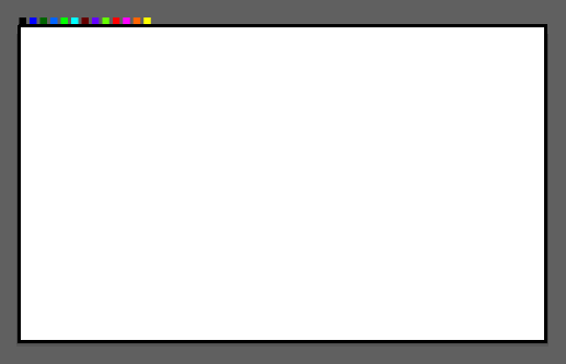
Same for this one, except the two colors are light yellow and dark green.
![]()
Okay, give me a bit to look at them. I might need to look at the AI files as well, but you’ll need to Zip them first before you upload here or they will be corrupted.
Whoops! Looks like Discourse corrupted the SVG files too. Can you zip those and then reload them? Otherwise Discourse corrupts the files and they are hard to interpret.