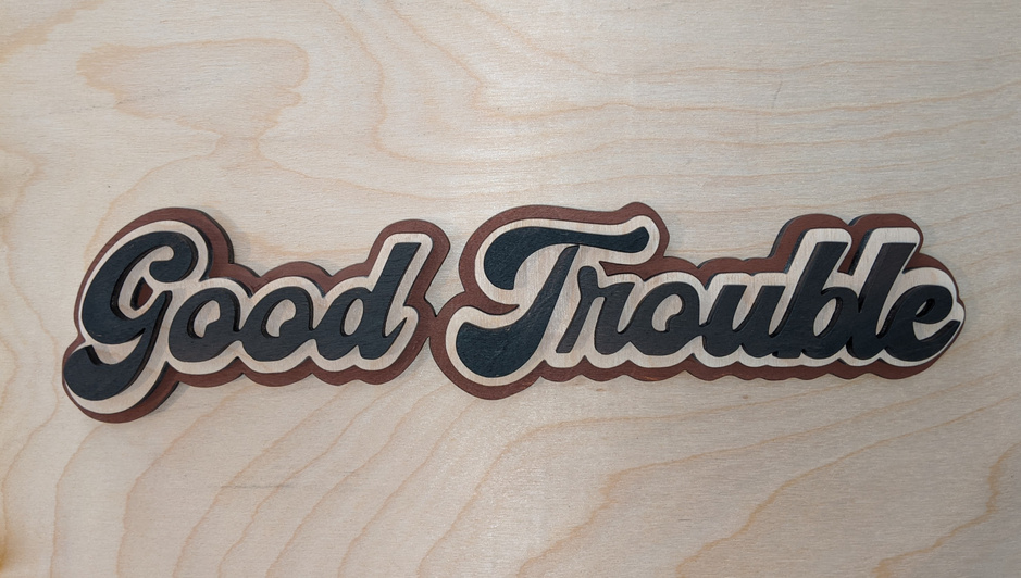
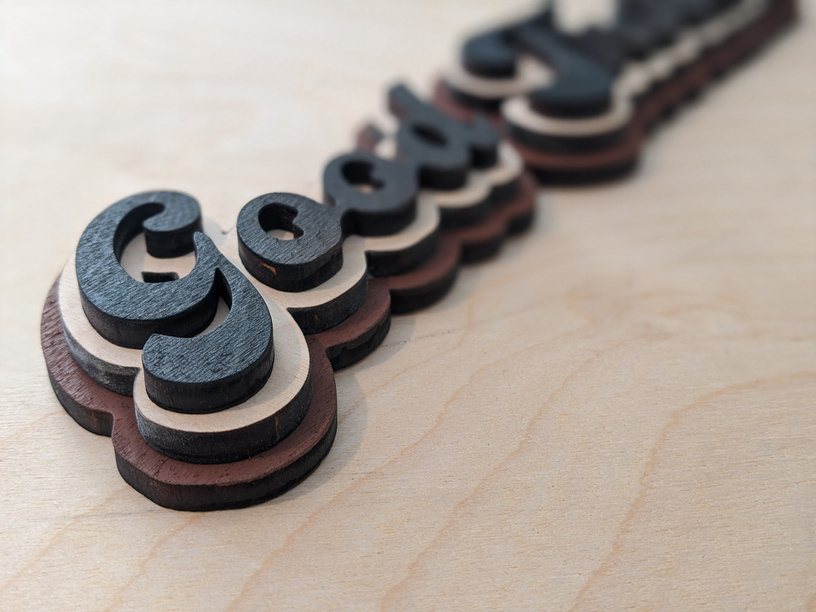
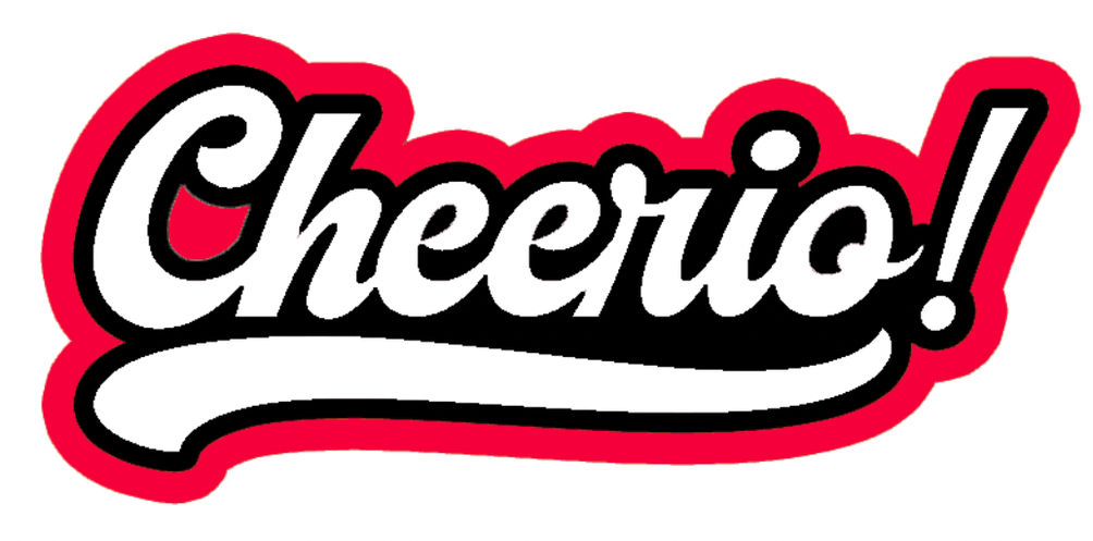
I found this fun retro style font from Creative Fabrica. Created regular text in Photoshop and added drop shadows for each layer. Pro tip - the drop shadows tend to get jagged when you enlarge the size. So what I did was create a drop shadow, flatten the image, select it & grow, and make a new layer via cut, then repeat with new drop shadow for that layer. boom! Another hack to add hanging options, cut a slot or hold in the back of your first layer!
I painted the first and top layer in acrylic paint, leaving the middle piece “raw” and sanded off the soot
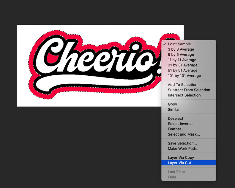
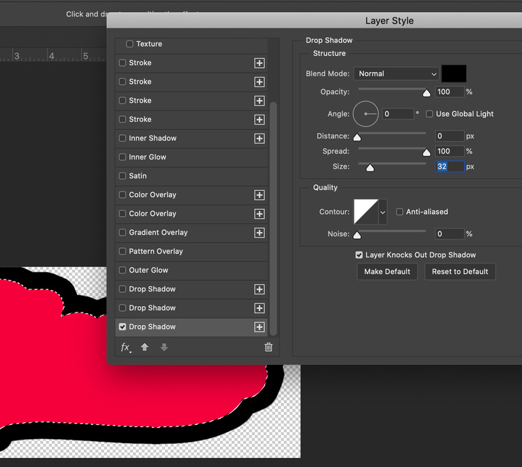
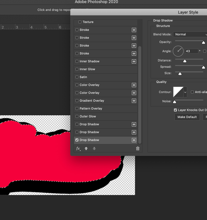
Here’s a short walk-through with screen shots to show you how to do this in photoshop. Also included is a variation of changing the angle, you can do some really cool stuff.
Many would be surprised at the accuracy of eyeballing. If from across the room if you look at a picture and think it looks just a bit crooked, you are probably right - within hundredths of an inch.
When hanging a picture or art of any kind, just make it please the eye instead of splitting hairs with measurements.
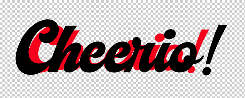
@sqw I was curious how it would look if you tried to just increase the font size. I’m sure there’s a graphic designer out there who can give you detailed reasons why this doesn’t work like drop shadow does… but here you go:
Spacing it just a little bit bigger (175 vs 185) it kind of works, but it’s not an even enlargement
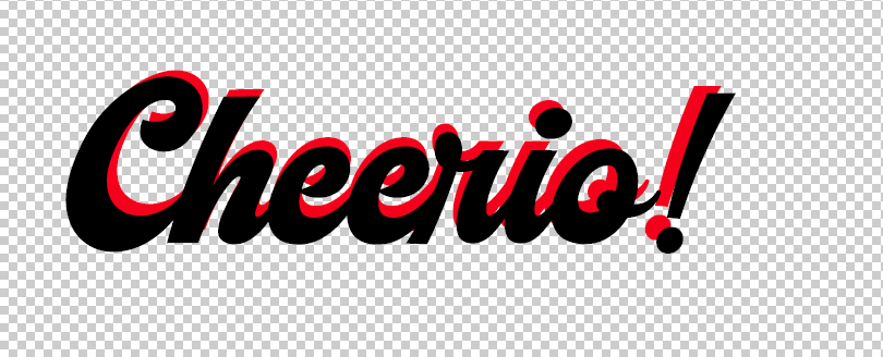
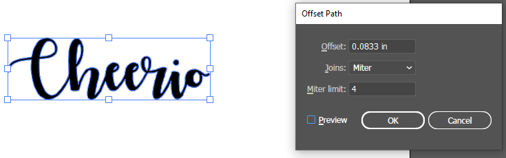
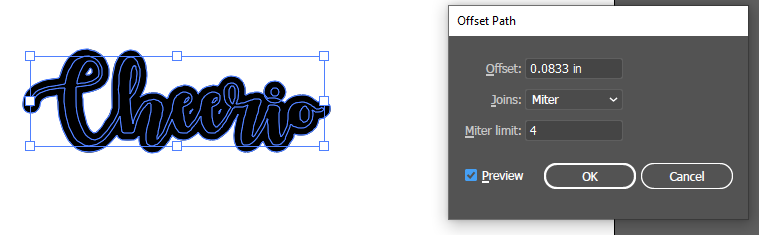
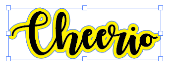
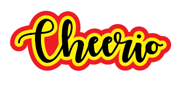
FWIW, i think this is a lot easier to do in illustrator, where you can convert the text to outlines and then use offset path to create the additional shapes.
ungroup and deselect (because you’ll have everything selected).
select just the outer shape (which in this case means selecting twice, to also get the dot on the lower case i) and merge together again (to get that dot merged with the outlined shape). change that outer shape color and you’ll see the two shapes.
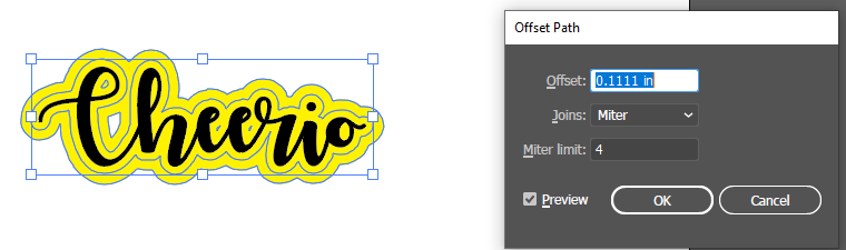
you can then outline that second (yellow) path again to create the third layer. maybe slightly more this time (maybe 8 pt or 0.111").
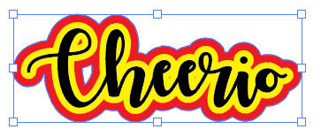
deselect and just select just the new outside layer again and recolor.
our change to strokes for cutting.
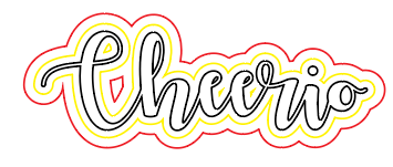
your advantage here is that illustrator is giving you resizable vectors and nothing is pixilated. and offset path uses and algorithm to make that outline symmetrical. and that if there’s something you don’t like, it’s easy to go in and edit a vector line. so maybe i don’t want that spot inside the C of cheerio to be a hole in the red, so i can just delete that.
and maybe the little red spot in the loop of the c, i can kill that too.