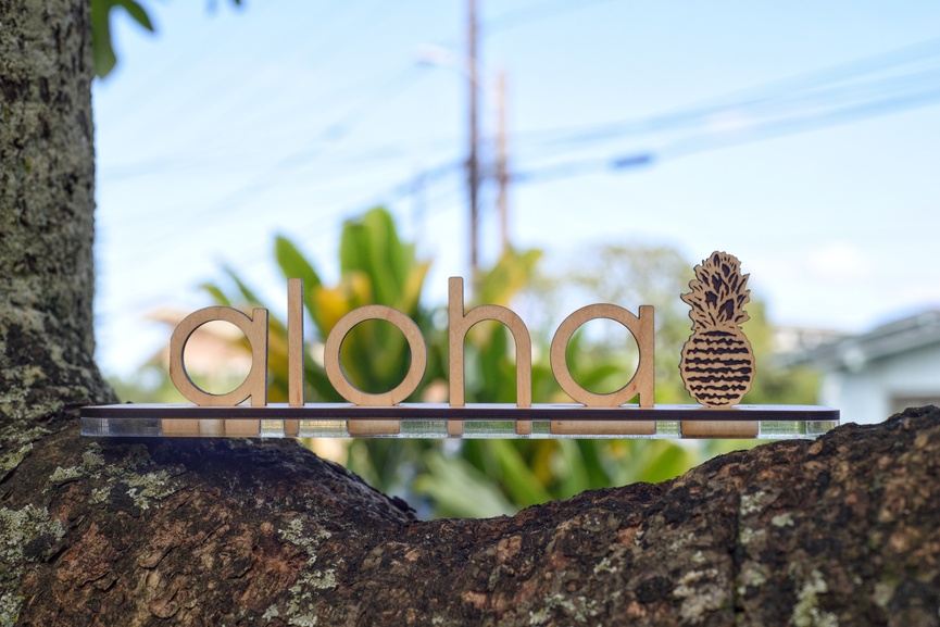
Not all of it was an accidental, but I do like the part that is. I’ve seen similar things like this in the store, but it’s not quite the same as making one yourself, right?
There were two Accidents made when making this, the first being that I measured the depth of 3 sheets of PG, one of which was thick acrylic, but I had scaled the overall project down after making the measurements, so the depth was a bit short on the letters. I liked the look of just the two sheets (since I could only use the two) and decided to roll with it. Without the base PG that I was going to use, I realized I’d be able to put my maker’s mark on it, and see it through the acrylic, so bonus
The second accident was when I went to make it for real and not with the Draftboard. My alignment was a smidge high so the first “a” in aloha has a flat spot on it’s outer edge, as does the base. Not a big deal and hardly noticeable, plus this is version 1 - I would like to make the letters out of thicker wood in the future. Also ordered some little rubber feet for the eventual finished product, but right now I’m pretty happy with what I’ve got!
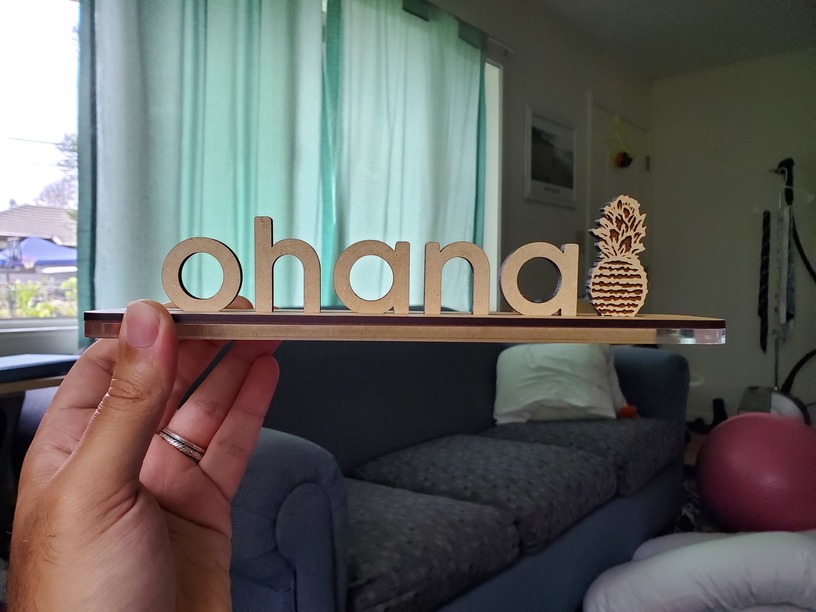
This one. I like that the signs can be broken down, so pressure fit works best, and since this was sort of a test, I actually need too decrease the slots a little so that the pressure is even tighter.
Be careful. There is a bit of give in wood, so tight fits work good. It’s been my experience that if you try to get that same tight fit on acrylic, it cracks/breaks.
I’ve read about that, yeah. I’m not sure that I’ve seen anybody cracking their thick stuff, but that doesn’t mean it won’t happen. The tolerances aren’t too bad for the pressure fit, in the above photo, I left the masking on the base of the letters so that they weren’t too tight, but thanks for the head’s up, especially for anyone who sees this post and may want to replicate it!
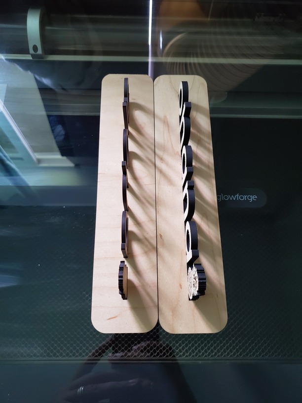
Used a bolder font, connected the letters at the base, rather than having them individually put in, and used thick Draftboard. Here’s an updated photo of the changes: