I’ve seen several posts on this forum where users have made some very nice slate coasters with engraved photos, so I thought I’d give it a try. I’m trying to make a coaster set for a friend that has various pictures of their pet cat. But I’m having a hell of a time handling the grayscale gradients, and could use some advice from anyone who’s had some success.
Background: I’m a longtime photographer, very proficient in Photoshop. I can alter the images easily enough; I’m just having trouble getting consistent results. I’m sure that this is because engraving on slate requires you to alter the images in a way you’d never do for printing on ink. My GF is in good working order, and I have no reason to suspect a fault with the machine. My settings for all the examples shown below are:
Speed: 900
Power: 30
LPI: 270
Vary power
These settings are based on threads I’ve read elsewhere on these forums where users got good results from them. I’m using 4" slate coasters purchased on Amazon, darkened with Tung oil prior to engraving (excess was wiped off and allowed to dry for at least 12 hours first).
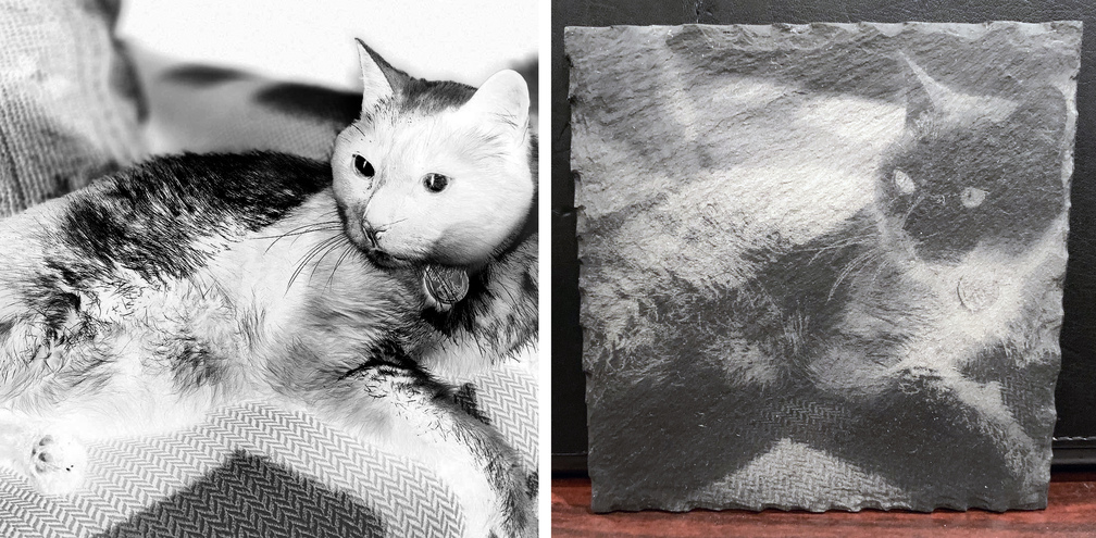
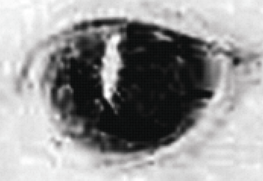
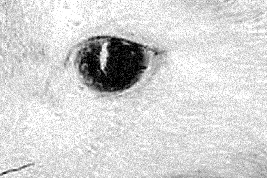
I’ve had very good results engraving simple logos on slate, where you’re just using solid black lines with no gradient. But I’m trying for something more photo-realistic here, or at least as much as you can get on slate. And I’ve had one success that I’m happy with - this photo below. I’ve included a side-by-side image of the source photo, and the resulting coaster:
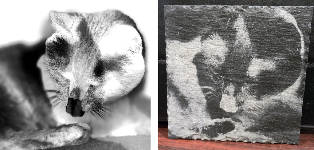
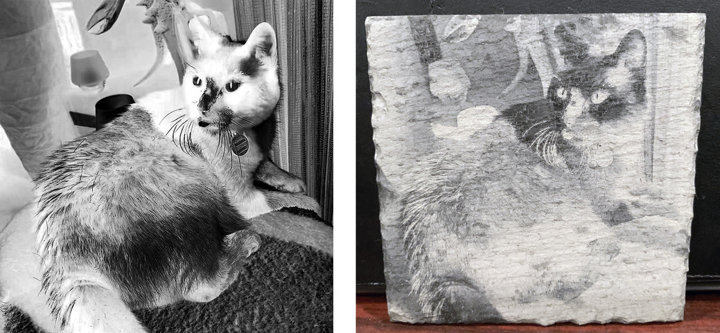
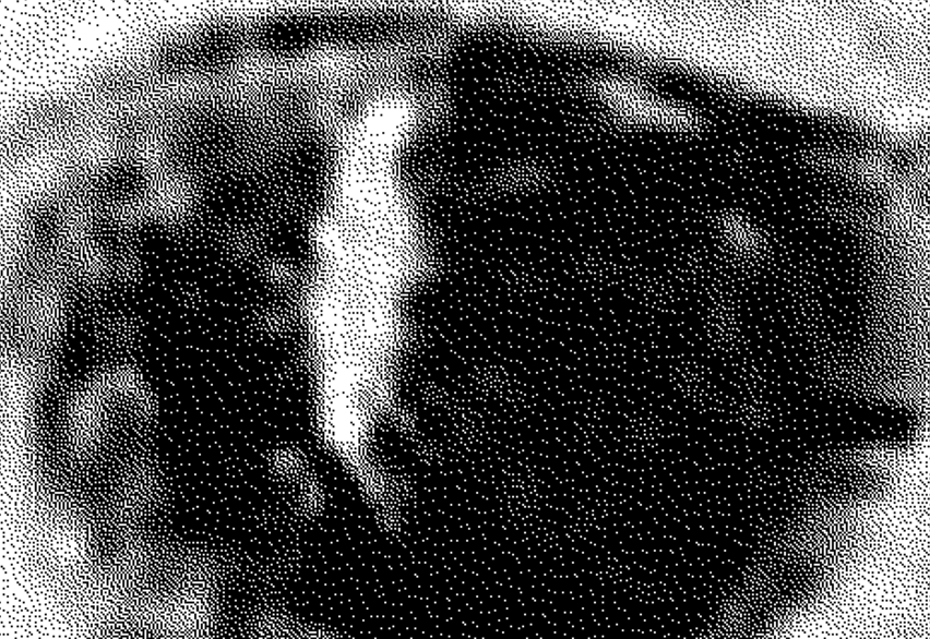
Problem is, I can’t seem to recreate that. The two samples below are examples of the problems I’ve been having. I used the exact same GF settings, on other coasters from the same set. The photos were similarly processed, and I felt I had a reasonable blend of blacks, whites, and grays, with some gradation between them yet enough contrast to show well on slate. But the final products are either too white or too stark, lacking in any sort of smooth gray gradients.
This seems to be a clear-cut case of GIGO. But it seems to me that the source photos for my two failures above are processed similarly to the one success I have at the top. So does anyone have any thoughts or suggestions on how I can process images for more consistent results?
(NOTE: I tried the GF tutorial on processing photos for engraving, but didn’t get good results from it).


 (was allergic to cats as a kid, not sure if I still am - I avoid them… yet, I’m the one they want to rub against???)