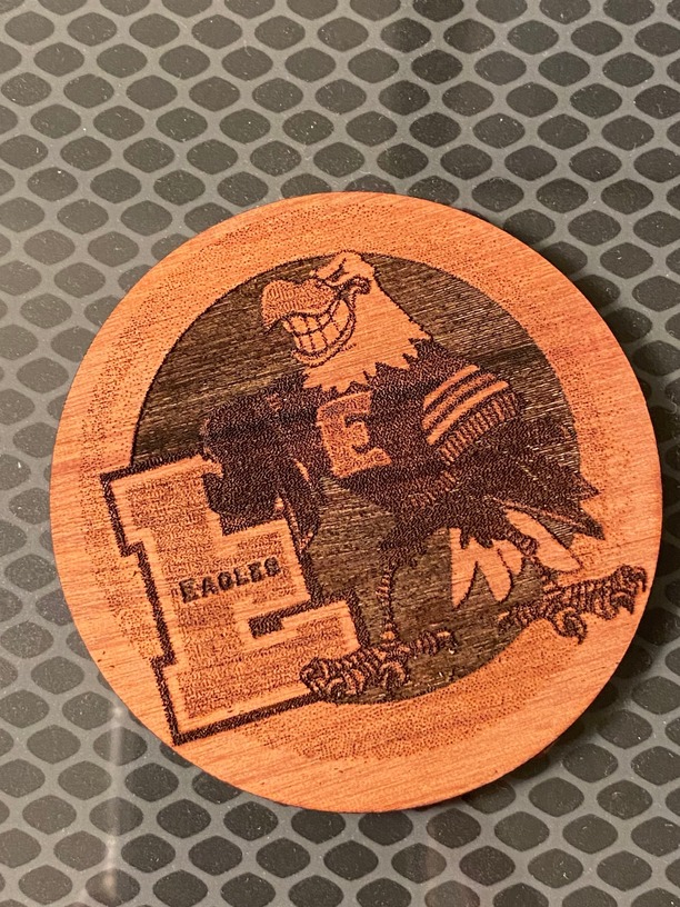
A friend wanted an ornament made of their child’s school mascot so she sent me this png file. I placed it in Illustrator and added settings to engrave and cut around it. It looks terrible though. The engrave looks flat although I can feel it slightly. I’m guessing the problem is in the file conversion?
2 Likes
It does look like there are a lot of extra lines that don’t need to be there. Did you engrave it Vary Power, Convert to Dots, or Convert to Patterns?
I’d suggest trying it Convert to Patterns and see if it looks better. I do like that the scatter effect on the E makes it look like a wool varsity letter!
2 Likes
Thank you! How do I Convert to Patterns? This is the first time I have used someone else’s graphic. I usually use purchased svg files or ones I create from scratch on Illustrator, haha!
2 Likes
Convert to Patterns is in the Glowforge Dashboard, when you select “Engrave”, then the small arrow to the right to open more options. Not in Illustrator 
5 Likes
Oh! Thank you!
2 Likes
It would help to see the original PNG but my first guess is that there isn’t enough contrast. You may also benefit from using a higher LPI.
1 Like
This topic was automatically closed 32 days after the last reply. New replies are no longer allowed.