Well I initially tried engraving my sign by breaking my logo up into four tiles. It turned out to be a major failure and took far too long to engrave. Keeping the tiles aligned was a chore as the UI kept resetting after each job.
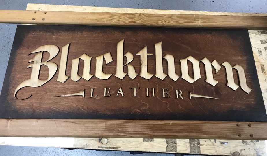
Anyway, long story short I went ahead and just cut my logo out. Much better results for sure and it took less than half an hour!
This is .25” birch ply from Home Depot. I did two passes on the cut as the first test cut left half a millimeter or so of uncut portions.
Looks great! Thanks for sharing this. I have been considering a similar method to create a larger sign than can fit in my Glowforge. It’s good to see an example.
Did I see on Facebook that you cut out the letters but then used the scrap to help you align the letters when mounting them on the backer? That’s a great idea. Any photos of that step? I was wondering if I should feed the backer through to etch a faint outline of each letter for alignment purposes but I like your idea better.
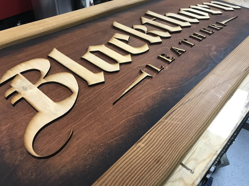
I don’t have photos of that part. I cut out the logo in two steps. The first was BLAC and LEA with the left spike. Repeat for the other half.
Then I was left with a perfect template to align on the base board. Clamped the two together, wood glue on the letters, popped them back into their cutouts. I let the glue set for a few minutes then carefully lifted the skeleton off the letters. Perfect alignment!