Ok, this is weird. I have a logo that is all SVG. However, since it has a white circle over a black solid shape I can’t just put it on the Glowforge because it thinks it should engrave the whole black solid.
I have struggled with this but the only really ugly solution I can come up with is to export it as raster and then put it back in with the outline. There has got to be a better way.
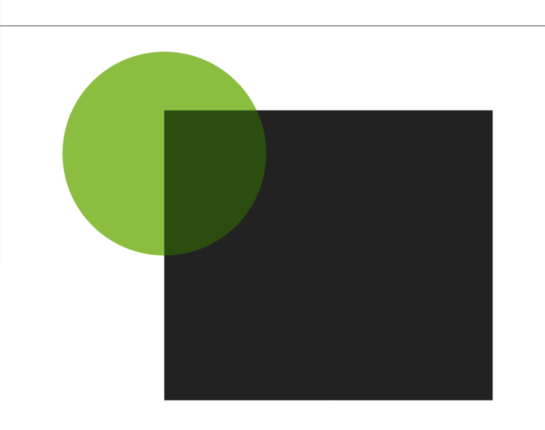
Your eye sees the white on top of the black but the GF (and your software) sees a full black shape and a partial white shape.
What you want to do is get rid of the black part that’s still under the white part.
In Inkscape there are a series of operations in the Path menu. Probably a half dozen options down the list - Union, Difference, Intersection etc. Those are the ones that will take care of it. You want the Difference.
You can use Inkscape help to figure out which object to click first to get to the result you want (since you said you wanted to learn vs just being given the answer).
The tutorial you are looking for, courtesy of @jules, is this one. It comes from the training matrix in the Glowforge Tips and Tricks category, and I highly recommend spending some time in there–it will save you a lot of time and reinventing the wheel!
You also want to get rid of the fill in the white shape unless you are going to engrave it some very faint color.
The general rule is that strokes cut or score, fills engrave. So if you’re filled with anything, including white, you will engrave. (I am luck enough to have no artistic ability and thus no experience with this stuff, so I could learn the new rules without unlearning any old ones.)
I think you’re going to have some unexpected results with this - or results that may not be as clean as you want them to be.
I’ll show you a few things that I see in the file (and sorry in advance if this makes life more difficult) I’m not an Inkscape expert, so I can’t really tell you how to accomplish any of this…
You’ll want to scale the image down, I believe. It’s showing that it’s 120" across, approx. 96" down. Maybe that’s just because I opened it in Illustrator and there is a weird conversion going on. If so, disregard. However, when I upload to the UI, it throws it way down off the bed and you spend several minutes trying to resize and bring it back up to where it needs to be.
Text: You’ll want to make sure that any text you have is converted to outlines, which should be an option when you save as/export to SVG. The UI won’t process text at this time, and either way - converted to outlines you’ll be assured of WYSIWIG.
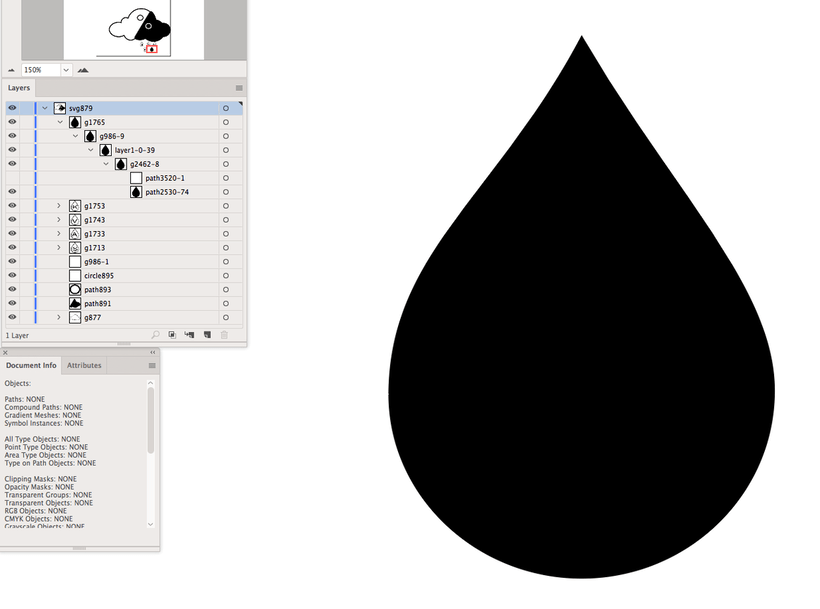
On the raindrops, to make the white middle - a duplicate raindrop filled with white has been put in place. All you need to do here is go into the raindrops, delete the white shape, remove the fill from the existing black shape and add an outline. What the glowforge is going to do with that is create a cut or score (I imagine you’d want a score), which will be a thin line. If you want it thicker, increase the size of the stroke and then you can “expand” the stroke (or whatever the equivalent is in Inkscape). I uploaded an image where you can see all of the layers and I hid the white shape so you can see what’s going on with the actual raindrop shape.
You’ll want to do that for all of the raindrops, and then you should be ok with the text engraving in the middle.
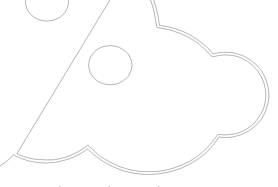
You’re going to have an issue with engraving the black portion of the rain cloud because of how strokes have been used to fill in and hide certain areas. To see this, go into “Outline” mode (or whatever the Inkscape equivalent is. See how you have a gap between the engrave outline for the cloud and where the real edge of engrave will be?
When you send it to us, we don’t have the same fonts installed as you do - so you have to convert the text to a shape so we know what to do with it.
The advice here is spot on. You’re dealing with one of the more challenging design problems - converting a vector design that was created to be consumed by an eyeball and translating it to be consumed by a Glowforge. It’s easy to design from scratch for your Glowforge but much trickier to convert! Hopefully this gets you on the right path.
I only worded it that way because I believe that’s how the job error is described in the UI. Just for reference - might consider changing it at some point if support for fonts/limited fonts won’t be included
Either way - the best practice is definitely converting to outline. One less variable to go wrong and you know that you’re getting exactly what you want without external interpretation/translation.
I’d add that this isn’t unique to the Glowforge - it’s a laser or CNC issue. Text needs to be converted to paths and “stacked” items need to be flattened. People are used to a print view of things where WYSIWYG prevails and white is not printed. It’s always a topic in my laser and CNC classes. It’s easier to see and understand it for the CNC because they can see the tool eat through the shape and then realize there’s nothing left for the part that’s on top
By default, these programs all default to a method known as knockout, which means an overlaying color “knocks out” the color that is beneath. This is possible because 1) a lot of graphics are just for web use, 2) the image will be processed by RIP software just prior to printing (raster image processor).
The RIP software does just what the name implies, it converts your artwork to a raster. The equivalent would be saving your work as a PNG, JPG, EPS, TIFF, etc. Your printer is essentially acting like the Glowforge in engrave mode.
I think the Glowforge has some cloud RIP capabilities, but not extensive. And then it’s complicated by throwing in true vector pathing for other parts of the project you don’t want engraved.
Two things help a lot with seeing what will happen: the outline mode, which drops all appearances (strokes/fills/custom appearances) and just shows pathing. Then, you can see where paths overlap. You just have to remember which paths are filled and will be engraved and how that will impact the work.
The other is one I don’t think that’s been brought up here: overprint view. It might not be a great tool to use here since it requires a little bit of effort to set up and design with.
But, it will effectively show you visually where you’re going to have “overprint” issues… it simulates an overprint view that basically says, you’re going to overlay these ink colors and this is what will happen. I’m not an expert on it because I really haven’t used it much in my history with Illustrator - but it seems if used properly, it could help identify some issues.
Hmm. One could probably just set up a design with something like 50-60% transparency assigned to everything and it would be easier than using the overprint view.
Is there any reason why overlapping fills can’t be process the same was as InkScape does when they are rasterised? Then it’s no longer a surprise and a challenge.
Thanks to everyone for all of the help!! I struggled with it for a while but now have a clean vector image (and more importantly a better understanding of some of the dark magic needed.)
It’s hard to define this in a predictable way. So a white circle on top of a black circle subtracts it… what about almost-white (like RGB 1,1,1)? What does a blue circle on top of a black one do? If it subtracts, then how can you tell it that you want to double-engrave? If not, why is it different than white? What if you have something that’s partially transparent? How do you deal with strokes that are really thick - should they be engraved? How thick before the behavior suddenly changes?
It’s fun to play with these, and it starts out easily enough, but pretty soon you’re mired in the edge cases.
We spent many hours working through combinations of behaviors to give “what you see is what you get” results. Then, for now, we decided that it was better to have simple, predictable rules for designing for laser, than have really complex behavior to adapt existing designs.
And if all else fails, you can always rasterize your vectors to get them to WYSWIG.
I think that is exactly what the GFUI should do when you engrave an SVG file. I.e. render it just the same as a browser would, including strokes, etc. Then convert to grayscale and treat it just the same as a PNG or JPG.
When you are raster engraving the artwork should be treated as a picture. It shouldn’t really matter what file representation is being used. An SVG picture shouldn’t be treated totally differently just because SVG is used to represent vectors in the cut and score modes.
I don’t think that is what we want. Right now you are able to have one SVG that mixes vector (for cuts) and raster (for engraving). If it treated everything as engraving, you would have to line up multiple files in the GFUI which would be horrid.

 to get to the result you want (since you said you wanted to learn vs just being given the answer).