So I am forcing myself to take time and really concentrate on learning either Inkscape or Affinity Designer. Making text and outsetting in Designer seems a bit more complicated that Inkscape but in doing the initial reviews, it looks like AD may have more/better features. Anyone have any suggestions on which one would be better so I can focus my attention on one or the other:-) I already have them both.
Thanks for any advice…
3 Likes
@geek2nurse speaks both, she started in Inkscape and switched to AD. She may have a more informed idea here than I do…
That being said, I’m an Inkscape user and have yet to find anything I can’t do with it. To me, it’s a bit like the old adage about cameras: the best camera is the one you have on you. What I mean is that I think either can be quite effective if you’re familiar with how to use it.
If I had to pick the one thing that has made me reluctant to try AD is that one of the common issues I see is image scaling with the GF UI. There have been many threads about how sometimes the files coming out of AD require some careful processing to ensure that the UI doesn’t interpret their size incorrectly.
To be fair, older versions of Inkscape had similar issues, but it’s all fixed now. The older advice of making a specific page size and saving as a plain SVG are out of date and are irrelevant with current versions of Inkscape.
And lastly on sizing, if you’re downloading SVGs from the internet at large, you need to be careful of the file details. The DPI setting in the SVG must be 96, the UI will scale incorrectly if it isn’t. That’s independent of what program you’re using, so it’s possible that the resizing issues we’re seeing coming out of AD lately are caused by starting with an incorrectly configured original SVG from someplace like etsy.
Anyway, I guess that the bottom line is that I have yet to need AD so haven’t messed with it. If you’re a blank slate on both of them, I think its down to choice – whichever feels right in your hands, you know?
6 Likes
Thanks for the input:-). I am still tending to go back to Inkscape since that is what i started with. I do have problems with making a union of 2 circles then adding a name in the middle of that. Not sure what i do but have trouble everytime and end up editing nodes to accomplish it-which is time consuming…
2 Likes
Glad to see this conversation come up, rvogt because I am getting sick and tired of Inkscape freezing and crashing. I have the latest Mac OS and Inkscape 1.1 and it’s very frustrating when Inkscape quits, several times, in the middle of a design.
I purchased AD (and Affinity Photo) a few months ago when they were on sale but have not dug into either one yet, hoping someone here on the forum can convince me the best course to follow.
1 Like
Can you show me a finished version of what you’re up to (one of the ones that was tricky but you got it done), and I can lay out how I’d approach it?
For what it’s worth, like many others I started out with Inkscape. I had never before in my life used a design app of any kind four years ago, so everything was new to me. I felt the same way…that I needed to find one app to learn, and to learn it the very best I could. I’ve always been a Mac person, and Inkscape seemed too ‘windowy’ to me, so I bought AD very early on and dove in. I can’t recommend what anyone else use, but for myself I love AD. There were a few things that people could do in Illustrator that AD didn’t do, but I worked around them. I didn’t want to pay a subscription nor the huge price for AI. I certainly don’t ‘know it all’, but if there’s anything I can help with in AD, please don’t hesitate to ask.
Regarding this;
If you decide to go with AD, this can be addressed first thing and never be an issue again. It’s not so much ‘processing’ as it is merely a simple resolution by creating a ‘preset’ specifically for the Glowforge. As @evansd2 mentioned the reason there are so many threads about it is because some people still don’t know how to fix it permanently within their settings
.
5 Likes
I abandoned Inkscape for AD 4 years ago and have never looked back.
4 Likes
I am a lot more comfortable now with AD than with Inkscape. The scaling issue is just a matter of having it export at the correct DPI, which is simple enough. Or just export as PDF, which also converts your text to vectors for you so you don’t have to worry about that step.
I think pretty much the only thing I miss about Inkscape is being able to break a line and join one of the pieces with another line. The node editing features are getting better all the time, though.
2 Likes
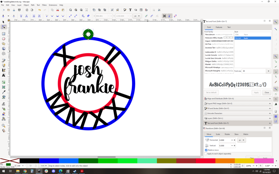
@evansd2 Here’s an example of something I was having problems with. I made the two circles then added the Roman dates and the names. I was able to do a union on the names, but when i tried to union everything together, I just can’t figure it out…so, i go in and break the paths on the circles and the names/numbers and ‘make’ it work…but way more trouble than i know i need to, just can’t figure out how!

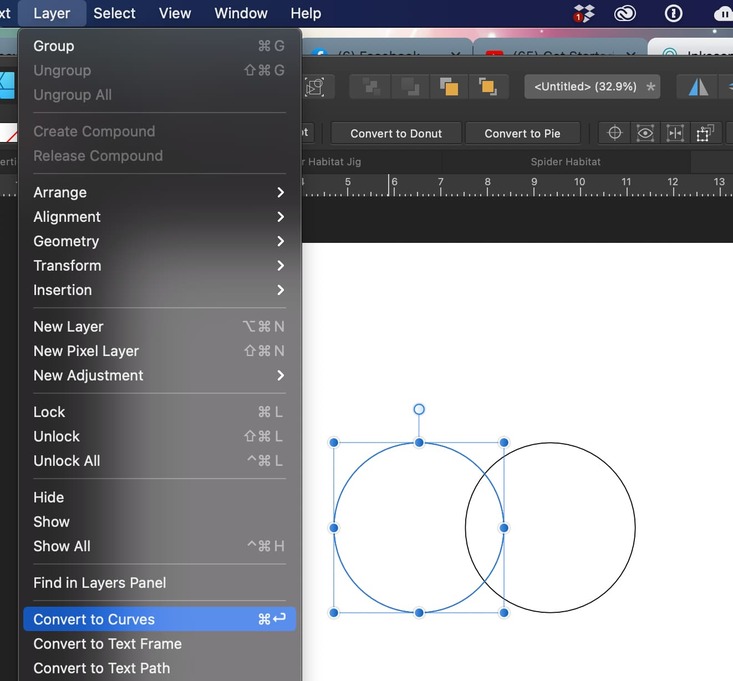
Convert the circles to curves before you try to union them. Same with the text. Here’s how I do it in AD:
First, create your circles, select them, and choose Layer → Convert to Curves. (I have only one selected in the screenshot, but you can hold down Shift and select them both by clicking on each one, then convert them at the same time.)
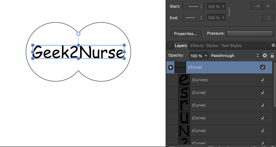
Next add your text. (I’m using Comic Sans here, because I know how much @evansd2 loves it!)
Select your text and convert it to curves just like you did the circles. You will get a group containing each letter as its own curve.
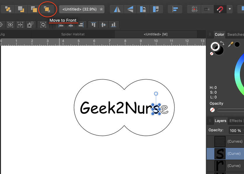
I like to ungroup them and work with one letter at a time, because sometimes subtracting can be a little fiddly. The important thing to remember when subtracting is that the shape you want to subtract has to be in a higher layer than the shape you’re subtracting it from. So my workflow is: Select the item to be subtracted, move it to the front
(buttons in the center of the top menu), hold down Shift, select the shape to subtract it from, then use the Subtract button at top right.
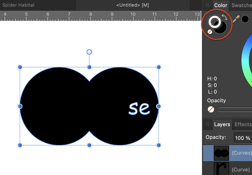
To make sure things worked okay with the subtract, click the little curved arrow in the color menu to change from outline to filled shape. Sometimes multiple letters or letters with an inner shape won’t subtract correctly from a complex shape, and you have to break them up into smaller components and do it in smaller steps, but the logic is improving with each upgrade to the software.
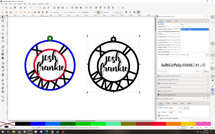
If you’re brave and want to save time, you can combine multiple letters into one shape and then subtract them all at once. It worked fine this time:
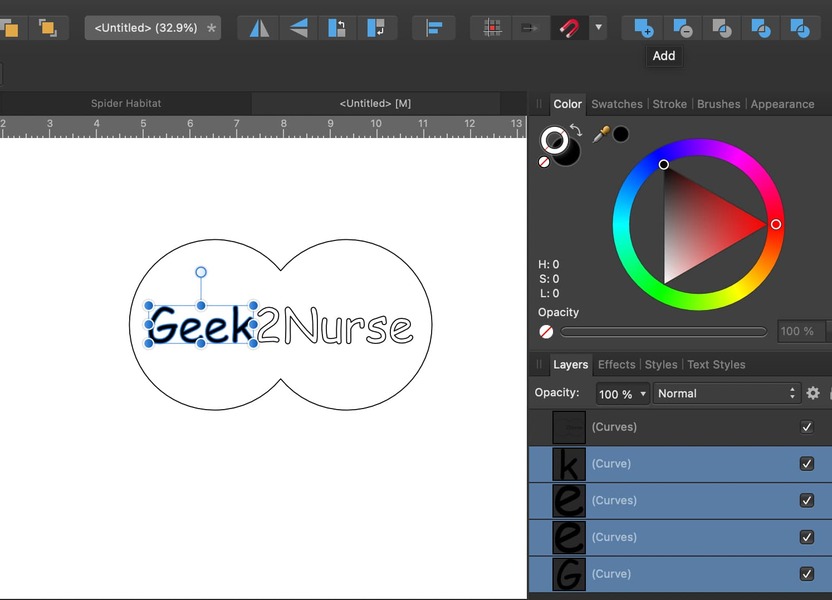
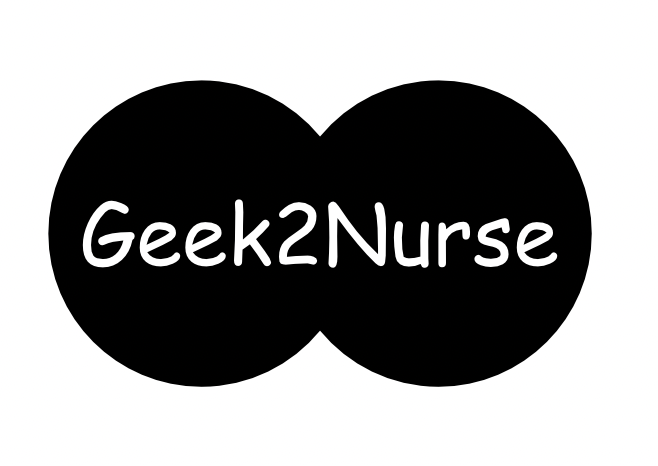
And here’s the finished design:
3 Likes
So your circle is ‘filled’ but will still cut okay? I need a ring around the name with the name part of the ring-make sense?
So i just tried this!! And, it works:-) Thank you guys so much! @geek2nurse I wasn’t converting my circles to a path! Appreciate the help.
Hang on…it ‘unioned’ it but if i cut it out, it will cut out the name from the ring…
sigh…the image is there, you just can’t see it…and i’ve forgotten how to fix that!
1 Like
I also strongly prefer AD to Inkscape, because I find it to be much more intuitive and friendly for the type of design work I do. In particular, working with fonts in AD feels like a radically better experience. By way of disclosure, I have AD, Inkscape, and Silhouette studio. I spend about 90% or more of my time in AD, but occasionally switch a file to Inkscape or Silhouette studio because they have a few features where they shine over AD. I don’t think AD supports image tracing yet, but Sil. Studio is excellent at it and Inkscape is good, too (although more work than SS).
3 Likes
one thing to always keep in mind whether it is Inkscape or AD, there are bazillions of tutorials on youtube.
3 Likes
If you’re cutting the circle but not the name, you don’t need to do the subtracting part (subtracting the letters from the circle). Just make the letters a different color from the circle so you can set them to score/engrave instead of cut.
EDIT to add: I assumed you were wanting to engrave around the name, which is what my artwork would do. 
1 Like
Oops, just saw your sample; that’s a whole lot different than what I envisioned from your first message. 
1 Like
No, it doesn’t. That’s one thing I really wanted. I wrote to the developers early on, asking about this feature. They replied that they are working on it…but, that was quite a long time ago, now.
1 Like
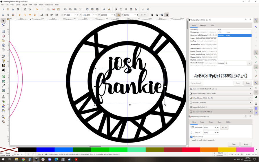
OK. So this is a simple project when it comes down to it, but it does require a lot of steps to get it done with tight control and precision, so here’s how I would attack it.
Start with your art. measure the desired circle size, and match it. I made my circle have a stroke width of 0.1", again, matching your art.
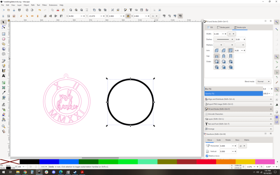
Repeat for the inner circle and align.
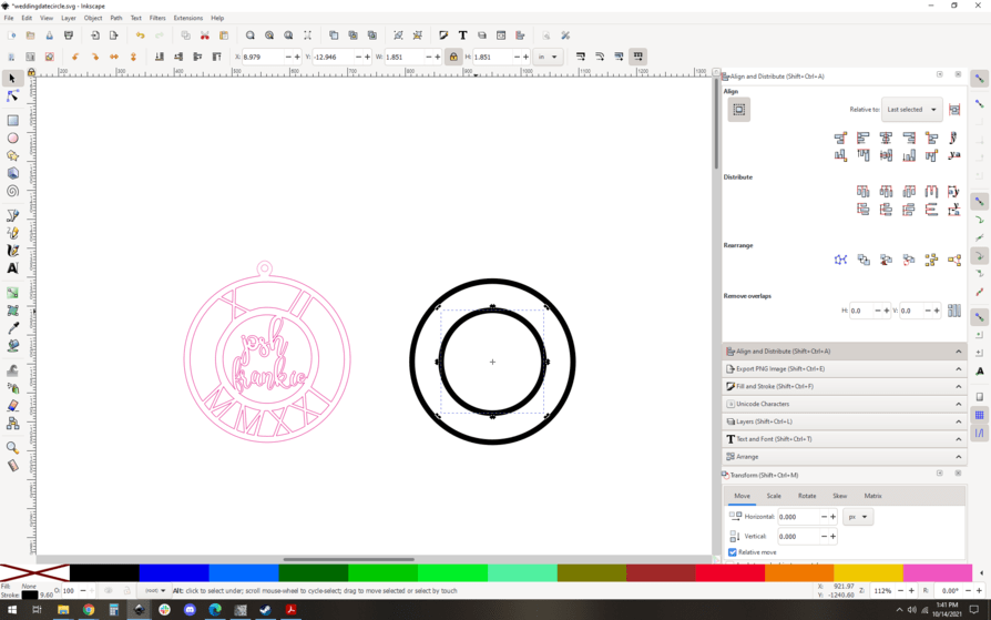
Use the text tool to write your roman numerals.
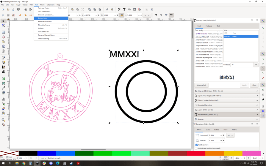
Put the text on the path of your outer circle. Oh no, alignment is wacky!
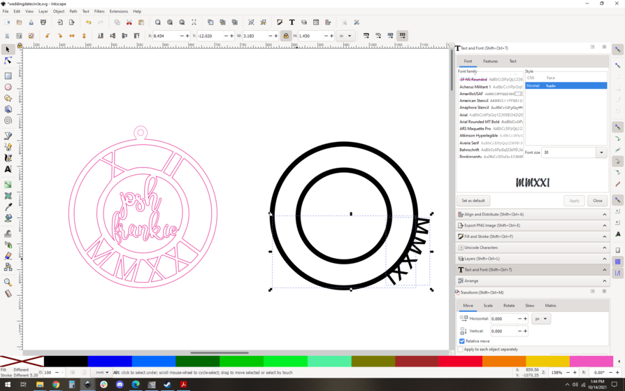
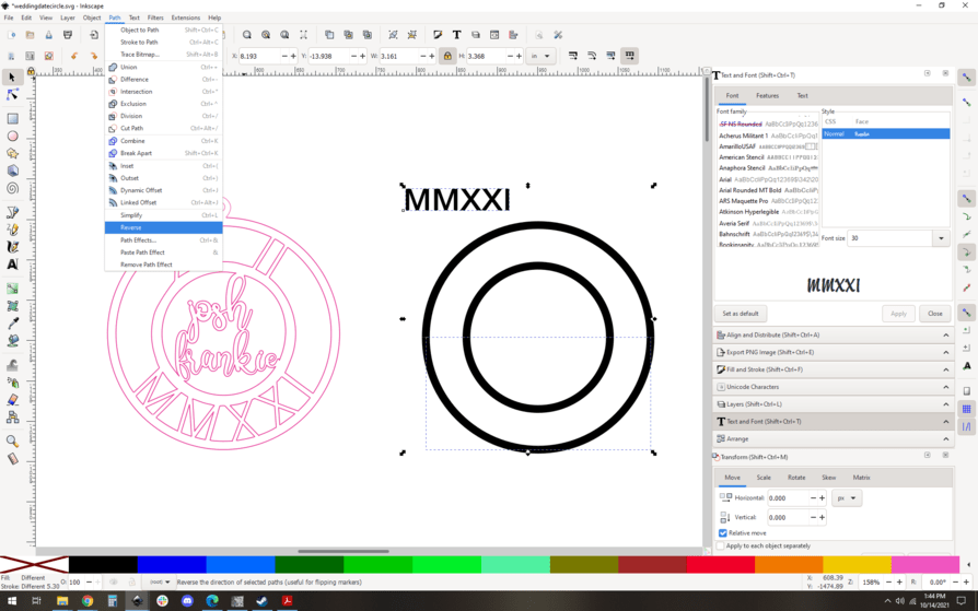
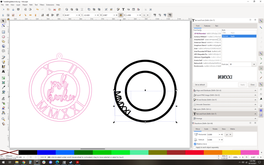
This is about the direction of the path. To fix it, I break my circle into to halves (upper and lower) using the node tool. Then I use path->reverse to flip the direction of the lower half of the circle. Then, put the text on path again:
Much better, but it’s way over on the left and too small and too close together. One thing at a time.
Fix the size…
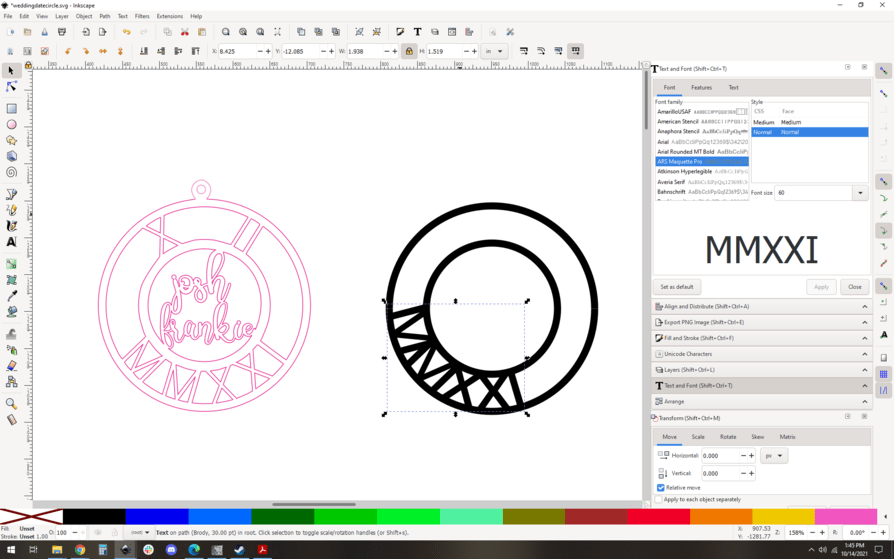
Fix the spacing… (I just added a space between each letter, easier than fooling with kerning settings.)

And now we fix the rotation of the text. You can do it a few ways, but I am going for max control so I am actually going to manually rotate it. Step one, find the rotation center you need. Snap nodes to the center of your circle… Turn on center snapping and pull nodes in.

Now turn on rotation center snapping and select your text. You can see the rotation crosshairs (small black plus). Grab that and snap it to guide your crosshairs.


Now, you can freely rotate the text to the correct spot…
Looking good! I want to convert that text to paths now, the standard way: path->object to path

Ungroup (note the letters are all in their own selection boxes now)

and union. Now the “M M X X I I” is one path object. Excellent.
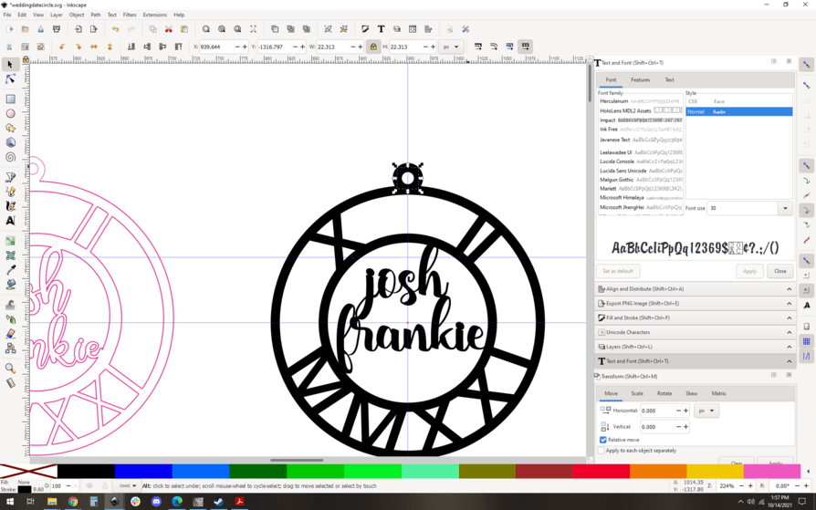
Repeat the process for the roman numerals on top. I won’t bother with the steps here, it’s exactly the same. I made the X and II separately, and rotated them manually using a guide to keep them aligned correctly. (note the guide at the center bottom of the X and the center bottom of the II)
Now you add your text, sized and aligned as you see fit.
Lookin good! Convert that text to a single path, much the same way as we’ve done before: object to path, ungroup, union. (control-shift-C, control-shift-G, control-shift-plus. It takes literally 0.5 seconds with practice), Make a small circle loop and align it to the top of your original circle…
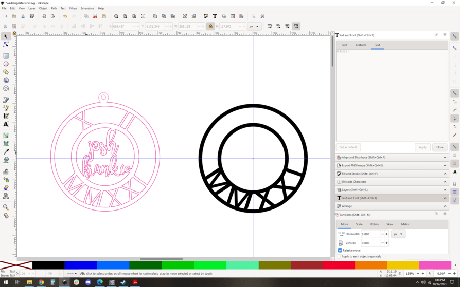
Great. Next we convert the circles to filled shapes: I color coded things so you can see how we have left things. Remember how we split that large circle into two parts? First thing up, we heal that by joining the nodes:
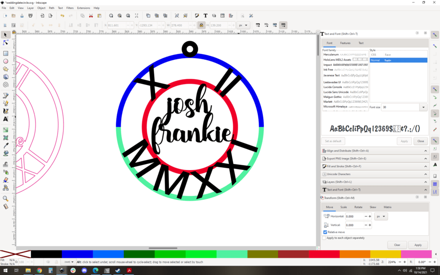
Now we have three circles to convert to shapes. Select the black loop, the inner red circle, and the blue circle, and do Path->stroke to path. You’ll now have filled shapes.
See the loop at the top with the nodes around the outside? Filled shape.
At this point I like to copy the whole thing and paste a new copy. This will let me keep the constituent parts separate incase I want to edit it later, but it’s optional.
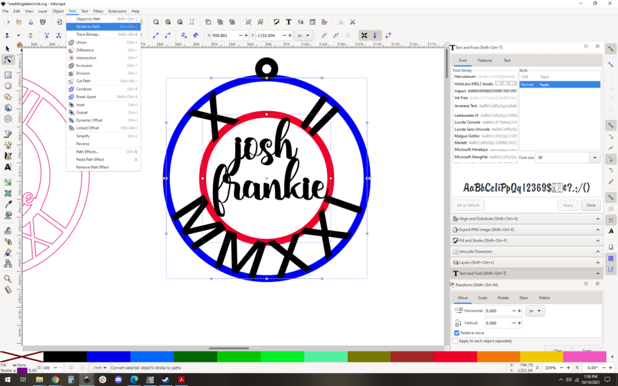
And now the final step: select everything in your copy, and do a union. They are immediately joined into a single shape, and you’re done! (on right)
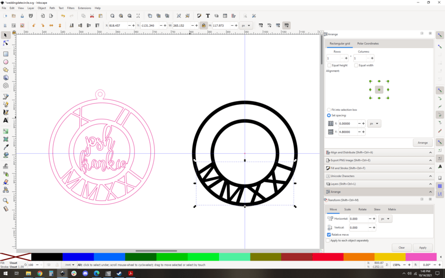
Now if we’re prepping this for a cut, you want to get rid of the fill…

Then since it’s best practice to cut from the inside out we want to color code it. First, we break it apart (control-shift-k)

then select the outer shape and change its color…
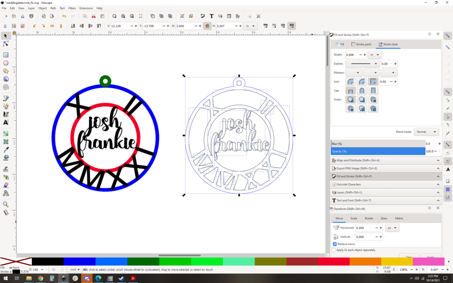
And then if we’re being super precise and want to keep best practices, let’s group the whole thing back up, so you cant accidentally move individual parts.
And that’s it! The skills here are quite basic: snapping, rotation, object to path, text on a path, etc… but they do need to be handled with some care and rigor to get it just right. You could cut corners and get it done a little faster at the expense of perfect alignment of things, but the steps are largely unchanged.
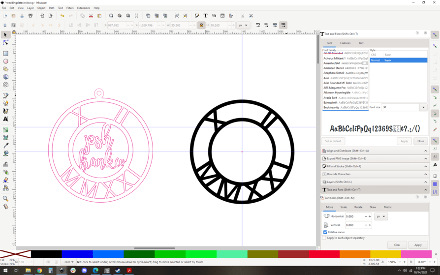
Here’s my revised SVG if you want to play with it:

6 Likes
I have found that having both a pixel editor and vector editor to be of need eventoally. I use Gimp for pixel editing (and it does the best in making vector outlines) then I use Inkscape as a vector program. But I am using Windows. If you are using a Mac things might be different.
Rant
I am quite sick of such folk charging fees that you cannot buy the program and be done with it. As much effort as it takes to use a program well, to then waste all that effort when you can no longer use that program is pure carp.
With programs like Inkacape, Gimp, or Bleder it might be a bit harder to learnbut it will be more effecient once you have done so, and the only cost is the effort to do so.