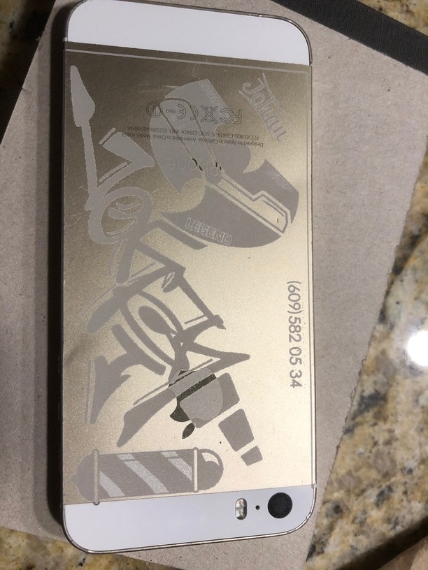
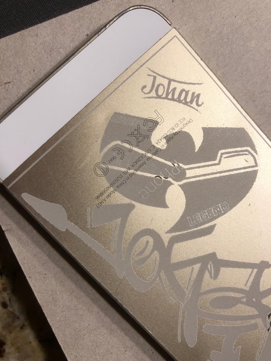
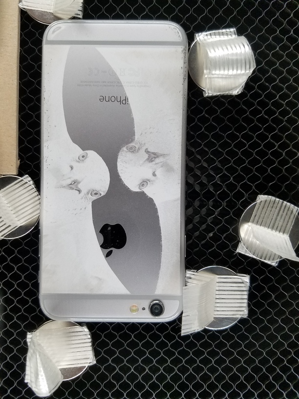
Not much progress tonight, but thanks to @JeremyNielsen for settings and my local iPhone repair shop, I tried etching. It’s much less stressful when it’s not a working iPhone. The artwork is from the phone shop owner. The process I used was first to scan the phone and bring it into Illustrator so that I could avoid the Apple logo and other lettering. Ultimately, didn’t matter because I couldn’t manipulate the artwork anyway. I measured the back and sized the artwork to fit, then created a cut line in a second color. Saved svg. In the GFUI, I ignored the image, set down some chip board with magnets and cut just the border. full speed, 10% power. Then switched and ignored the cut line, and setup the image for full speed engrave, 99% power and 340 dpi. - ERROR.
The GFUI didn’t like that I inverted the colors of the image. The original artwork was white with black background. It gave a fix of a screenshot and then upload new artwork. I think that was my downfall. Even though I aligned the new image with the old and ignored all the right things, it’s still a little off kilter and there’s a border. The border is in the screenshot, not the svg.
It’s close enough to knock their socks off tomorrow. Now, to figure out what my charge is to do on working phones. Gasp.
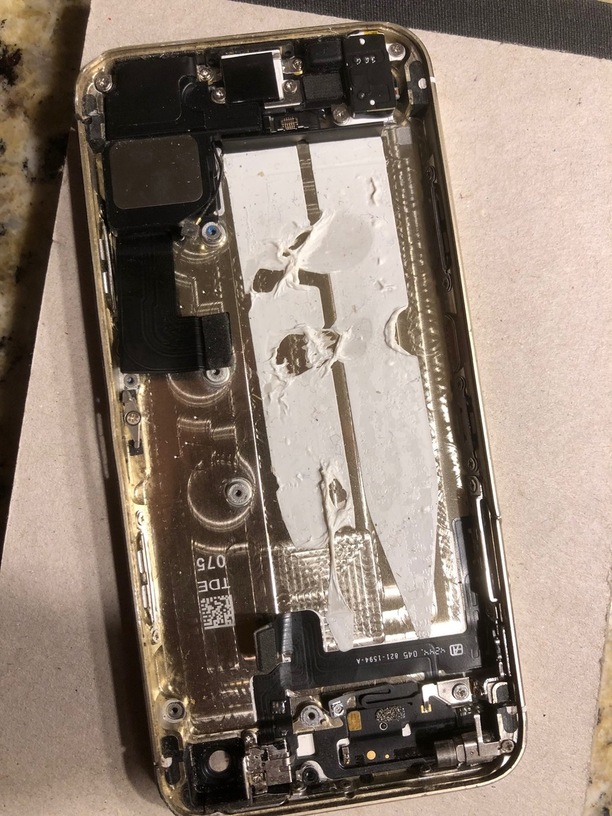
I worked in a cell phone repair shop for a year and a half. I loved it; in fact, I had been working in the shop when I saw the Glowforge announcement video, and originally we wanted to use my laser to do things like this. Seeing the inside of this iPhone makes me a little nostalgic Anyway, that was two years ago, and I live 2950 miles away from there now That would be really cool if you could continue to get the casings to test out on!
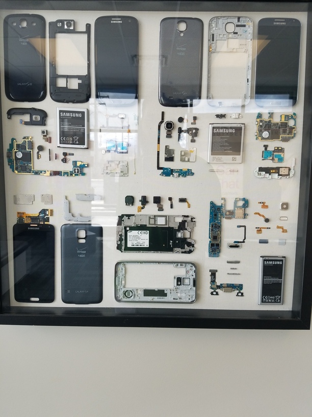
Here’s a pic of a shadow box I had made while working there
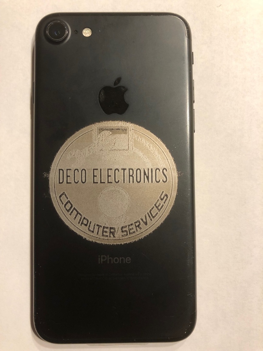
I took last nights etch to the phone store owner and he was pleased. Not quite as ecstatic as I was imagining he would be, but enough to give me a new task. A working phone, (I love not practicing on phones that matter to me). iPhone 7, black with his company logo. He wants to market it to his clientele. Price, no idea. My son is jazzed by it too and wants to market it at school, but I’m not happy with the result yet. And, I need to write up a disclaimer!
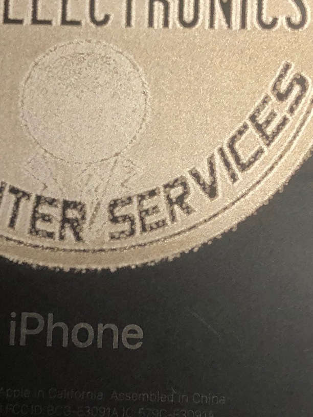
Grays don’t render all that well. You will see the close up looks like splatter, but it’s a gray ring. Also, the gray images within the logo didn’t render hardly at all. So, I would say black and white would be ideal. But, maybe the power is too high? What do I do with the gray scale slider in the GFUI? Would it render grays better if I slide it to mid-range? But, would it still render the blacks?
You’re into new territory here, but i would consider making the logo black and white in a separate photo editing program like Photoshop before bringing it into the laser.
Yes. It was color and I made it gray scale in PS. I think straight black and white would be better. I’d have even more control if it was a vector or I created it myself. That way I could charge even more.
Correct. Anodized aluminum (and iPhones are a variant) are like slate and other monochrome types of devices where you’re marking and not engraving - it’s either burned or not burned which means grayscales don’t translate well.
But, this is also a place where high LPI pays off. Something like 450LPI is noticeably better than 275 even though you aren’t getting anymore depth. I expect you might get the same effect from multiple passes but it’s easier just to bump the LPI. You’ll get smoother “engraves” (markings). If grayscale is important, you need a half-toning approach like the dot graphic selection (Floyd-Steinberg).
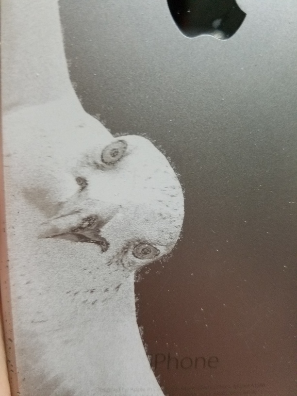
It’s probably not as blank white as you think - there is a lot of noise in white images that we can’t see but the computer can.
If you want to make absolutely sure of it, remove the bird from the white background and use transparency as a background. (Save it as a PNG image instead of a Jpeg.)
Are you using Photoshop to clean up the image? There is a trick I use after removing an image from a background to find little stray marks - use the Layer Style menu to add a thick stroke temporarily to the layer that the extracted bird is on - it will show stray marks in a horrible way, and then you can erase them.
just a though, under grayscale are you using “convert to dots” setting or “vary power.” Mine is vary power and I am getting grey just fine. I am however getting banding issues.
jules- you were right, there are some artifacts. I assumed after doing a vector mask with no feather (in photoshop) that I would get a clean image. I will try again with other images later.
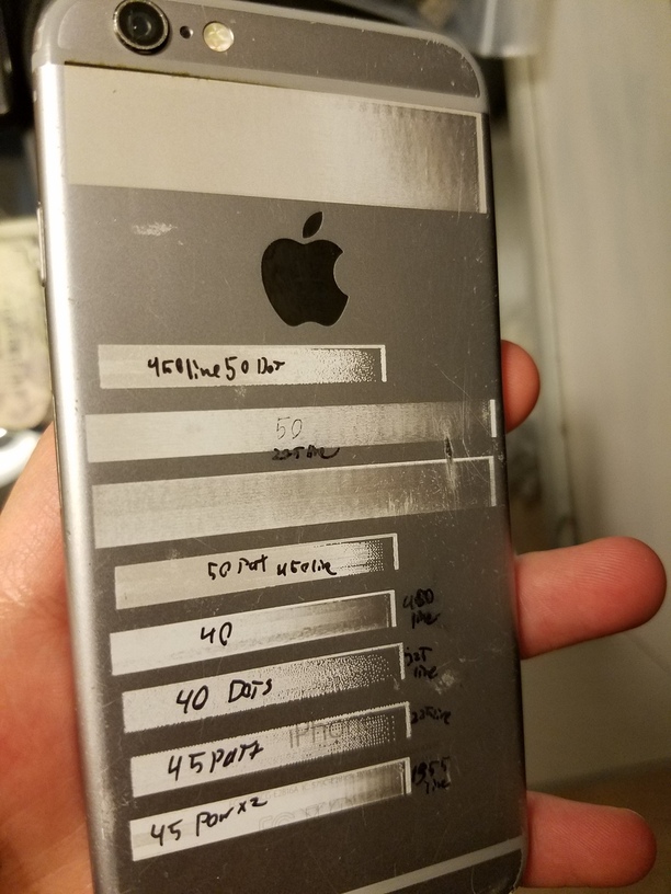
one thing I would like to know is in my tests (above) the last one has a spot right at the end where the power should be <1%. there is a 100% black line at the end of each to tell me that this is where it ends and it should be 0% just before. Any ideas?
Can’t say that I remember. This was during the time that I was kind of just winging it. What can I laser next? How about a phone? I wasn’t keeping track the way I am now and I haven’t done another phone. I now have a new benchmark to strive for thanks to your trial.
@imahappylewis I just went back and read my whole post. What were all your settings and the power? What did you do with the gray scale slider? Or, is there something different than a slider with “vary power?”
the options under greyscale for vary power is that you can choose minimum power, I wanted to be able to go to complete 0% so i left it there.
in my gradient test image the speeds were all 1000 and the power level was marked ( 40, 45 or 50) the un marked at top was full power.
under greyscale;
pat=pattern
dot= dot ( obvious but I’m trying to be through)
otherwise it was very power.
the mddle unmarked was a 40% 2 pass that u cut half way to see the difference.
and the bottom was a 2 pass.
the lines per inch are marked on the bottom 4 to the left (if you can read that) the bottom one was 1355. (had to try max)
I also tried something risky. I did a second pass at a different LPI to fill in the gaps as it were.
I think that I just need to lighten the image then ill be good.
Any comments?