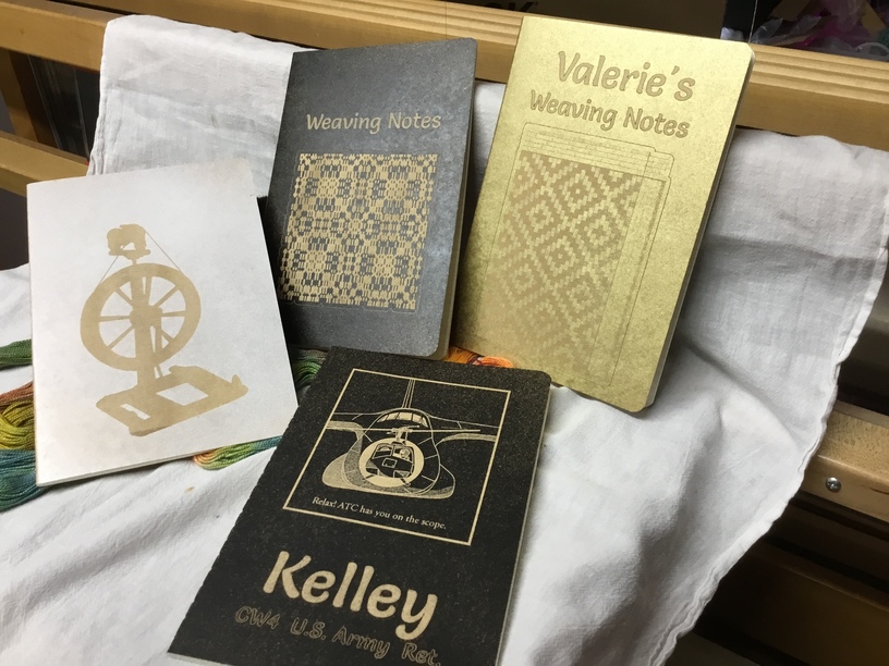
There are various types of small journals on Amazon, that have kraft paper covers. I’ve made a jig on the honeycomb so I can just slip one in after the other and print a new design (weaving notes).
I found engraving directly on the covers makes a too-subtle design; more tone-on-tone. I used black, white and gold spray paint first (lightly, from above, so you make a paint mist that sinks down onto the paper) for better contrast. I finish up with a coat of spray shellac. This gives a supple feel to the front cover.
There are no commercial markings on the back, so more room for design!
and @arh2 and @JimmyWayneWestie, thank you! The aviation graphic is one of the first things I drew on my Fat Mac (Apple’s 2nd Mac in the product line) in 1985. I traced a cartoon from an Air Force magazine on acetate, taped it to the screen, and copied it in MacPaint. My version has an Army UH-1H (Huey) helicopter, with me taking an instrument checkride in flight school. That’s a C-5 behind us.
When Illustrator88 came out, I bought it and updated the drawing to vectors. It holds a special place in my memories of white-knuckled flying as a student.
Thank you! The covers are a natural pale gold. On the covers displayed, I just spray one color and follow with shellac. Last night I did one that looks like golden-black, but it won’t work on all designs. It needs big engraved areas, not fine marks.
I misted the cover with black (not 100%, but more like 90% and not thick) then immediately applied a very light mist of gold. Striking, but chose your design carefully. I found that if I just scored the word, it was only readable in full-on light.