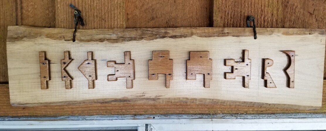
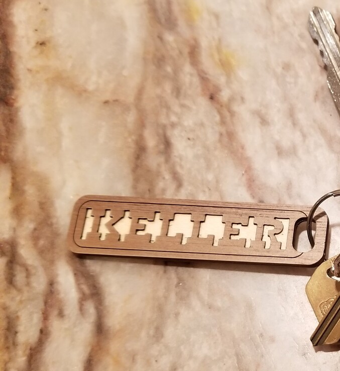
If you have trouble reading it look at the negative space.
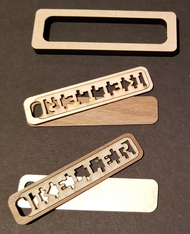
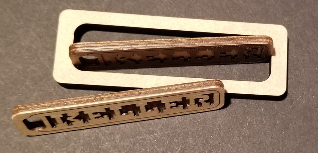
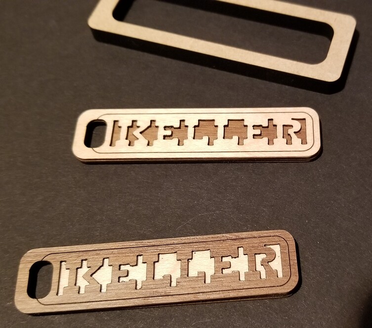
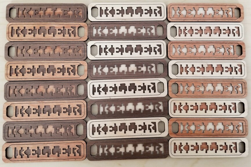
I’ve been wanting to make my own version but decided I’d start by making a keychain. After getting the lettering in InkScape I made the keychains using 4 layers of PG Veneer Maple and Walnut alternated and stuck together front to back.
Really, really nice. After admiring the overall shapes, saw the comment about focus shift, the space invaders made more sense–love the use of negative space to create the letters! Kudos to your cousin for the idea, and your great conversion to the keychains!