Hello All,
I have been experimenting with making lasertype-cyanotypes on paper (300gsm). I have had some moderate success. I am reaching out to the hive mind to help perfect this process.
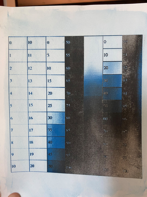
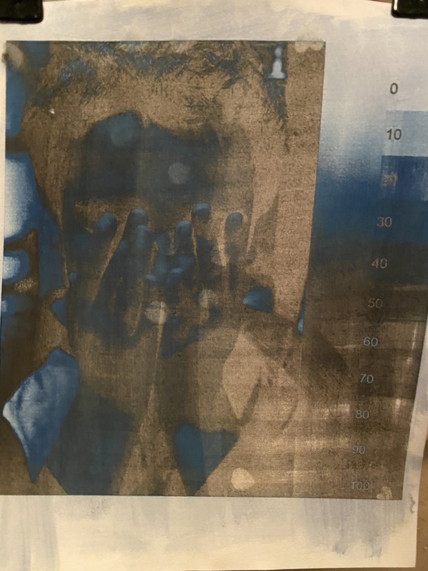
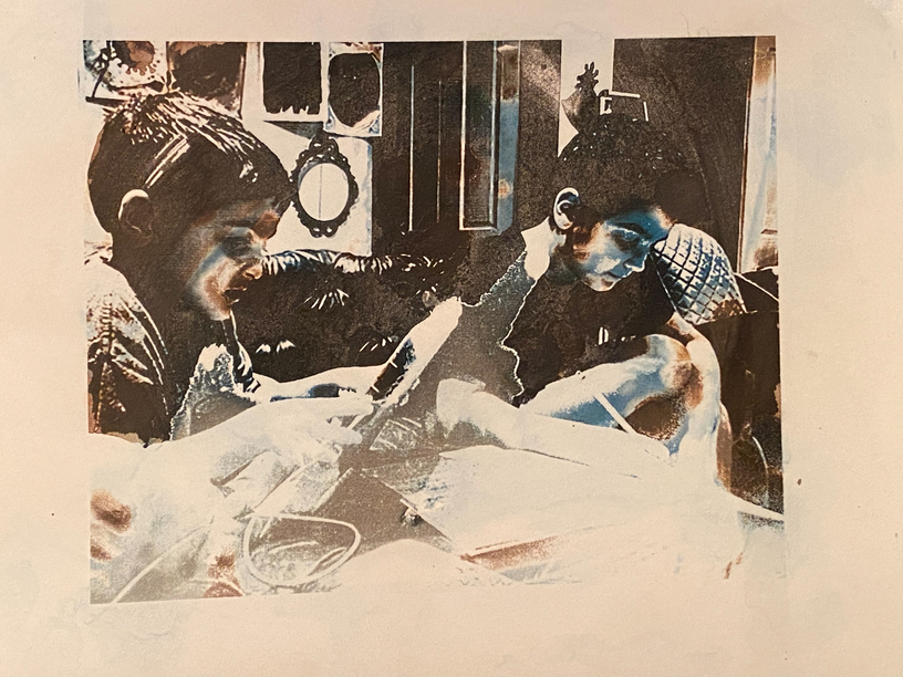
This image was made with settings 1000/25/vary power, and 170lpi. The emulsion was applied by hand. While this looks cool, I am now venturing in to deeper waters. The black is ash. It is poetic.
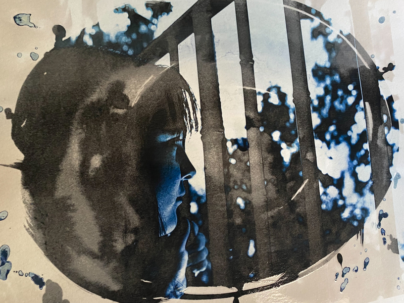
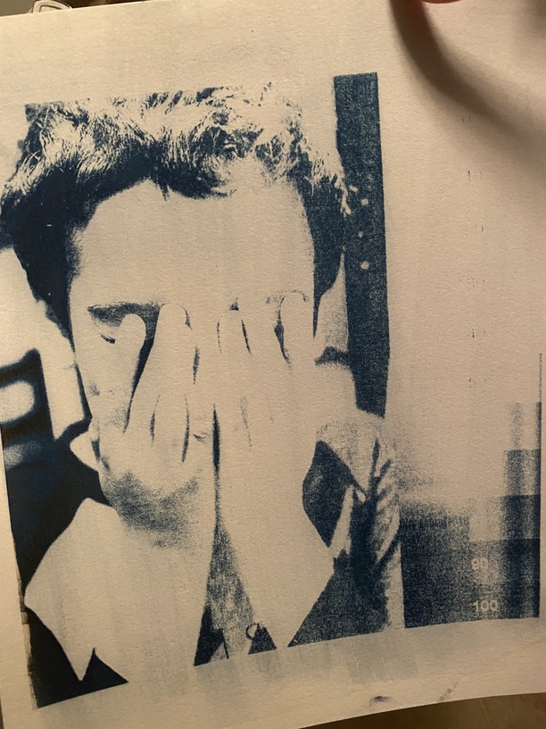
This photo was created with 1000, 21, convert to dots, 170 with 2 passes. Still not great for tonal range.
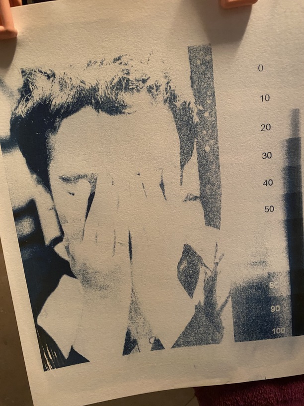
I have been working on opening the tonal range.
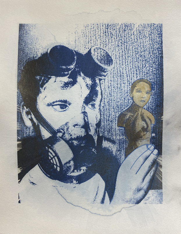
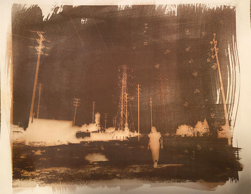
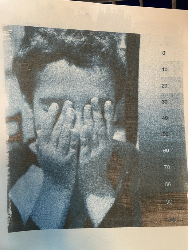
Here I combined the cyanotype and Van Dyke Brown processes. As the cyanotype washes out in the fixer, I am considering a 2 pass option to make it darker.
I am open for ideas on how to improve this process as well as any other comments you might have.
That is beautiful work but the difference between “blasting to atoms” and “barely touched” is extremely small at the bottom 1 % of the power while the rest is how far beyond blasting to atoms you wish to go. For this reason there is not much room for high detail.
The few thoughts I have on this is that with a raster pattern and variable power you can have speeds up to 4000. This is one area where you can have some variation of power as the energy can be raised to have some room to play. At 4000 speed a power of ten has a lot more room than a power of one.
I wonder if you have tried or, would have better luck building more controlled halftones in Photoshop rather than letting the Glowforge software convert images to dots for you.
It kind of seems like you have three distinct tones (white, blue, ash) with nothing really between them. The other “shades” (e.g., the boxes labeled 30 and 45 in the first image) seem to be combinations of specks on one side or the other of a threshold. It seems like there is some potential to do something like a tri-tone.
Doing halftoned separations for a tri-tone and, using a separate pass with the appropriate settings for each of the three colors might also produce something interesting.
With “convert to dots” every dot will be the same power, spread out more where light spread less where dark. This is best where the choice is either black or white. Trying to get between when the distance is very small is asking a lot.
However you have a much more complicated problem of when there are not just two colors, and you are wanting to use that tiny difference, so both asking a lot and insisting on an answer.
At variable power 4000 speed I would expect as fixed, and single pass, with only power as the variable. If not dark enough at full power for one pass, then I would increase the LPI. All this can take a lot of time, but it will exist for a much longer time than it will take to do it, thuss better to be annoyed by cutting time, than the rest of time.
I have no understanding of this art process, but these images are way cool! There’s an emotional component that’s hard to quantify, but I feel it. The woman at the bars is especially effective. It almost looks like there’s a reflected image of two people in her hair.
Don’t know if this helps but it was mentioned above…
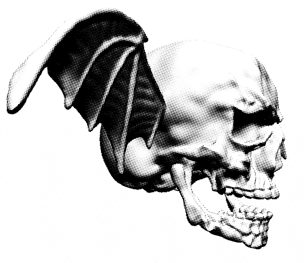
I’ve been playing with using the GIMP “halftone” filter (“Newsprint”) to try and get better detail in shaded designs without submitting to the unknown GF settings. I print with “Vary Power” so basically the laser is on or off, but I control the dithering/halftone pattern. A long way from being done. Here’s one example:
That is not the case Dither is either on or off, while vary power is variable.
Handing the laser a dither might have some issues unless the dither is huge and the LPI is high and the dpi is also huge, If you take a tight look at the dither dots they will not be b/w but variable kinds of fuzzy.
Matching the Dpi and Lpi and the dither in Gimp seems an issue. I have been using a lot of means to create gradients that one could then use laser dithering that the holes would be actual on off.
Most I am making into relief carvings rather than photos, unless it is actually a photo.
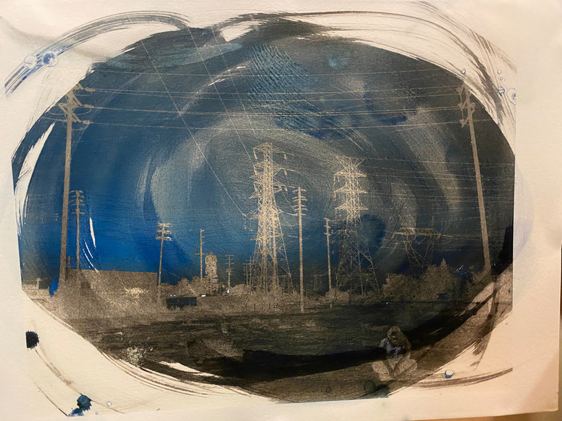
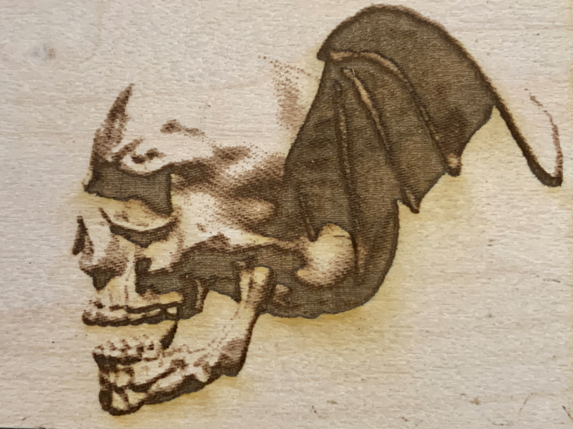
Switching the settings to 4000/full power worked amazing for a greater tonal range! I noticed the picture has more noise now. The engrave is still set to Vary power but it has more of a dots look (noise/high ISO). I am experimenting with getting the noise down by increasing the LPI. I hope this helps. If not, do you have any other suggestions?
I think you will see a benefit to high LPI. The time taken will go way up, If the original is dots and scaled up that will have bigger dots and you cannot avoid the fact that you are only able to operate in a tiny piece of all the possible settings of nothing to too much.
Higher LPI may make it too dark but you can scootch down the power levels as needed, In the range of speed, power, and LPI you have to find that happy spot and increasing speed is not a possibility. 1355 LPI will take a long time, but powering down enough to manage that will be losing some of the range to gain resolution, but it is a needed choice, and a very personal one, and easier to back down from too dark in this case,
Personally I am not put off with that much “noise”.
Looking back at the version at the top I thing most of that noise is in the original as it is still there in the version at the top in the part where you have anything at all. I am amazed it was still that light at 4000 speed, and increasing LPI would not get you detail that is not in the original.