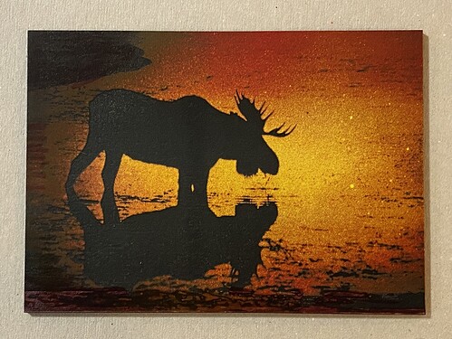
I’ve discovered that settings on one photo does not always work on the next and the easiest remedy is to tweak the tone curve. This has been the only that I have been able to effectively deal with gray areas of the photo.
This turned out really great.
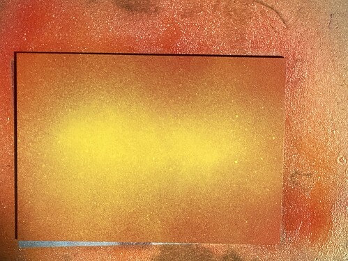
Totally agree. The painted media is a crap shoot. It is either epic or a tosser and no way to know until it is done.
Color matters also. I have gotten better results just by using different colors with the same design. This painted media is that ‘box of chocolate’ you’ve heard about.
In fact. It is about time to paint up another MDF board and see if I can get something kewl on it.
I had the worst luck with mdf/hardboard, so that is when I tried the Lowe’s dry erase/chalk board. The black side gives a good black when you get the perfect setting.
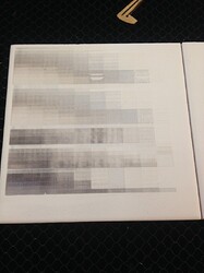
Not sure if it would be helpful but what I do when I am trying to dial in the contrast so it will show up on the final engrave I do a test pattern on an extra work piece or scrap that was painted same time and way as the final. Its a pain to setup because each row needs its own settings on the gfui but I get better results and easier to dial in what I want. Getting that range of detail can really be a struggle. your moose looks amazing, really tempted to try one of these myself.
Thank you. I need to do some more research the best way to set one up. I tried one yesterday but didn’t get it right. Since I convert all of these to grayscale I should probably do a 256 (or maybe divide that by 10) shades of gray pattern. I’m working on a moose with the aurora now and it now. I use Corel PhotoPaint and I’m not as familiar with it as I was Photoshop back in day.
Not sure the correct way either heh, i just change the opacity down in steps of 10 and then export that to png. I seem to have lost my old one but made this one that should work.
Engrave pre test.zip (81.8 KB)
Thank you very much.
Awesome effect!
That is perfect, I kept trying to do colors and then assign different power to each. Sometimes I can’t see the forest for the trees.
I just made the first png and then did copy and paste and it seems the gfui reads the info which image was created first so its an easy way to arrange a test without having to apply the colors to get the order you want
Thank you again. I learn something everyday from the “elders” in this group. I don’t think I had ever even hear of a png file before getting my GF, (and I have worked with computers since 1972 and had a hobby business doing photo touchup).
-BTW- What does FSJ stand for?
They are initials for the town i live in here in canada or used to anyway. No problems on the help glad i was able to, i think i normally just tend to confuse people and myself so ill take the win.
 I love the Great White North. I have many friends scattered across your beautiful country.
Love the tequila sunrise colors
This is beautiful!
Love your choice of colors … plus I love the moose.


