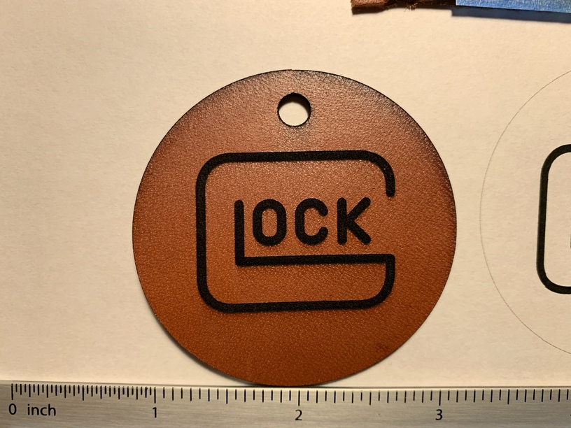
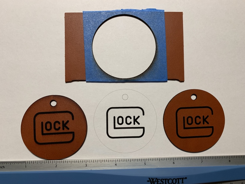
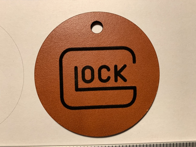
I’m engraving English bridle veg tan, making keychains. So here goes. All are exact copies. The one to the far left was cut and engraved with no masking. The one to the far right was engraved and cut with scotch painters tape as a mask. You should know I used a 2.88 inch wide tape and my whole keychain is 2.2 in total; so one piece covered the entire job. Maybe it’s just me but it looks like the keychain with no masking resembles the digital design more closely than the one I put the masking on. Why do you think this is. I increased the power from 6 to 10 to compensate for the masking; however the unmasked one looks a tad thicker overall in the shapes and letters . Any ideas would be greatly appreciated. Thanks a bunch.
They look identical to me. It’s possible that the smoke staining on the unmasked one is giving the burns the appearance of being slightly thicker. If you wipe it, you might find that it gets a little “thinner”. Or the settings might not be quite the same for the masked one - in that instance, you have to account for burning through the tape in addition to burning down into the leather, and they are not going to burn the same way.
Yeah, they look pretty much the same - there is always variation in leather, even on the same piece - so possibly you’re seeing something in person that doesn’t read in pictures. I do notice a clear burn mark around the outer edge of the non-masked one, so if you’re seeing that around the logo that would definitely make it look fatter
To me I see it particularly well when I compare the “O” between the 3 of them. And yes I know, I know it’s insignificant but hey it’s worth a post over here. I got all you great guys to get back so fast
Right I see your point. Hopefully I can run few more through and see if the same issue persists. But I’m so glad I decided to use masking it’s a night and day difference. Also I’m using Wickett & Craig leather.
The difference, if noticeable between masked & unmasked, is that you’ve altered the thickness, and thus the focal point for the laser, with the additional thickness of the masking.
Also leather will always have subtle variation across the hide, and bridle leathers are “stuffed” and likely even more variation possible between the natural density of the flesh and the stuffing additives (oils, mostly) and processing to produce a consistent thickness, flatness and top finish of the leather.
So @bansai8creations , your saying that it’s possible that the masking tape is what is accounting for the slightly thinner looking letters and shape. And yes I’ve learned sometimes even the best finished leather can be off from time to time.
Yes, if you’re comparing masked to non masked, and only setting material thickness based on the leather alone, then yes, it will cause some difference, mainly if trying grey scale/dithered pattern, the light or low power dots will likely not show up thru the masked layer. But this is not always a bad thing, depending on the artwork.