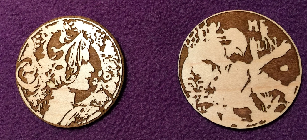
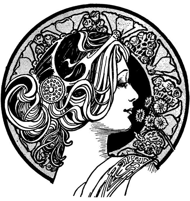
You can’t always get what you want…but don’t think of the Rolling Stones. Found these two wonderful drawings on Google images…an art deco woman and a really cool image of Merlin. The woman turned out OK, but there was way more detail in the original. And Merlin turned out even worse. Not really sure why. Seems to me that neither one of these was a good candidate for lasering.
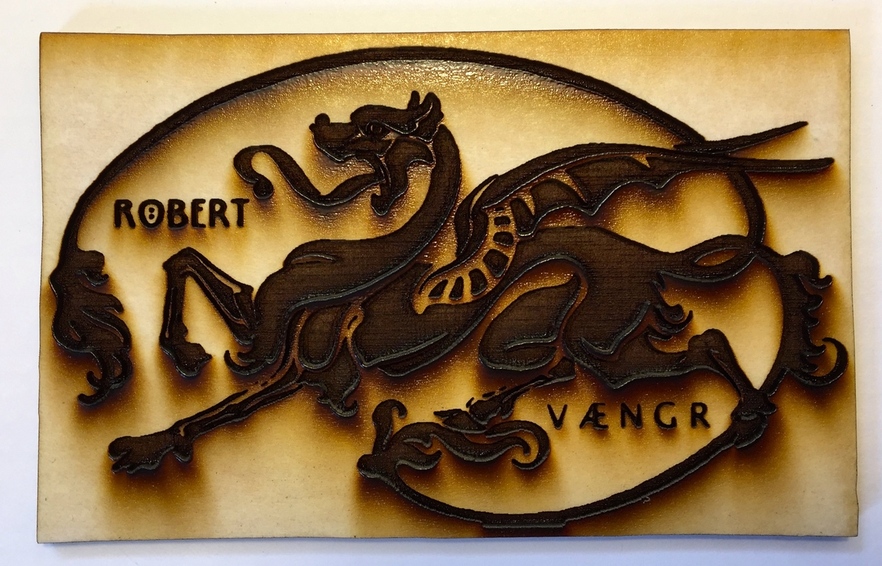
…the front feet of the beast and a couple other places don’t look really great because of me trying to get all the masking out of those tiny places. All in all…not pleased with art deco and Merlin one, but do like the dragon.
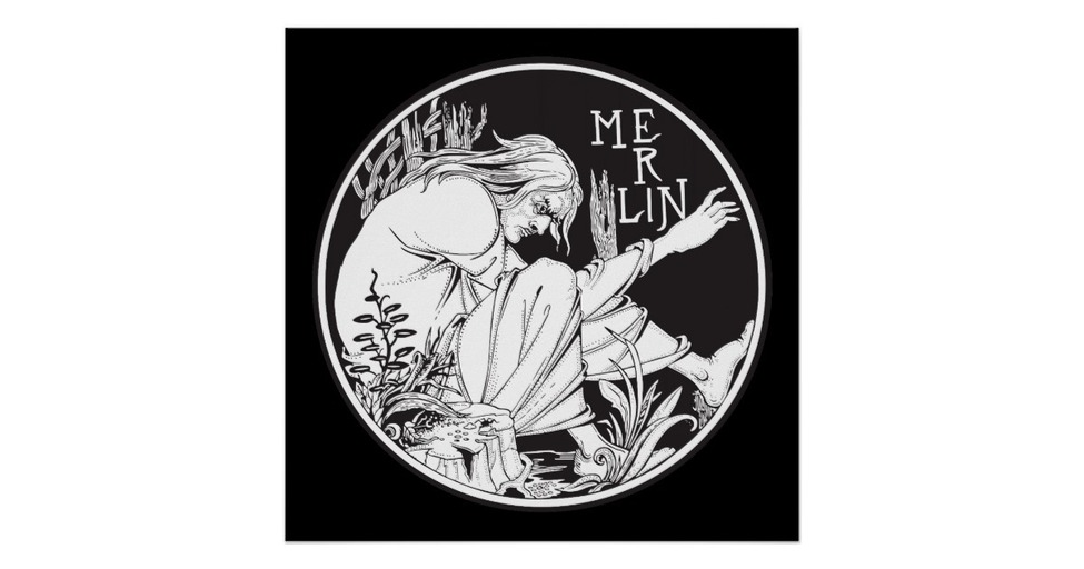
The dragon is outstanding. I agree, the others are just ho-hum. The woman is OK, I’m honestly not so sure what Merlin even is :-/ I think some things just don’t translate so well. I do like the contrast and tones of the round ones though.
I agree that the dragon is the best of the three. I do like the Mucha-esque lady, though … while I can see the lack of detail that you’re talking about, I wonder if you might be able to add a sense of detail or interest with some pretty colored stains?
Can you run through what your process was on the top 2?
What kind of resolution were the source files? Were they traced and then put in as SVGs, or just the jpegs put in?
What were you trying to accomplish - by this, I mean what did you see in your head when you grabbed the files and envisioned the end product (I don’t want that to sound rude!!) Grayscale type engraving, or?
Just trying to get a feel for what you expected. Since it ended up being 2 tone (I know there is a technique name for this that escapes me at the moment), I can speak to that - it can be really hard to get just the right image that pops with that style (in any medium).
The dragon’s technically better, but I like the art deco woman. To me it says, analog and has been worn through use over a hundred years. If you want a new-looking art deco piece, then yeah, not so much.
Thanks. So far, I’ve been doing very basic stuff. I use Affinity Designer and while I know how to trace things, AF’s tracing tool is not yet as easy to use as AI…although I’ve never used AI. I believe it’s a requested feature, so I’m expecting to see it updated someday. Anyway, these two images would take me forever to trace, so I just used the trace feature on the GF. They’re both jpegs. The lady is 650x689, which isn’t real great, but not the worst. Merlin, however, is 1200x630 which should have looked better. Also, since I still know nothing, I haven’t gone beyond using the settings that have been suggested to me by support. Any and all help gratefully appreciated.
Nice images to work with. One thing to think of is that the default settings are in place for Proofgrade AND design catalog items. So the bit maps that are to be engraved are going to be linked to the default settings and optimized thusly or they are vectors that are marked to engrave.
You are putting in a bitmap that is a little fuzzy (the Gibson girl type image) with a lot of noise in the back, all those little dots.
Try the girl at 340 with 100% power and 335 speed. See if that makes a difference.
Merlin is a lot crisper in the bitmap. It’s pretty solid black and white with definite outlines.
This demonstrates the difference between engraving a raster or engraving a vector. I tend to convert my rasters into vectors if it is simply black and white. It does help.
Part of my problem is not knowing how to use power and speed settings. The settings for PG are not yet optimal (at least for MY machine), so there’s a cut and dried list of settings based on material. I have not yet grasped the concept of how to adjust those settings…even just to experiment. I was going to start a separate thread asking for some help from all of you in the know. I think I will do that later, so not to get this entirely off track. In the meantime, I’ll sure try ‘her’ with those settings. Thank you very much!
The problem with the other images might have been…did you get the images off of the internet? If so, they are probably only 72 ppi - which is too low of a resolution to get a good trace or engraving results without doing some cleanup and modification work to it in something like Photoshop.
The dragon worked because it was essentially a black and white image…two tone. That makes it easier for the camera to pick up the clear breaks between the colors.
Any images that you get off of the internet are probably going to be very low resolution. (They do that to keep the bandwidth costs and usage down.) If you scan or trace a physical picture that has a higher resolution, you’ll get a very different result. Give that a try and see if you don’t like it better.
Thanks, Jules. I do try to check resolution when I get stuff from online…but, I’m sure you’re right. They came from Google images. As I alluded, I’m going to be picking all your collective brains about this, very soon.
I still need to finish up the overview…you guys are hitting on a bunch of stuff that I do discuss in it, but honestly…
…it’s damned hard to go back to writing tutorials when you’ve got a machine sitting in front of you whispering…“Design something…design something for me now…”.
Here’s a quick and dirty AI trace in SVG of the Art Deco woman… I don’t know if you want all of that stipling in the background - I left the threshold so it picked some of it up but not all of it.
The GF scan gives you a preview of what it expects to look like - right? Did that preview look suitable?
One thing I love about Google images is that it states the resolution with every image you click on. Also depends on the size of the final print. You are making a great point that you have to pay attention to resolution. In fact, I find that there are loads of higher Rez images but you have to note them and be aware of this fact. It’s not as bad as it used to be when you designed for dialup instead of broadband. Although one issue is that it’s designed for mobile so that sends it back small. A good page will have mobile and computer versions.
But I digress: @Xabbess, there are three settings that require three numbers.
Try this (although YMMV because of tube realities)
First click on the operation in the left column.
Click Convert to manual engrave.
Then put 1% (edited) in the power and 335 in the inches per minute. Then click the third field and scroll through the drop down until you see 340. Maybe go with few lines.
Then click anywhere outside the pop up. You won’t hurt the Glowforge doing these settings. When I first got a Glowforge I was hesitant about using custom settings. Since I was the only one really posting about it I didn’t exactly talk about this on the forum. Being a rules and regs person always coloring in the lines, I kept it quiet since I felt that not using the defaults was not being loyal to Glowforge. Irrational yes.
When @karaelena and @takitus started cranking things out I was much emboldened by their willingness to push the boundaries.
My recommendation for a must have accessory for the GF is a flatbed scanner. A decently high res one will cost you less than $100 and you’ll be able to get awesome scans. They’ll be better than what you’re getting now with the GF’s camera and key if you’re going to get into 3D engraving and manipulating images to create depth maps.
Thanks Fixed it. When doing variable depth/greyscale engraving, I put it on 100% and I’m so used to putting that in for engrave. Sometimes I don’t think it makes a difference in engraving when it’s top speed.
Thank you so much! Very kind of you. I’ll give it a try later. Actually, the trace of the jpeg I put in before looked really good, so obviously, it was a case of you don’t always get what you see, I think. I’ll let you know.