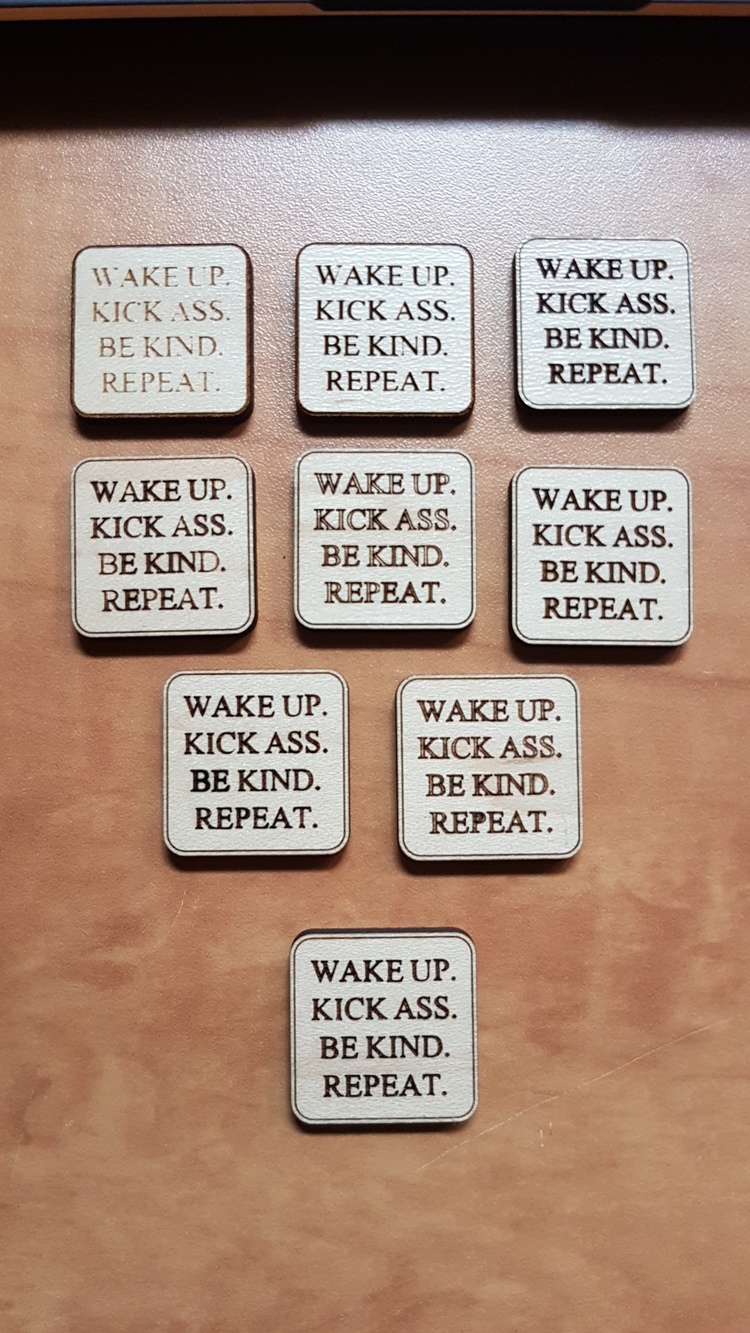
Any tips on getting a uniform engrave on a font that has thin parts? The W U C and N is not as uniform. Should I increase the DPI? Go high Def?
This is on proofgrade maple
Any tips on getting a uniform engrave on a font that has thin parts? The W U C and N is not as uniform. Should I increase the DPI? Go high Def?
This is on proofgrade maple
What about Bold-ing the font?
You can also do a light score in addition to the engrave.
So thicker would be better? I’ll try that!
That’s a great idea too! Thanks! I was in a paradigm
Slow it down (decrease power accordingly). I regularly do very small text but for it to engrave well, I slow down to about 400.
What @jbmanning5 said. Or, peel off the masking before engraving. 
is that a vector or a bitmap. it almost looks like it’s a bitmap that isn’t high enough res to engrave well.
This is a vector. I dont like using bitmaps for that reason. I know it’s a combination of speed and size that is contributing to the problem. But I’ll work on it as I really want to make this piece!
Glad it worked out. Even though you spent the afternoon on it, you got the results you wanted and learned a lot to get quick results on the next project. I’m sure DaVinci practiced a lot before painting the Mona Lisa. 

I would also increase the LPI up from the default. I was having a similar issue, but didn’t want to increase the size of the letters. The increase was enough for me.
When I didn’t mind adding a bolder look, I just increased the path size accordingly, but that’s also my only easy option when using vetain fonts, since not all font files come with a bold option
Hehe…its one of those things you think it’s easy as I made many things this size but this is the first one I did something with small font. And of course it’s one if my favourite words of advice I get frustrated with
I found increasing the LPI didn’t improve it to what I was looking for. What worked was a light score adjusted to the laser kerf so it ran just inside the boundary of the letters.
Happy cake day!
Generally for improving quality, lowering speed would be the prioritized option. Because speed is different, power and LPI may also need adjustment.
Here’s a link that gives some guidelines to manual settings:
https://glowforge.com/support/topic/first-three-prints/working-with-manual-mode
This topic was automatically closed after 32 days. New replies are no longer allowed.
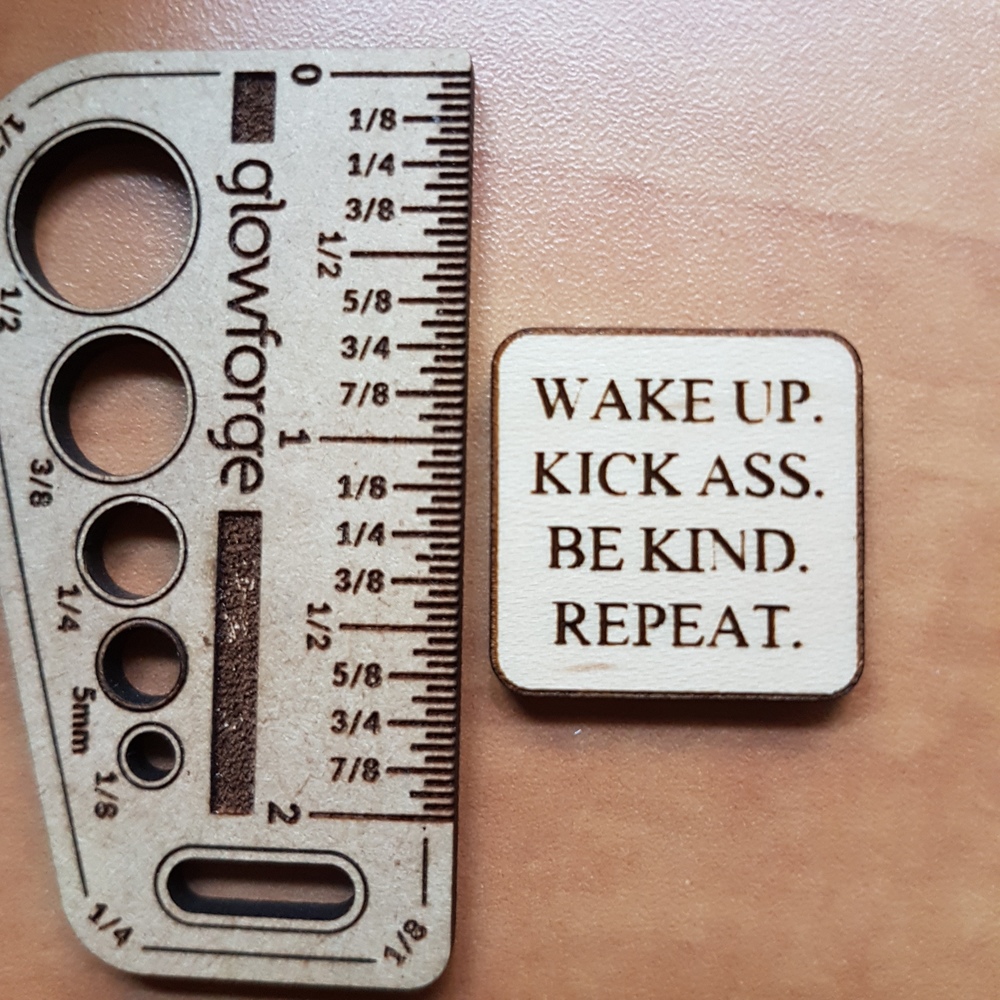
 Happy how it turned out!