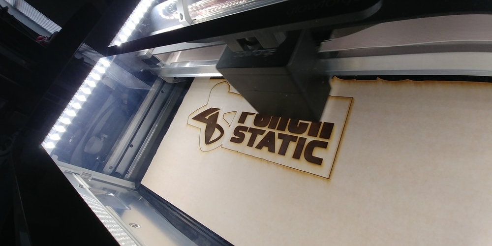
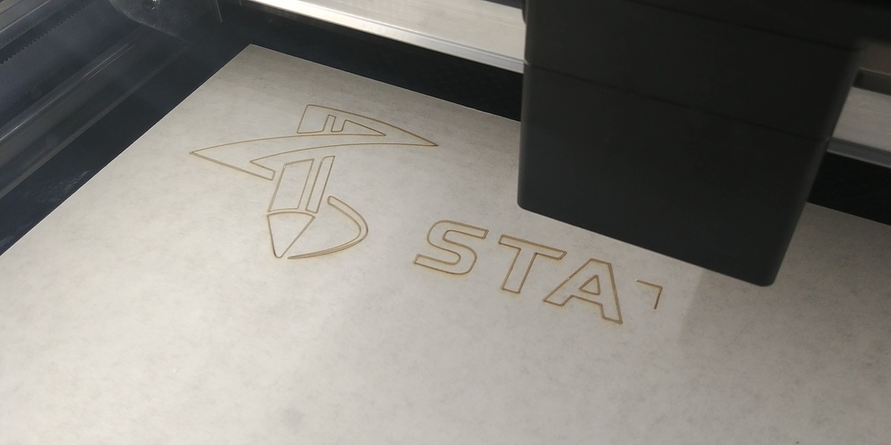
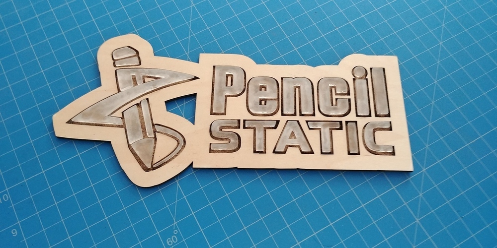
I already showed my first print, which was my company logo, but wanted to try my hand at some more.
Some of you may know, but I started out as a designing, then a web developer, photography, etc and now doing woodworking… a lot like @makesomething (I believe it was him that said that on a video not too long ago). Instagram: @InteractiveRealm
Anyway, a friend wants me to help him create his logo on a larger scale and backlit, but before we go there, I thought I’d get some ideas on a smaller scale. This is one of them.
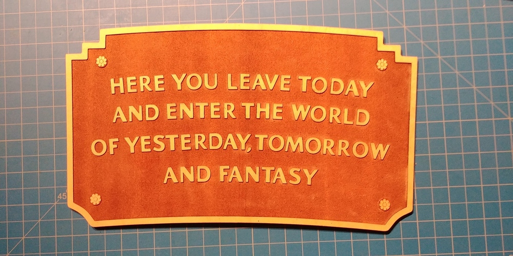
I sanded down the burned engraving to get the glue to stick better and also sanded the acrylic to give it a frosted look.
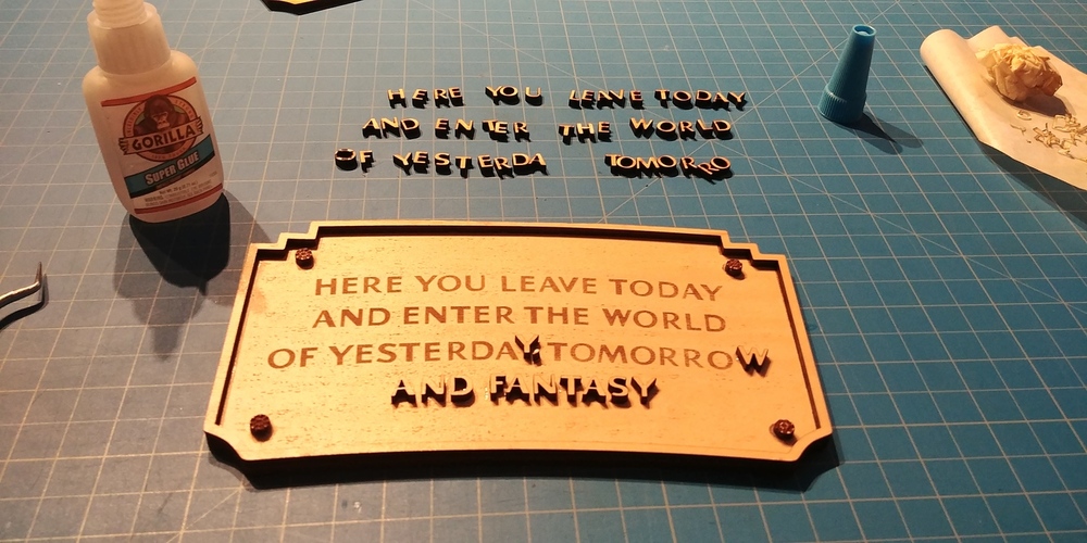
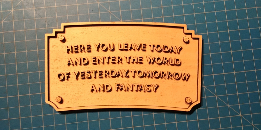
Besides making signs lately, I’m also a big Disney fan and go to Disneyland as much as I can. They have a plaque just as you enter the park, which I recreated in photoshop (each letter mind you, as there is no font of this type).
Here I wanted to double up the plywood, which led to cutting out each letter and gluing it in place. I cheated a bit and lightly engraved where the top plywood pieces would go. But that was tedious work.
So on this version I decided to just engrave it on a signal layer of plywood. 2 passes on the engraving. Also separate engraving on the flower/screw head design.
An idea: cut the letters out of 1/8” wood to leave holes, then again in 1/4” to drop in. Or use 1/8” letters for spacers to raise 1/4” letters in 1/4” holes. If you want a tight fit you will have to use separate letters and not just use the ones that drop out of the hole cuts and adjust for kerf.
Yeah I had that idea, but I only have the initial proofgrade materials that GF sends, and the only plywood is the maple and its all the size thinkness.
I need to order more supplies… but right now I’m using what they sent as to just get used to using the machine.
Right, but the heavy sides of the lettering is fine with you? Take the “A” and “V” vs the “Y” and “U,” plus how skinny the left part of the “D” is. lol But that’s how the sign is… which is why there is no font for it.
I had the same exact idea to recreate the Disney Sign as you enter the park. I was wondering, which version you recommend if I wanted to create it myself. The cutting out the letters, and applying them, or engraving them. Which version looked closest to the real thing? Thank you for your feedback. It looks great. Thank you.