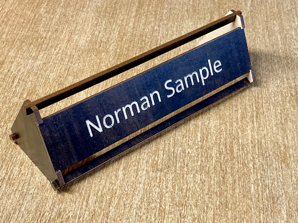
I filled in the engrave with a white acrylic paint pen. The wood is one-sided JPP Laserbits Walnut.
Any suggestions or ideas on connecting the ends, aesthetically?
I know the title is “minimal design”, but…you have two other sides to play with! This name plate could be a 3-for-1 item. [edit] But if you go my way, then leave the ends plain.
With the way you’ve fitted the name plate get rid of the cross pieces, make it more of a right triangle and push the end pieces inboard about an inch. A standard 8 x 2 nameplate should be supported just fine that way. You can always use 1/4" stock if you want a little more stability.
The white pen would work just as well on the sides or a black one. However, if I was making one for my desk I would use a comic hand lettering font (not comic sans)
I like the way it looks. It’s so different than the ones you normally see, which makes it stand out. Now, how do you get your pens to fill in engraving so nicely? My tips get ruined and just make a mess. Or maybe it’s just me!!