Having trouble with this particular logo (given to me in jpg form). For some reason when I trace the bitmap, the corners/angles come out too “rounded”. I fiddled with the bitmap settings to no avail.
Would anyone be able to help me get a good trace of this for engaving? I would be so grateful!
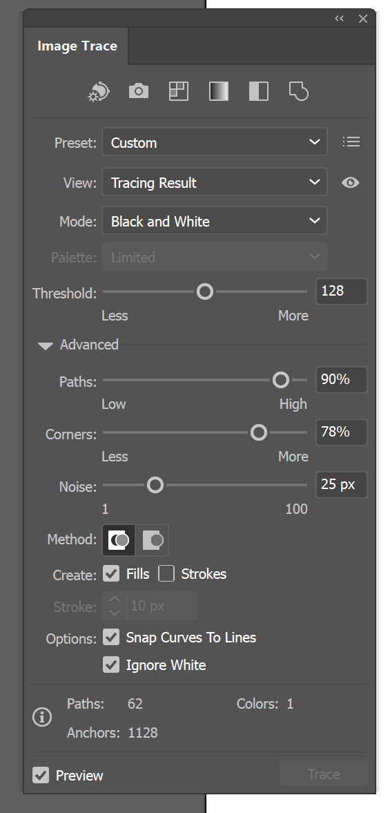
(And for future reference, can you share the Speckles/smooth corners/optimize settings you used?)
Unfortunately the jpg isn’t clean enough (in GF it’s VERY grainy with dots everywhere).
My bitmap is MUCH cleaner/crisper than the jpg, but the letters just aren’t angular enough (got somewhat rounded in the process). (the engraving will be approx. 3.5")
My bitmaps usually come out GREAT. But this one is awful - pretty sure it’s my settings but can’t get it right.
So @jestelle is dead on here, the image is about 297 px square, so you’re running into some resolution issues.
You want it to be 3.5" wide, so you end up with about 85 DPI, which will look “jaggy”.
There are image upscaling techniques, but they have tradeoffs. Not impossible to get a decent result, but the best bet? Ask the creator for a higher resolution version.
As for the dots everywhere, there are ways to solve for that using an image editor and curves. momentito.
Doesn’t solve your resolution issue, and it’s not black and white (it’s a greyscale) so be wary when using “convert to dots”. I’d recommend using vary power/3d engrave with this one.
Thank you, @jestelle and @evansd2 I’ll play around with these (while requesting a higher res. image).
@evansd2 Traced your png in Inkscape and it looks almost identical to the one I did (but eagle is slightly better), so I’m thinking it has to be my Inkscape trace bitmap settings? Going to look up what the default settings usually are and try to reset them.
So, the rounding is because inkscape’s tracing is an approximation. It’ll never be perfect.
As I said, the fix I did should resolve your dots issue, not the resolution issue.
One trick I do sometimes that can make things a bit better is to resize the image in inkscape to be very large (low res and all), and then trace it when it’s bigger. After that, I shrink the resulting trace back down to desired size.
Do you need to cut or score some part of this design? If not, you don’t need to worry about tracing anything. You can upload images to your Glowforge and engrave them. You don’t need vector artwork to engrave. You even get additional settings and speeds not available to vector artwork.
As for me, I say don’t engrave this version unless you’re desperate. 3.5" is still in the “hand held” class, and that means people will be getting a good close look at it. I’d shoot for at least 300dpi resolution, if you can get it. Ideally, you’ll get a source image from the creator that is at least about 1000x1000 or higher.
And this svg looks pretty good! If I’m not able to get a better graphic, I think this will will work.
I’m relieved to have this as a backup ~ thanks SO much!!
@dan84 and @jestelle I think it’s just that the jpg is such a low res. that it looks super grainy (on screen, anyway) even when cleaned up…but maybe I’m overthinking it, and it will come out ok.
I will do a test - one of the jpg/png and one of the svg - and compare.
Does anyone recognized the two fonts? This would be super easy to recreate with the right ones. I did a quick example, but couldn’t find anything close to the “and proud f it” part.
I have found Gimp to be best for me, especially in cases of jaggies,. It will still round corners (as they are rounded by pixels anyway) but you can get a good mask and set the mask to a path and then export that as an SVG.
Once in Inkscape if a corner is too round, if highlighted, you can double click in the middle of that curve, and then double click on the leftmost “curve” button and it will be a sharp angle. You can then grab the midpoint to the next node and make the fine adjustments. It is a good thing to practice with Gimp and Inkscape to know where stuff is when it is not a time crunch first,

 I would be so grateful!