Some great tips in here.
I’m still trying to get my head around gradient engrave. Understand the physics of why you want to do it with edge lit, and also have a pretty good command of Illustrator. But how are people preparing these gradients?
I’m assuming that for a complex shape, you want to do an even gradient running vertically through all of the parts (in otherwords, any horizontal “slice” across the image would have the same grayscale level). In Illustrator, the only way I can figure out how to do this is by making it a compound path and gradient filling that. No problem… until I want to send it to my GF
What’s the right workflow from having a gradient fill on a compound path?
- Save as SVG with a gradient and compound shape (I don’t think that works)
- Expand the gradient and export?
- Expand the gradient, release the compound shape, pathfind and clean up (a lot of work depending on design)
- Rasterize and engrave it that way? (If yes, do I do “dots”, “patterns” or “vary” and why would I change pattern density)
Also
- What grayscale range do most people find works well? I’m guessing something like 100-70%
- I assume it makes no difference which direction?
- I am a little fuzzy (see how I did that) on defocus. I see .308 in the example, but I’m not sure what the material depth was. What ratio are people using relative to material thickness and does it matter if it’s “higher” or “lower” than the top surface to get the intended effect?
I’ve tried a few thing and get errors around using compound paths, gradient meshes, expanded gradients and the like, so figured I’d just ask the folks that have mastered this.
Thanks in advance!
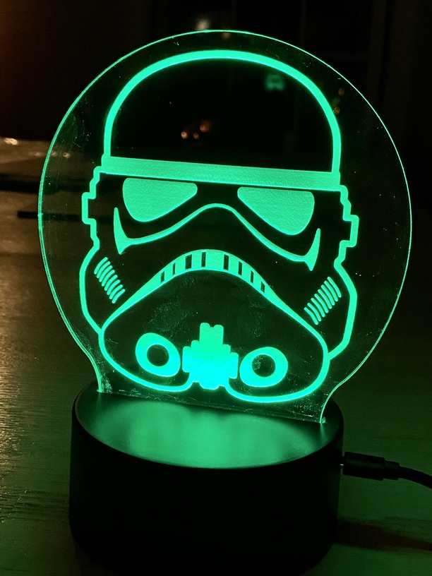
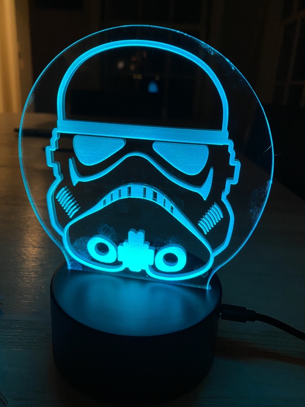
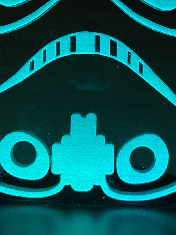
(for reference, the SVG that I’m trying to figure out. As you can see, lots of independent parts… I think from a results POV I want to get the gradient to be continuous through the parts from bottom to top. For purposes of illustration in the photo attaached I did a whacky multicolor gradient to show how I’m approaching it and that any horizontal line is the same color. For the actual GF job, I understand this would simply be grayscale from X% to Y%)