Hi everyone!
I’m really hoping someone can help me out. My husband asked me if i could do a farewell project for his battalion with their logo. Despite my best efforts I can’t get the logo to transfer into anything remotely legible or useable, and searching the web and youtube videos have not worked for me. I’m still fairly new to this and am hoping some of you experts can give me some guidance on this. The logo is this:
Any help would be greatly appreciated!!! Thank you in advance!
Is that a screenshot or your source file? It’s really small and low resolution, so it’s not surprising that the results aren’t very good.
You also need to plan for what you want to do with it. The Glowforge is not a color printer, so you’re going to have to make some decisions, like whether you want to take out that green to make the emblem show up better.
But the first step is to try to start with a higher-quality original. Ideally there’s a nice vector file somewhere you can use.
It’s the file my husband sent me. The color doesn’t matter i was just trying to get it into a filled logo that can be engraved onto a piece of wood. I looked around online for a better quality image but it’s slim pickings.
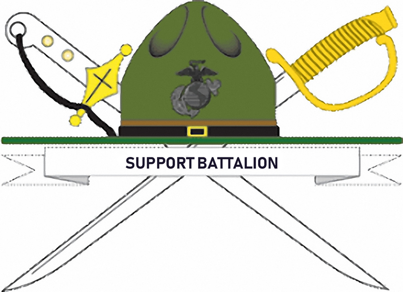
I upscaled it a bit. It is still not the best resolution but better than the original.
I erased the words “Support Battalion” and retyped it in cleanly
What’s the specific unit? This group can do a great deal with a good source image, and I’m sure there’s an official one that’s a little better dialed in, especially with regard to the sabre handles and the globe and anchor. I’m sure there’s an official logo we can Google up with the unit identification.
Hi
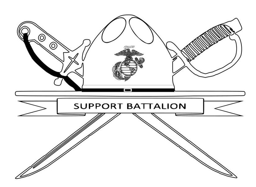
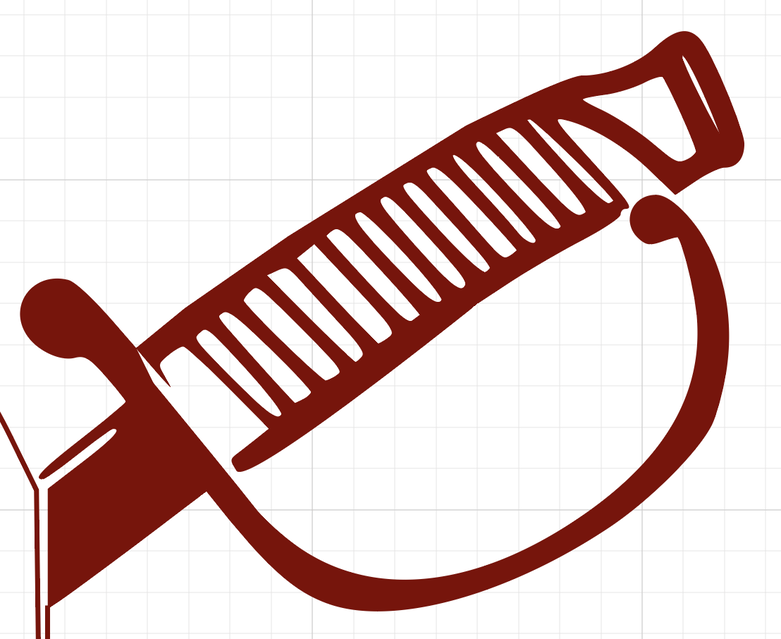
It’s not perfect but I hope this works as a start for you. I did not have very much time available and I am still learning the Inkscape software. But had to try when I saw the logo on the hat.
Best of luck.
I’m going to go in and make a couple little adjustments to make @alexandrakher’s work easier in the Glowforge interface - and that way you can see what I did and hopefully it’ll help you with learning inkscape! Win-win
When I googled it I was only able to find maybe three images and one of them is from the military website and the resolution wasn’t very good on that one either 300x217. The unit is literally just support battalion mcrd Parris Island. I struggled for several hours trying to pick it apart and piece it back together, along with a cleaner image i found for 2nd recruit training battalion which uses the same logo but there is a giant two behind it and different words in the banner. i was actually able to get it looking right on inkscape as an outline but as soon as i hit fill it got all weird with some random lines running through it which i know had to do with the nodes but i couldn’t figure out why or how to fix it.
Better than what i did! Thank you so much! I’m still learning inkscape as well. It never ceases to amaze me all the amazing things people create with their Glowforge, but even better how willing they are to help newbies.
Well I tried again to upload the svg
to Free Designs section but not sure if I did it correctly.
Hopefully deirdabeth will be able to offer better help.
Good luck with your design.
The .svg is there in your first post - it was just saved off the art board so the big white square is all you get - if you right click and save on the big white square you’ll see it’s off to the right when you open the file in inkscape
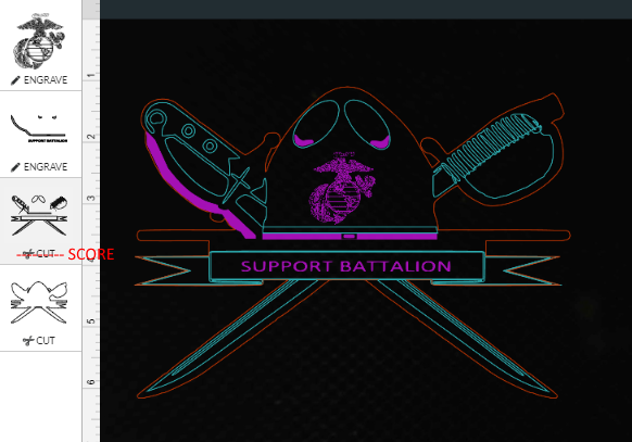
You file was fabulous - let me know if you have any questions about what I did to GFUI it
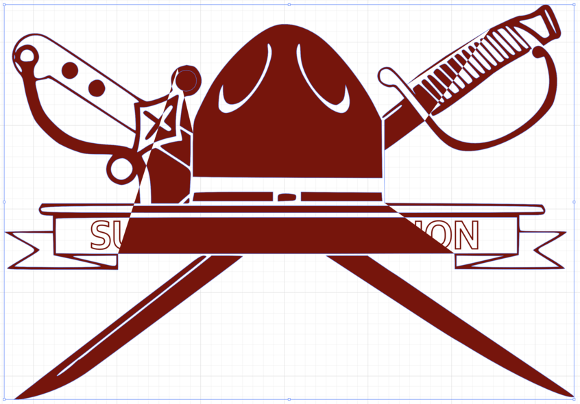
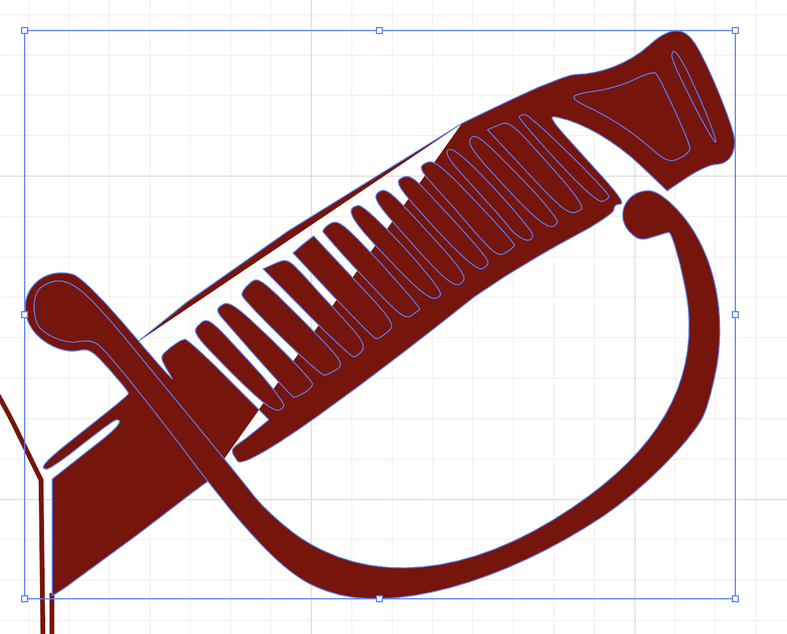
This is the one I did with picking it apart from another logo and putting it back together:
the problem is when i go to fill it, it gets all weird and i can’t figure out how to fix it.
This is the image I used to create it:
Looking at that in the GFUI with engrave selected I’m guessing using the combine function will address some of it - but I’m not 100% sure without playing with it. I think you’ve got a remainder of the 2 in the source image showing up in the background.
Combine will make things like the center of an O actually show up instead of it engraving a solid circle.
Also looking again I’m seeing things I want to fix in the one I did - but as I’m not planning on cutting it, it’s better to get yours working!
there are just some slight things that are off but probably easily fixable, and i appreciate the one she did and will probably use it. i more wanted to know if someone could tell me what i did wrong with the one i did so i know. I’m still fairly new to this and i was trying to make it more of a filled logo but when i fill it in inkscape it creates some funky lines, and they are to nodes i had broken and deleted the lines to.
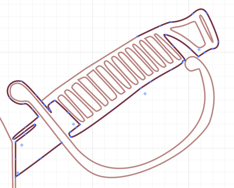
Since there’s a lot going on there, let’s focus on one thing. First of all, it’s one big compound path, so start by releasing that and just looking at the upper right where the sword hilt is. Again, it fills strangely:
It’s not closed, and it doesn’t really represent a whole shape. So if you connect the start to the end and fill it in, you get that part of the weirdness above. Actually, if you stare at that thing closely and trace where the lines go, it has a sort of M. C. Escher thing going on. What’s inside and what’s outside is not exactly clear.
As for how to fix it, well, I’m a technician and not an artist. I imagine the best way is to manually clean up the paths and redraw the nasty bits. 10 seconds with the Shape Builder tool in Illustrator can repair the paths in place, but it still requires a bit of touching up and I daresay it’s not what you’d even want.